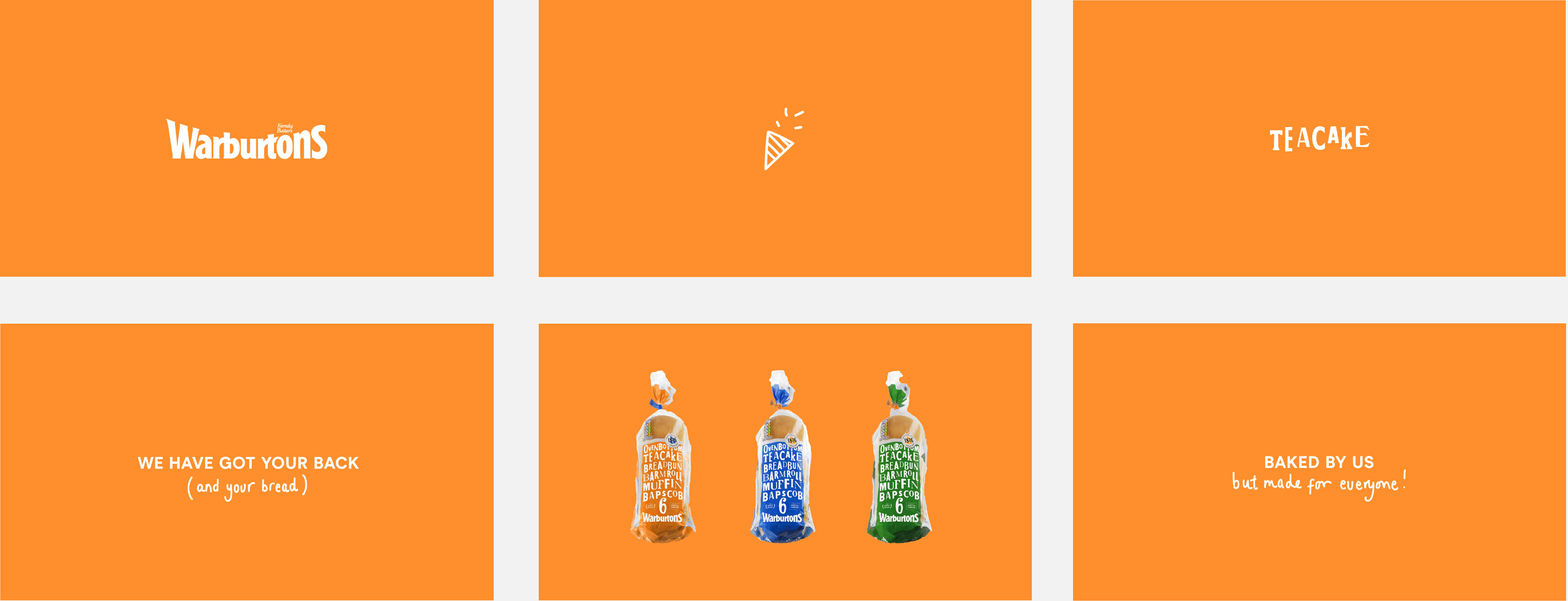
Warburtons - Baked by Us, Made for Everyone
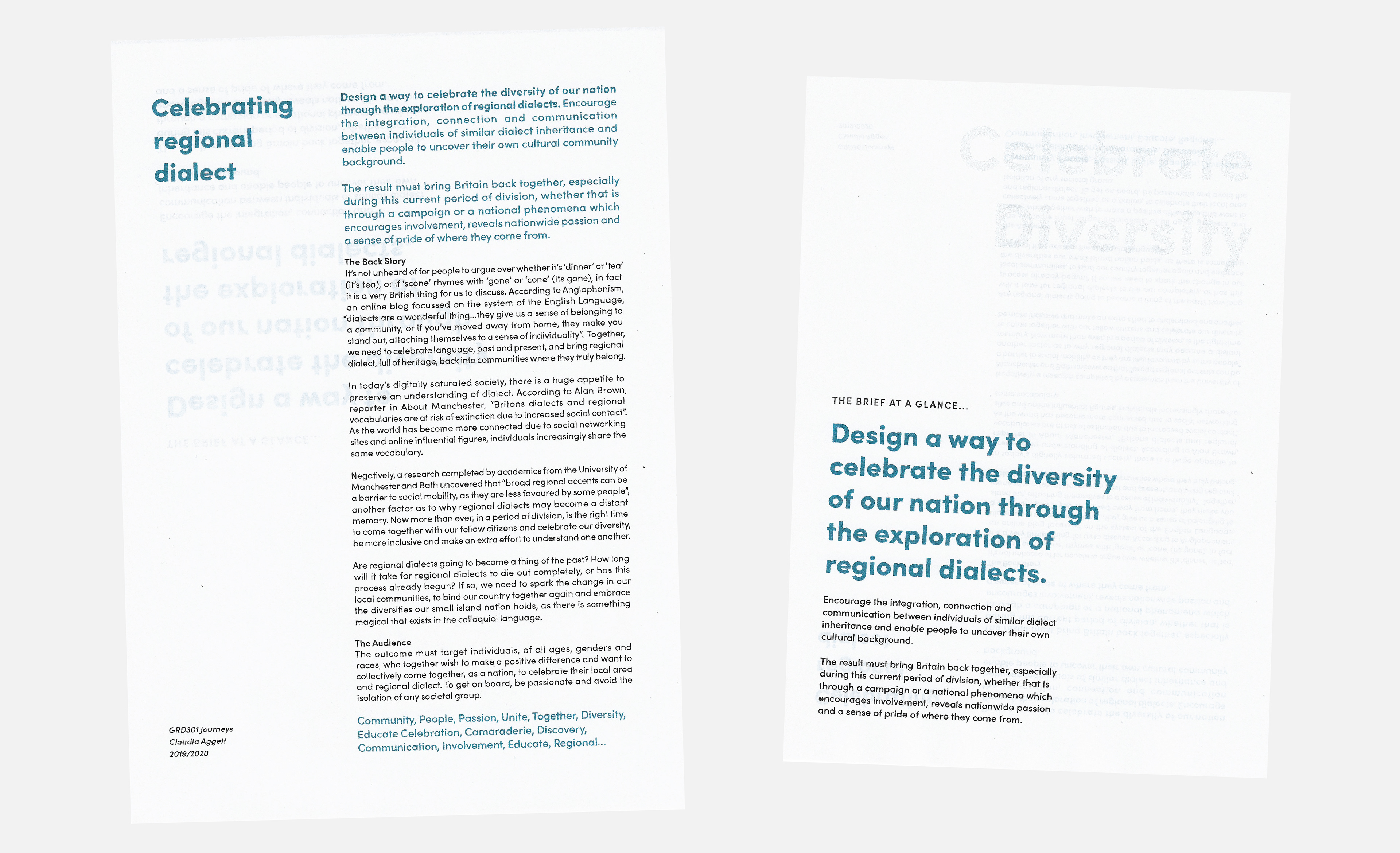
Celebrating regional dialect
Self-Initiated, 2019
Brief
Design a way to celebrate the diversity of our nation through the exploration of regional dialects. Encourage the connection and communication between individuals of similar dialect inheritance and enable people to uncover their own cultural community background.
Outcome
In association with National Dialect Day, Warburton’s will be transforming their iconic designs into easily recognisable, regional packaging to celebrate the diversity of language and dialect in the UK. Introducing Baked by us, Made for Everyone, an all-inclusive, ‘accepting of all’ packaging range which aims to permanently replace Warburton’s designs which have long been a symbol for the British dinner table.
Branding and Identity, Packaging and Animation
Background
The direction of this project has derived from my personal experience when discussing food in particular. It is known that us Brits tend to argue over whether it is sc-gone, or sc-cone, or what we call an evening meal; is it tea or dinner? However, everyone in the UK has a different opinion on what to call, what is perhaps the most inoffensive food known to man - the humble, ubiquitous ‘soft round bread’.
University has given me the opportunity to be surrounded by individuals from different regions within the UK. Consequently, I have been involved in many humorous, but also extremely passionate debates regarding the ‘fluffy substance with a floury exterior’ and what it is called. It seems we are all caught up in our own ‘bread bubble’ and at the mention of any alternative name, passion and a sense of pride of your cultural background ignites.
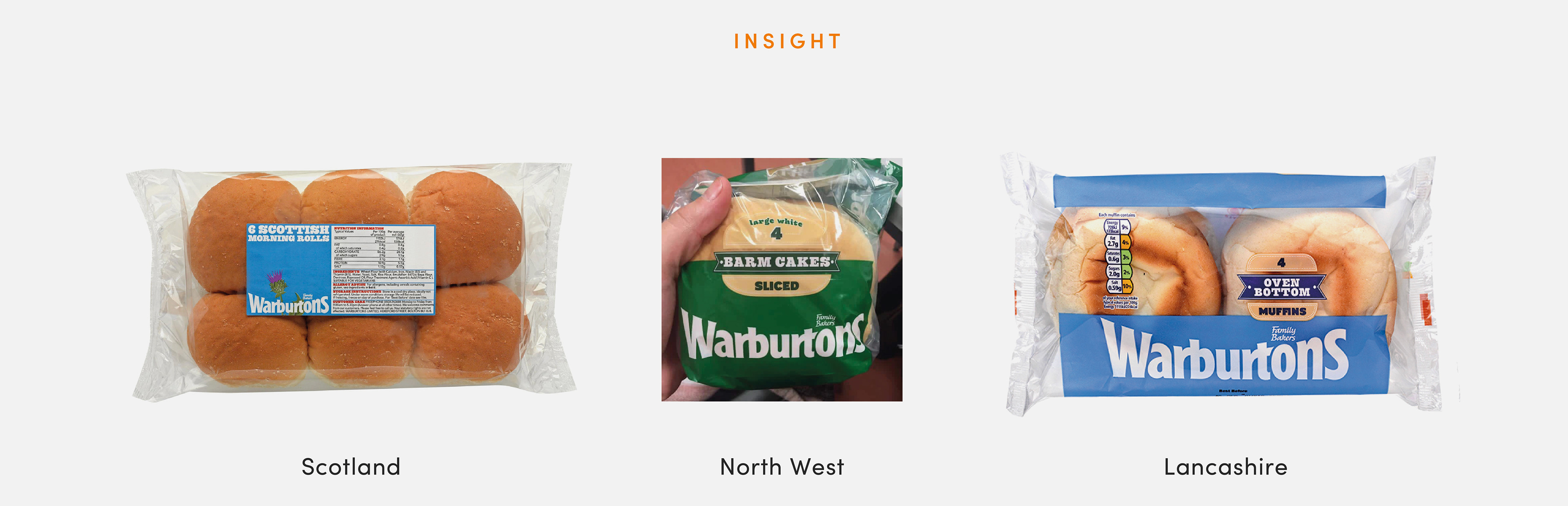
Above is a range of packaging designs which can be seen sparingly across the UK, in very few regions. These packages have been specifically tailored to that region, for example in my home county of Lancashire the 'soft white roll' is marketed as an 'oven bottom'. However, this appears quite exclusive and regionalist, I believe the packaging needs to be celebratory of all and promote the nation's diversity.
Existing Packaging
Analysis
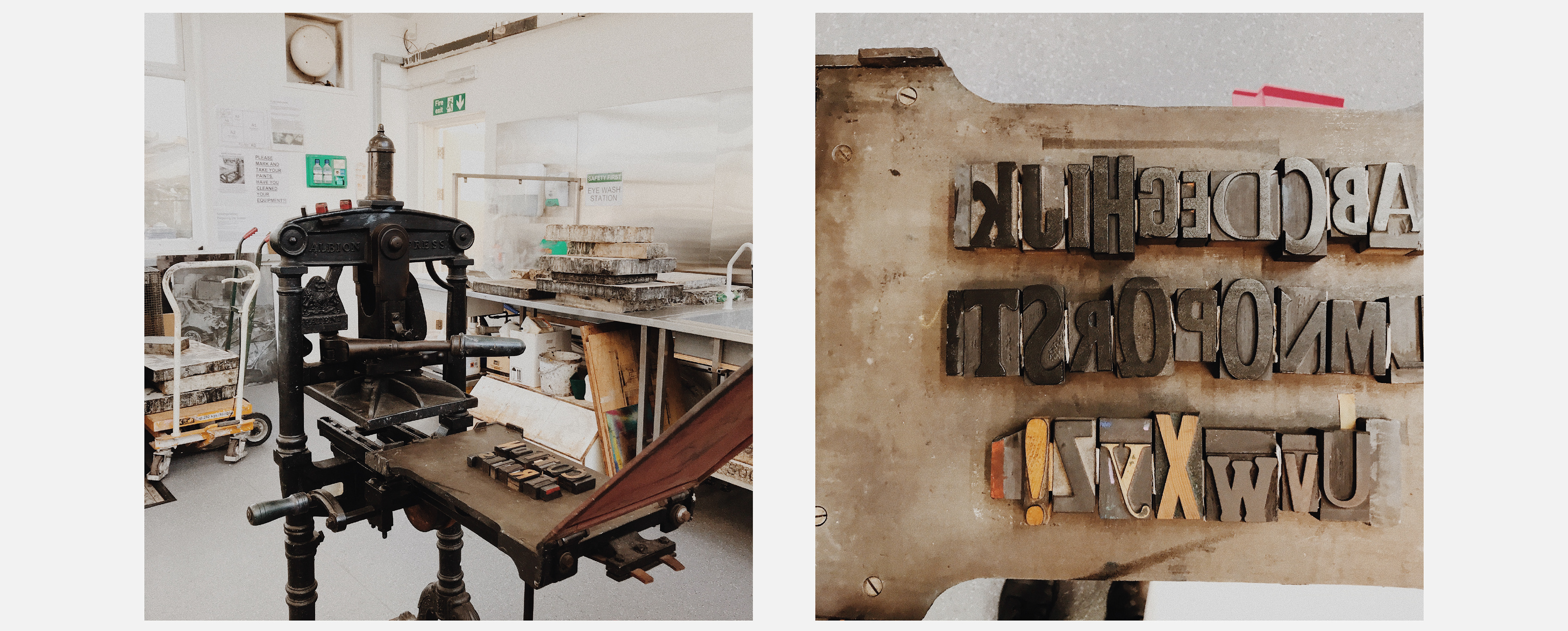
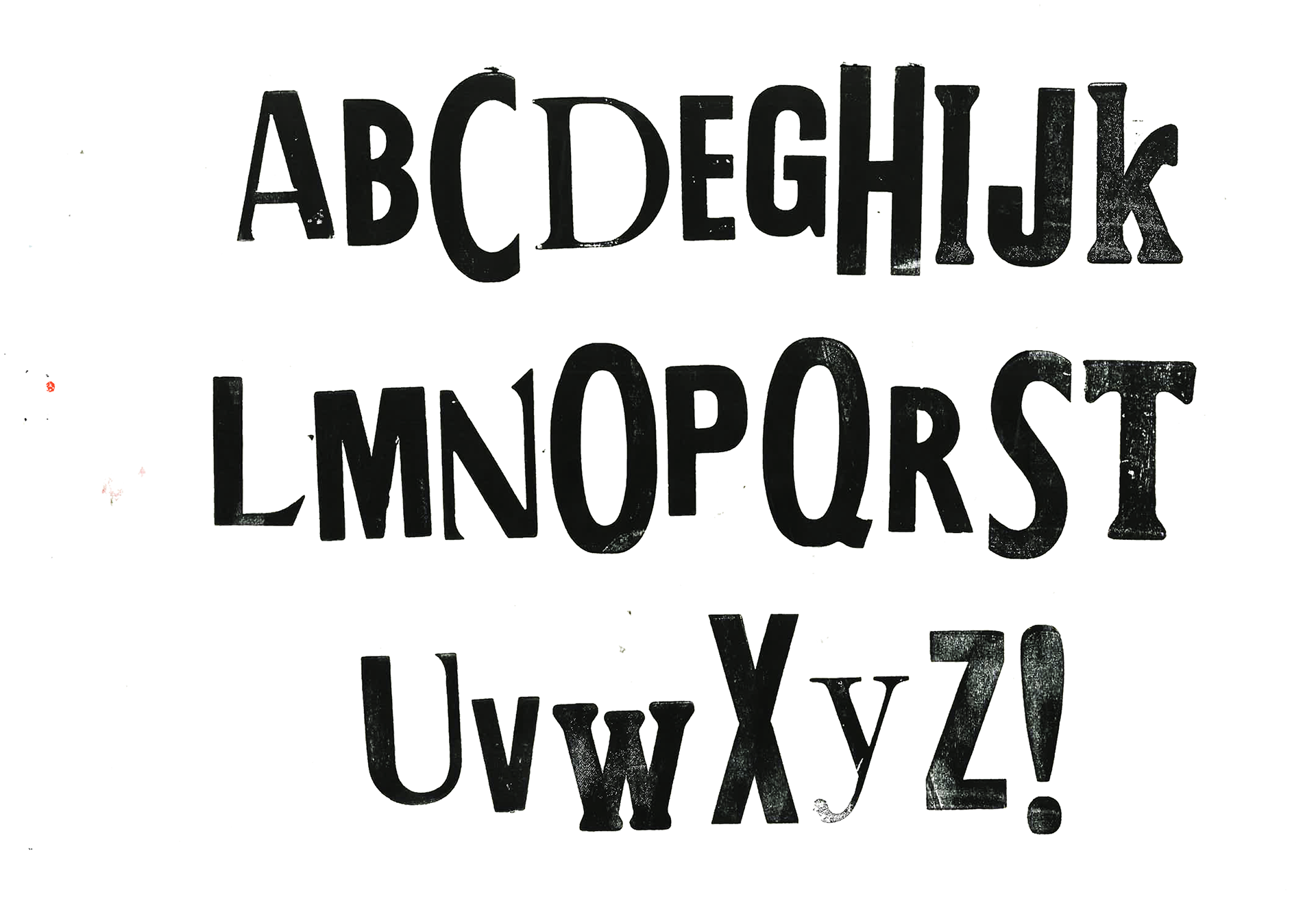
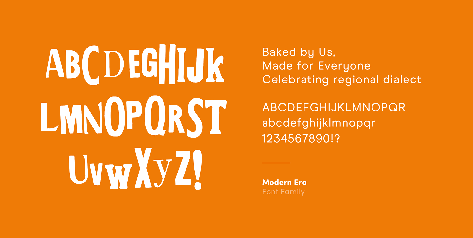
Letterpress Experiments
Typography
Warburton’s was first established by Thomas & Ellen Warburton back in 1876, and since then the company has been passed down through five generations of family bakers and is now recognised as Britain’s favourite bakery brand.
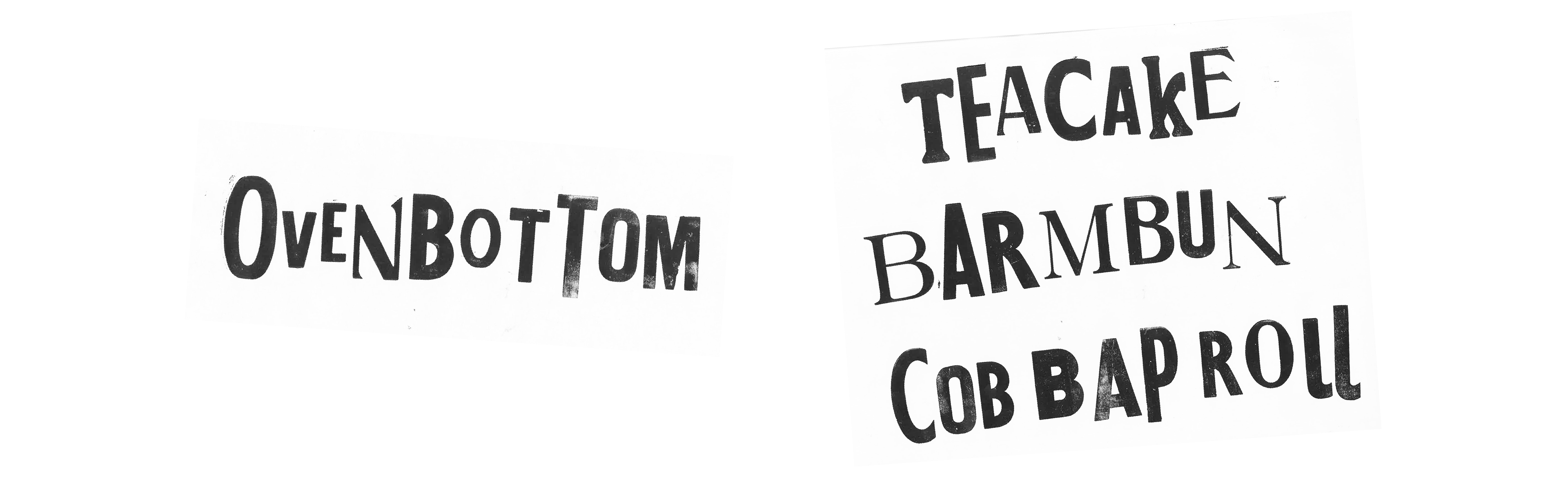
I created a typeface using traditional print methods to resemble visuals often related to bakeries and Warburton's traditional qualities and heritage. Each character is different to represent the nation coming together in celebration of our regional differences.
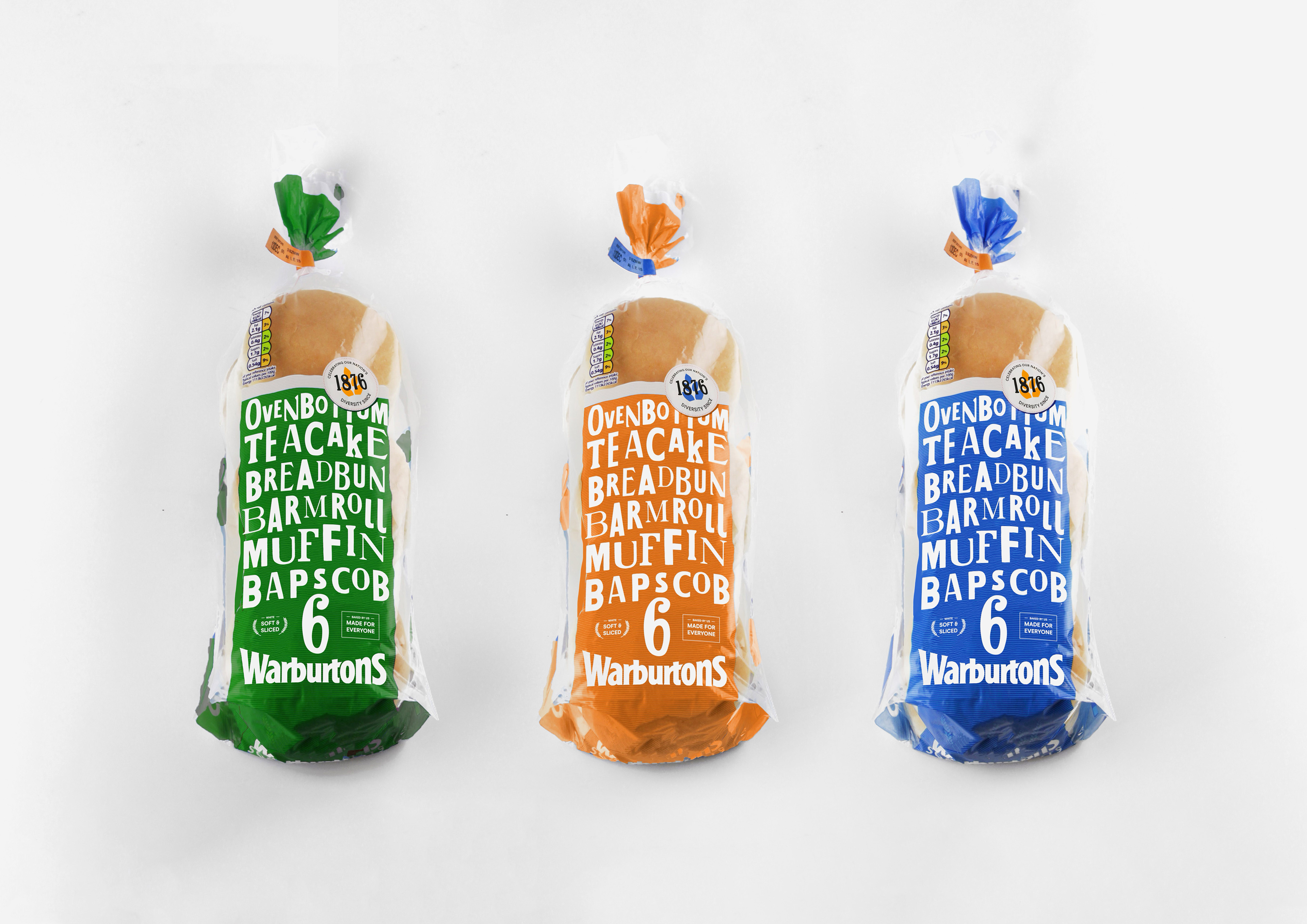
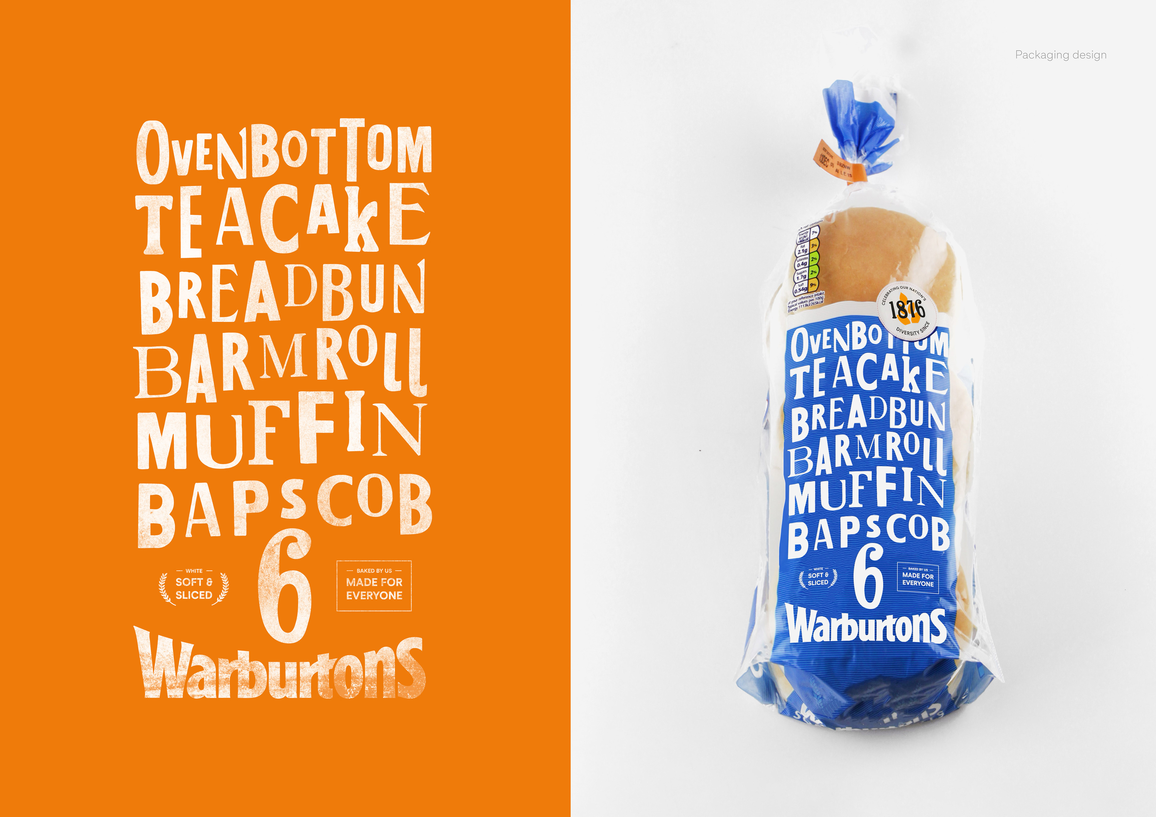
Packaging Design
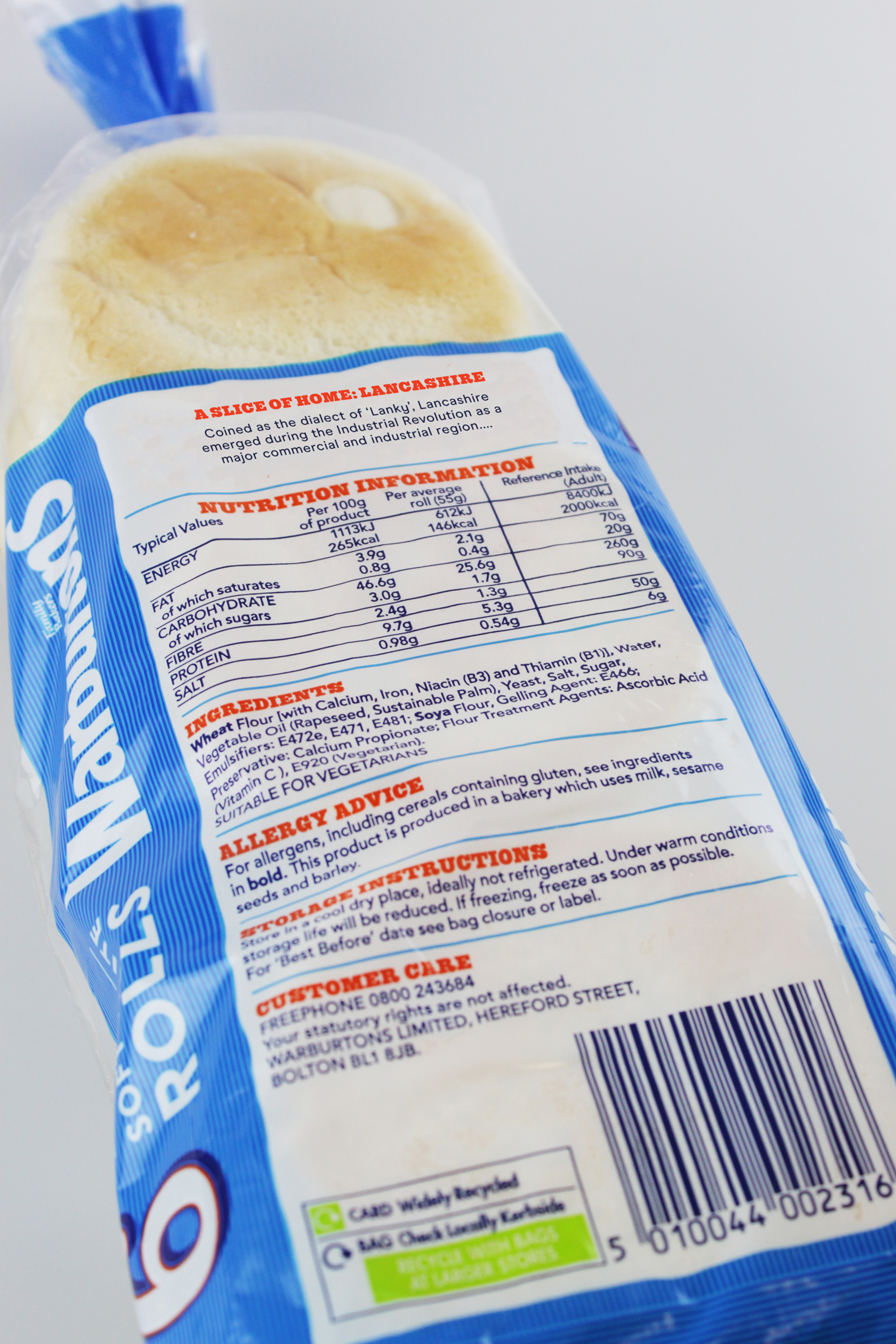
The new bread packaging utilises the developed letterpress characters to produce a collage-styled packaging design, which incorporates all of the names given to the bread type. The packaging is all inclusive, demise of any hierarchy, where everyone and every name is equal.
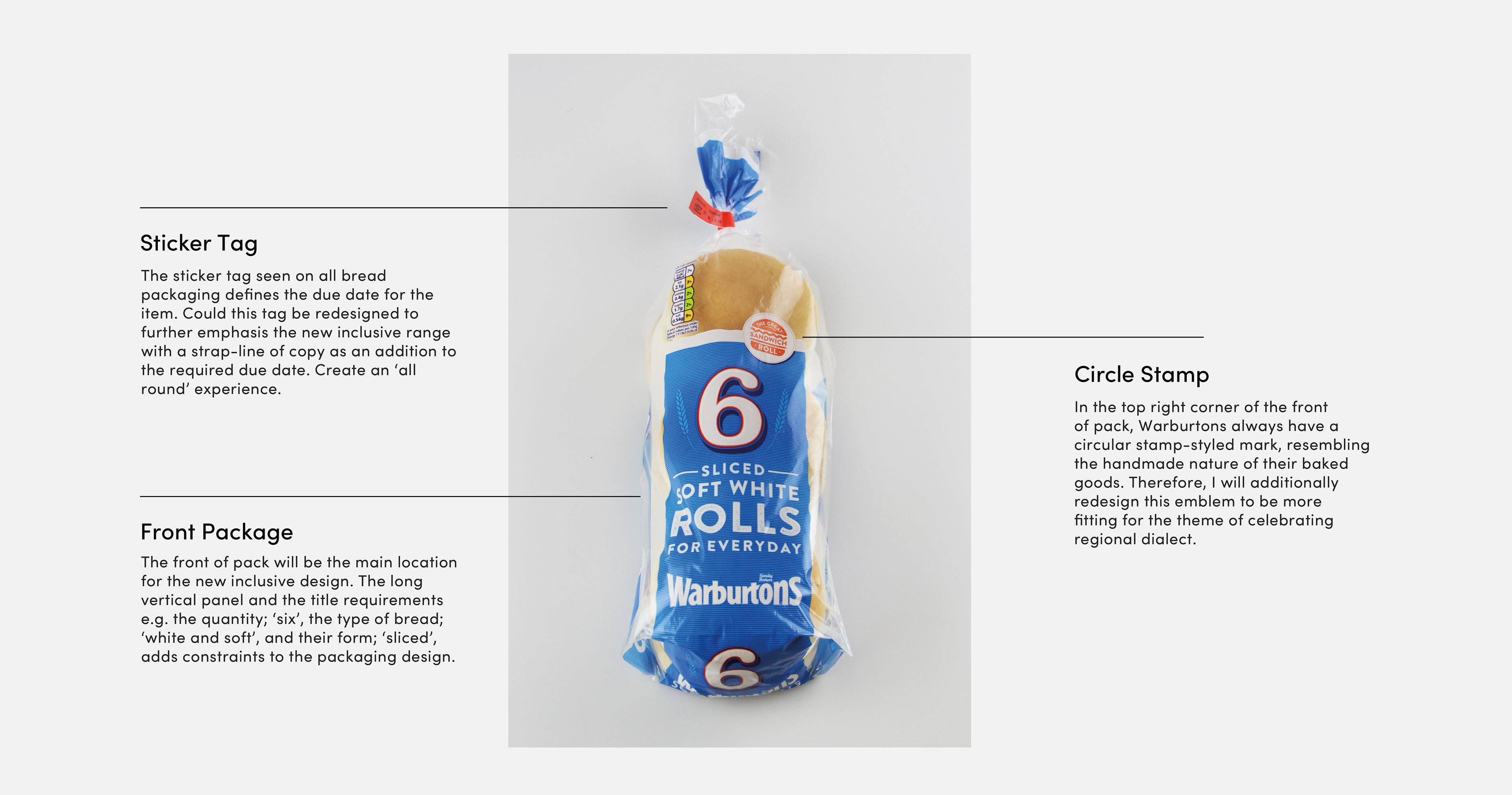
The Warburton’s logo, positioned towards the bottom of the packaging, nicely frames the typographic collage and provides space for any additional information. The slogan ‘Baked by Us, Made for Everyone’ has been positioned on the front of pack to emphasis the campaigns aim, alongside the required packaging information.
The circular stamp reads “celebrating our nation’s diversity since 1876”, suggesting Warburton’s appreciation and recognition of communities throughout the UK.
Back of Pack
Due to the limited space, the back of pack hosts a small section towards the top, entitled “a slice of home”, a segment which will explain the history and origins of different dialects throughout the UK. Each packaging will reveal different facts, giving individuals the opportunity to gain insights into other regions in the country - opening their eyes to the nation’s diversity.
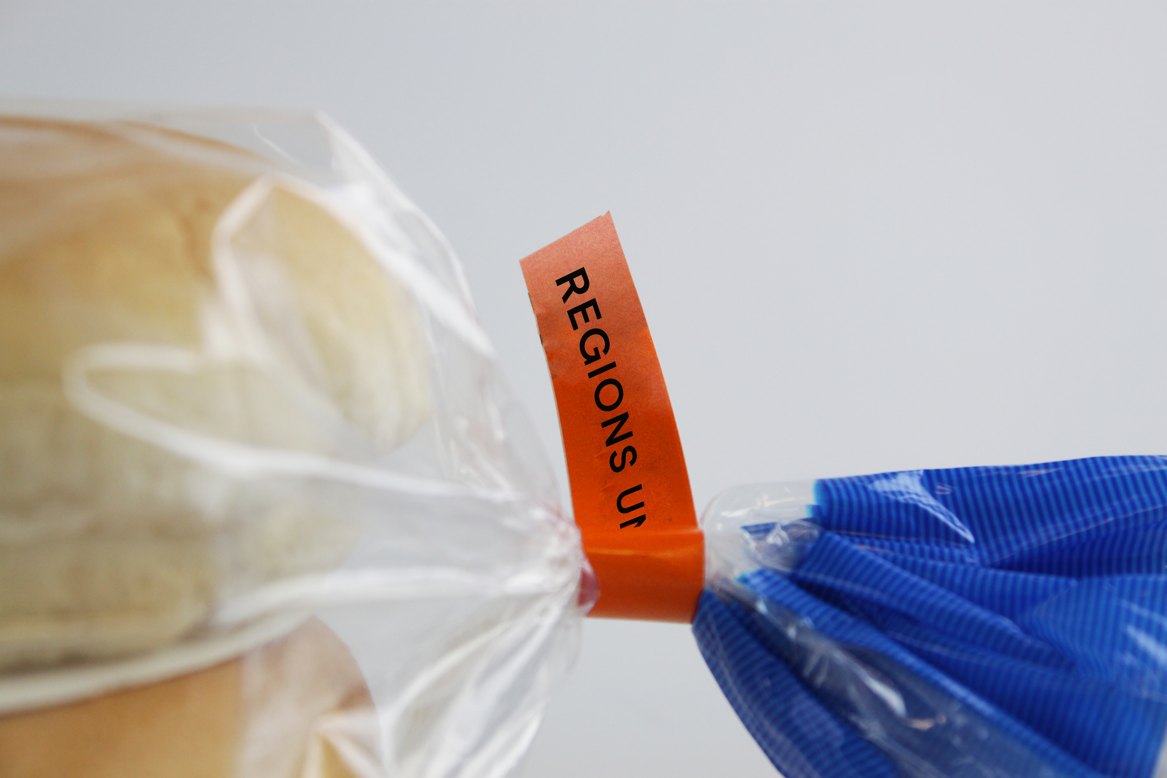
Sticker Tag
Alongside the due date, the sticker tag will additionally read “regions unite”. The act of tying the bag suggests how the elements come together, whilst the new packaging unites regions and dialects throughout the UK.
Promotional Animation
This animation has been created to celebrate Warburton’s new campaign and packaging range. The video will be used across the brands social media platforms, as well as taking centre stage on their website upon launch.