Art is _____ Campaign - A year of art for a fiver
YCN Art Fund Brief, 2018
Brief
Create a campaign that can drive sales of the Student Art Pass amongst university students. We need to convince students, not just art students, that visiting museums and galleries can help them step out of their daily lives and get a new perspective on the world.
Problem
In today’s society a large percentage of students revolve their lives around the use of social media, digitally connected to a vibrant world, however physically becoming increasingly secluded, closed off from culture and the awareness of opportunities surrounding them.
Art is stereotypically depicted as lacking importance and is generally overlooked by students and generally related to ‘dull old paintings on gallery walls’. Combined with a reduction of engagement with young people, Art is understandably being disregarded, however ‘Art Fund’ have announced their affordable ‘Student Art Pass’, which entitles students to visit over 200 locations across the nation for just £5 a year.
Nevertheless, art is everywhere. Art surrounds us at all times and by highlighting this factor it may allow it to be more of an accepted topic, compared to one that is frowned upon.
Branding and Identity, Advertising, Social Media, Animation, Print and Craft Skills
Outcome
Introducing the ‘Art Is_____Campaign’ – a campaign across the UK highlighting the importance and extent of art within society, having no limitations, breaking the stereotype and opening student’s eyes to what art truly is. Travelling across the country, visiting major universities, the #ArtIsCampaign will be installing inspiring badge walls to provide students with the answers to their questions and unveil their opportunities - showing participants that art may not be what they first thought.
It is an attempt to make art appear more appealing to students by changing their perception of what ‘art is’ from “dull paintings on gallery walls” to something more personal, exciting and relevant to all young adults.
Continuing Art Fund’s key brand visuals, I used the underscore in the form of a ‘fill in the blank’, inviting students to have their own opinion, understand the need for art, acting as a space for an answer and to spark conversation.
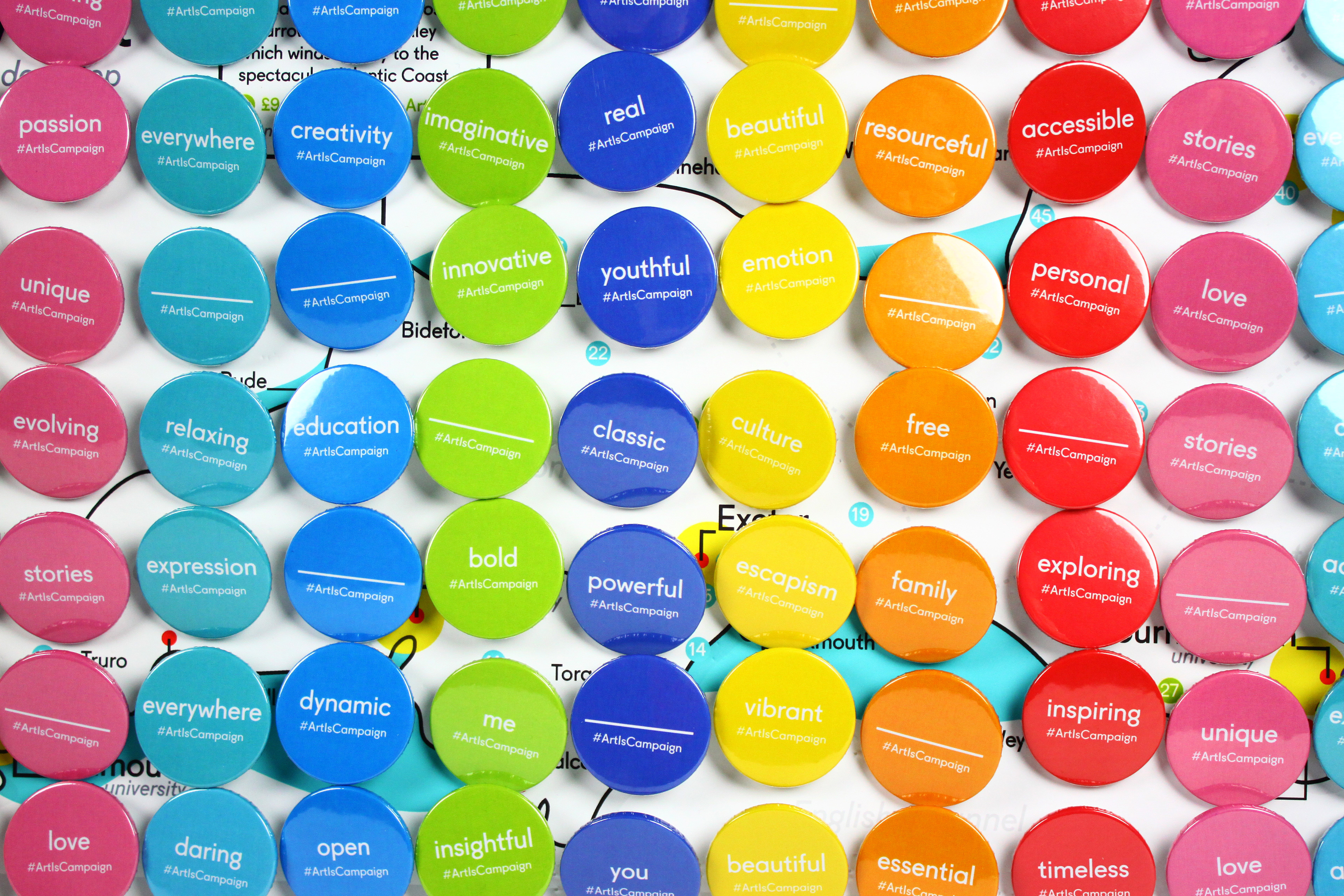
The Badge Wall
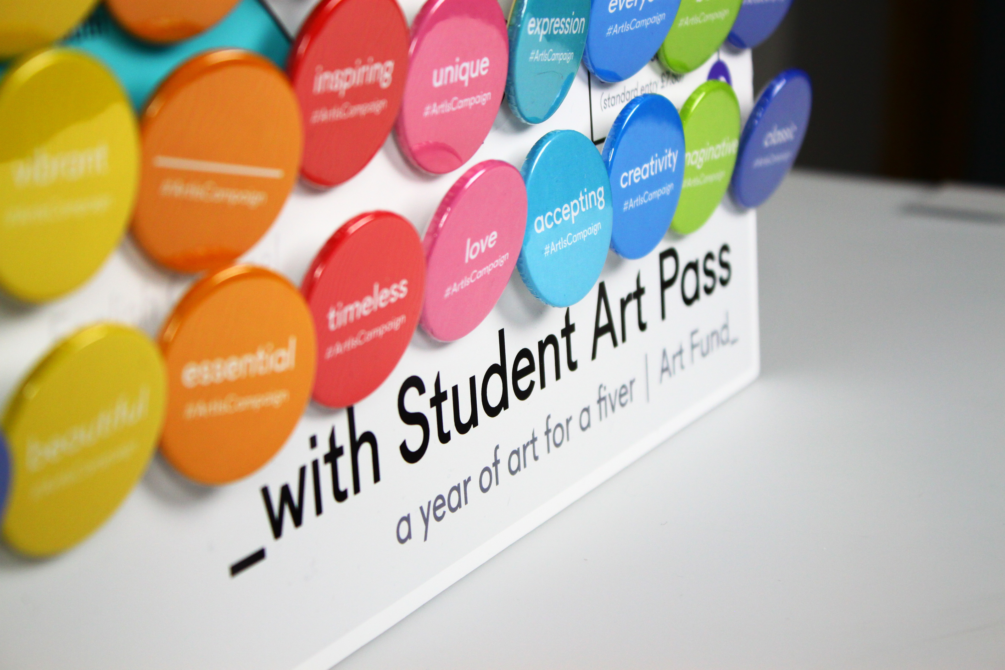
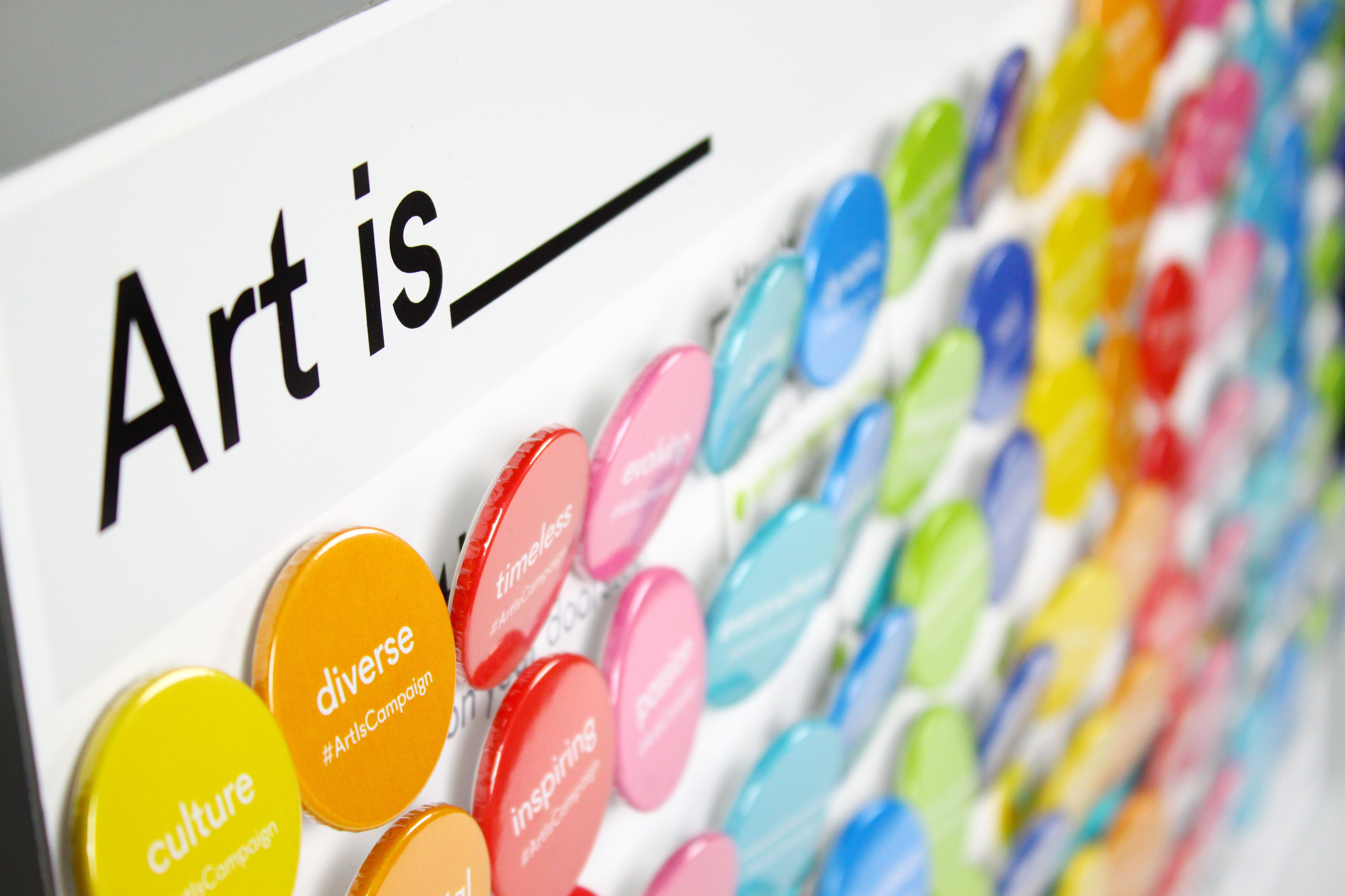
The preliminary component of the campaign is a wall constructed out of badges, strategically located in heavily trafficked areas within major universities. I had to ensure that this campaign would override the already overly populated fresher’s week, to capture student’s attention.
The bold, vibrant colours encourages engagement and acts as a lightning rod, drawing people in, full of intrigue and questions. Whilst the simple act of selecting their desired response to what ‘art is’ sparks dialogue, releasing stories and inspiring hundreds to follow and register for a pass.
As participants approach, they notice the wall is covered with words which depict art. Words that are able to be fulfilled emotionally, and physically simply by buying a £5 pass.
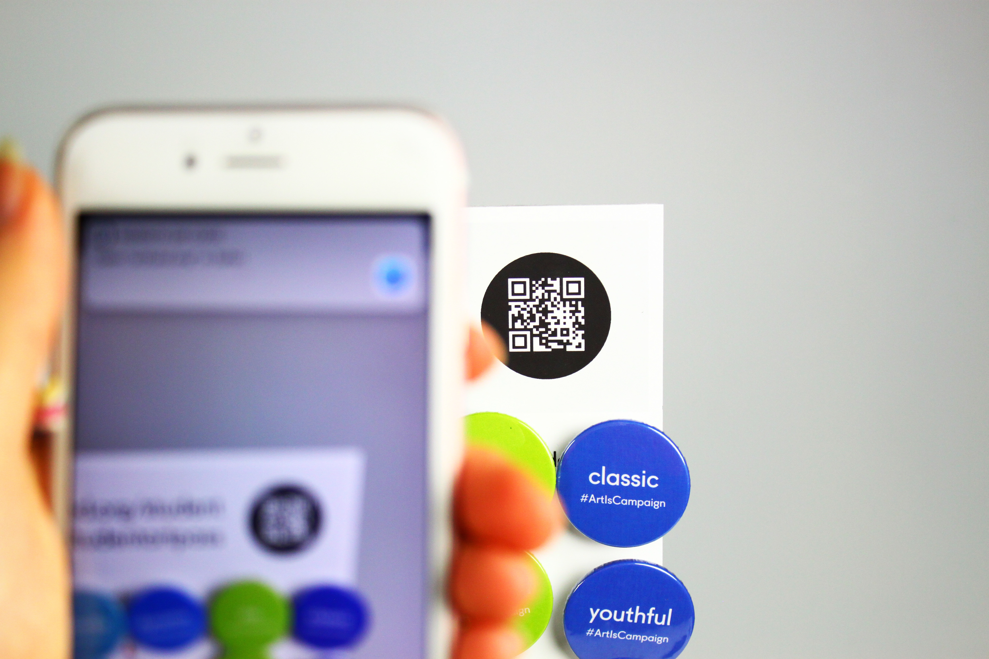
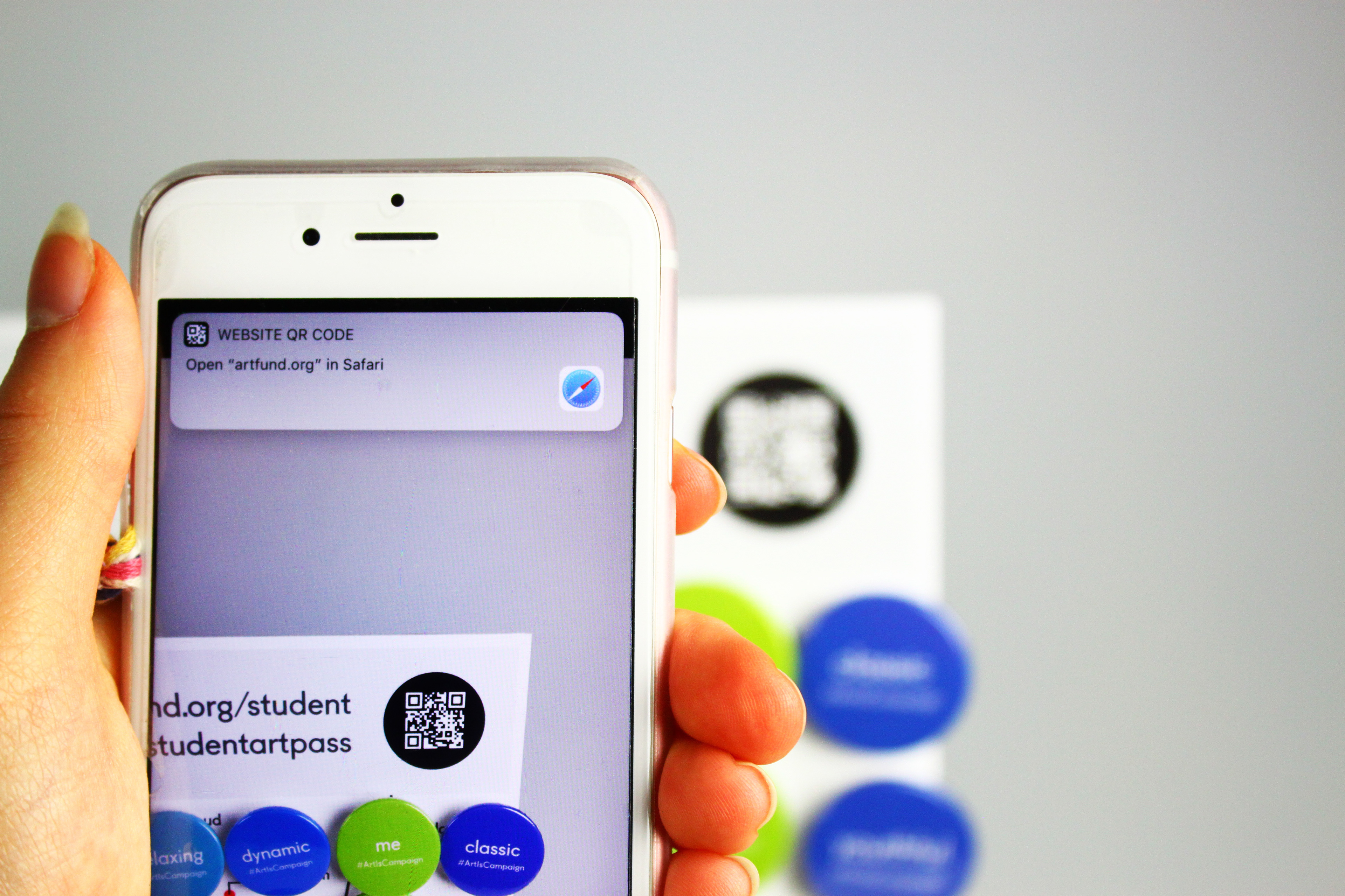
By efficiently scanning the QR code, individuals are instantly directed to the Art Fund website, where they are able to register for the Student Art Pass, removing hassle, as all can be accessed with the ease of phone scan.
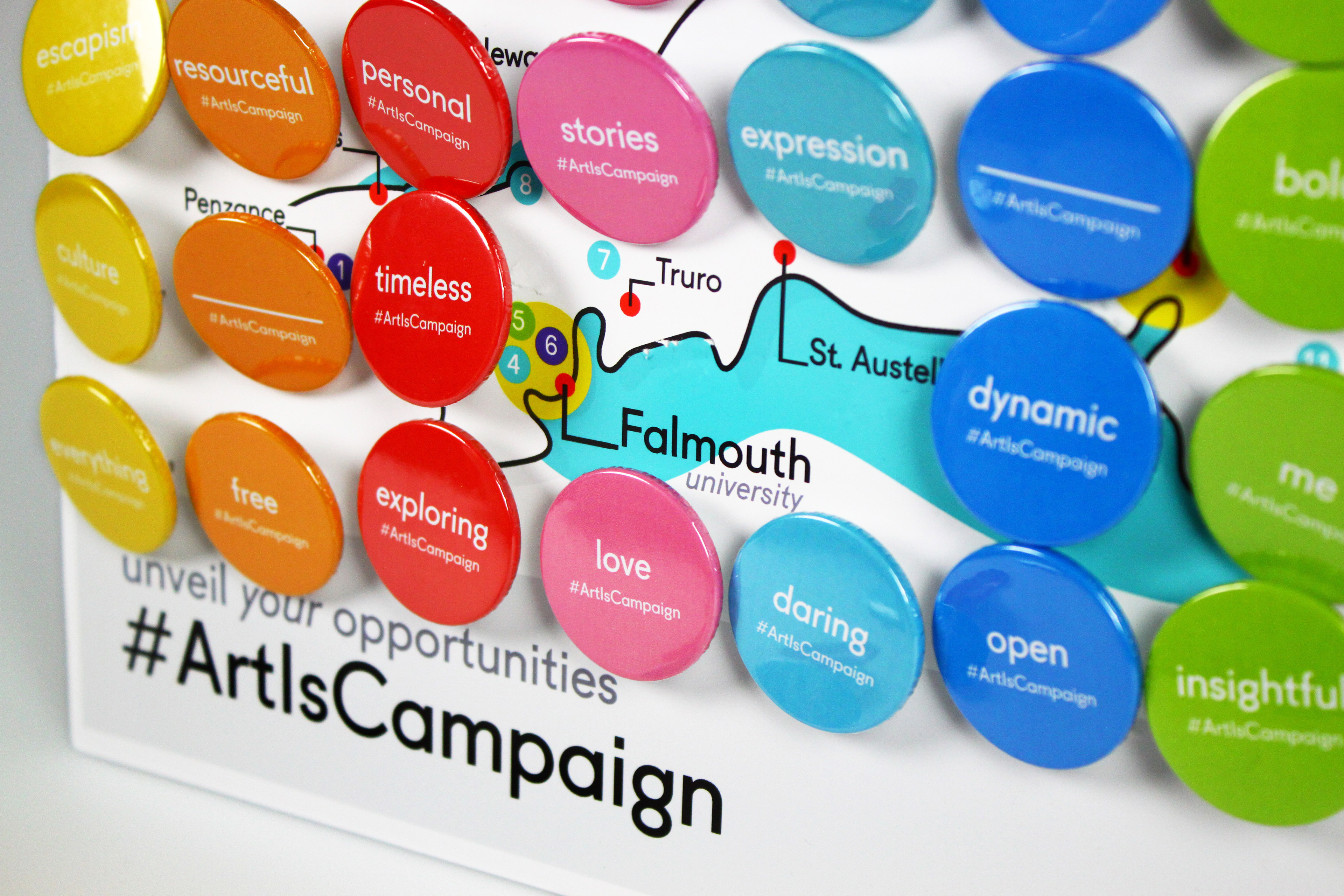

Removal of Badges
Individuals are invited to remove a badge, which best corresponds to their opinion and how they feel about ‘art’. Wearing the badge projects art into the open, making a statement and generating further discussion. The removal of badges begins the process of revealing what lies behind - the map - allowing students to ‘unveil their opportunities’.
The use of the hashtag on the badges encourages students to post images online, commenting on their experience and additionally increasing the audience reach.
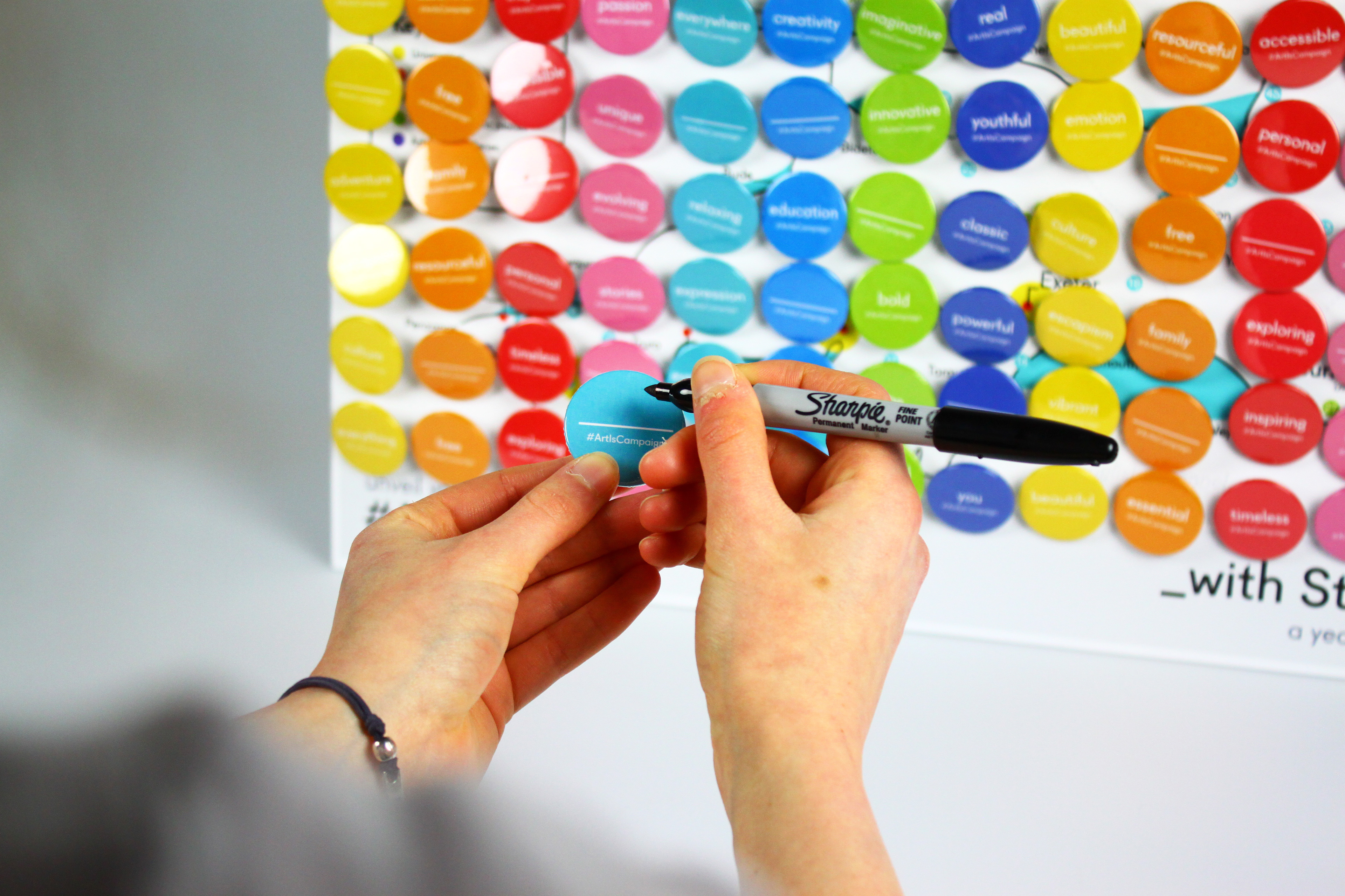

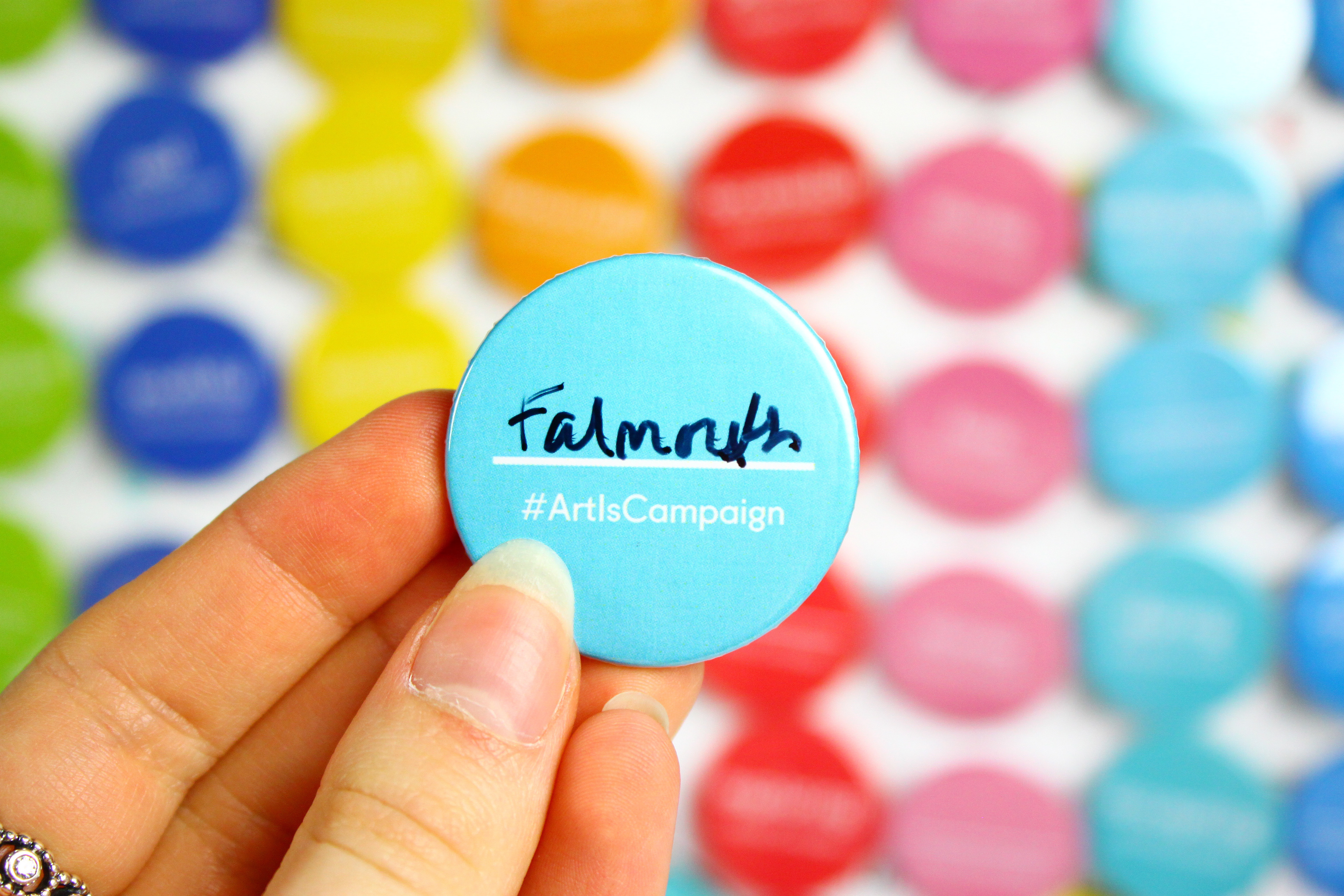
Some badges appear blank where individuals are invited to complete the badge with what they believe ‘art is’, triggering thought and a touch of personality, capturing the essence of art.
The Map
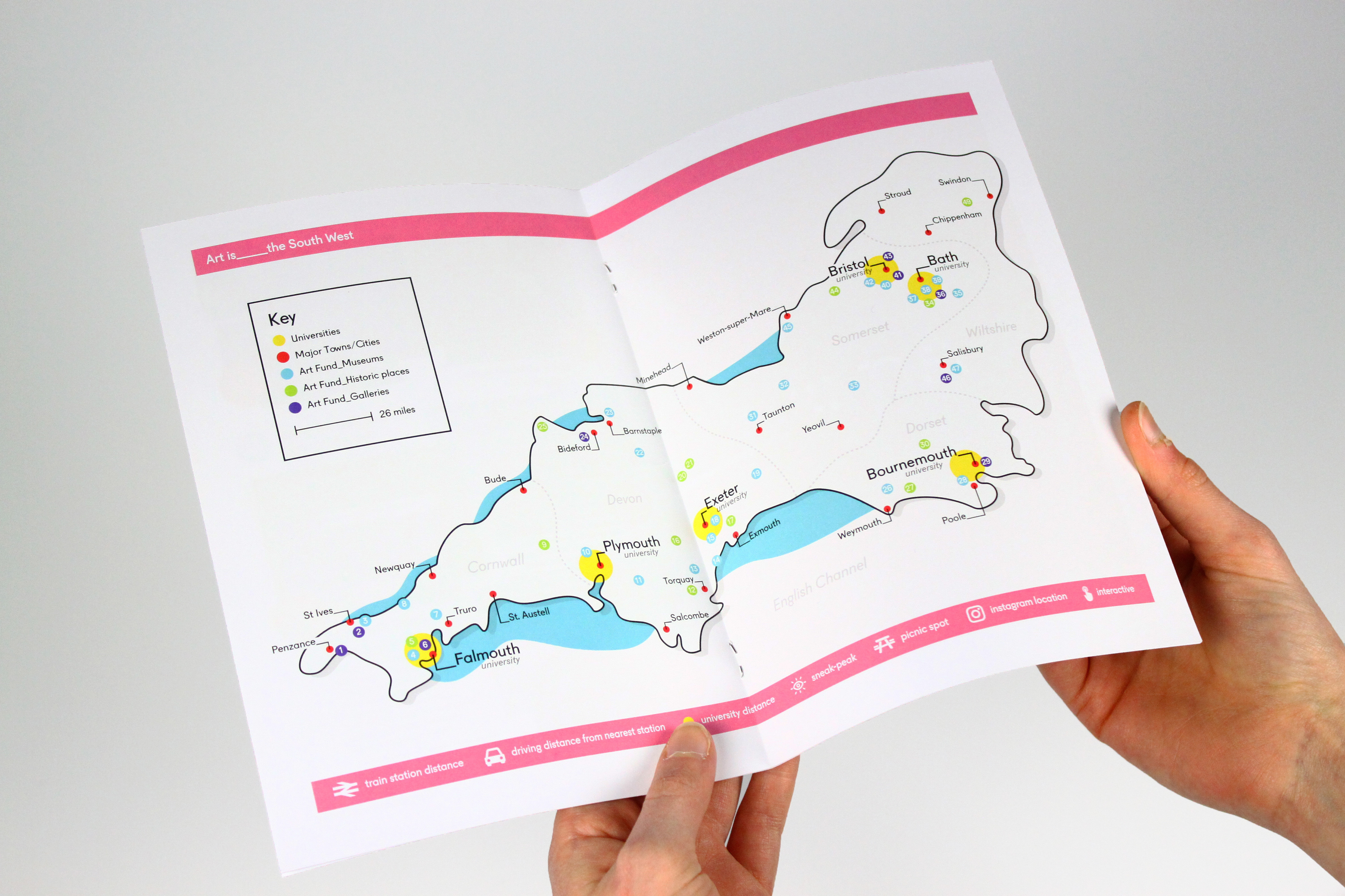
Once the badges have been removed, the wider picture is revealed. The map corresponds to the regional location setting. It gives viewing individuals the chance to explore and experience nearby opportunities available and covered by the Student Art Pass, depicted by coloured pinpoints.
By picturing specific regions rather than the entire country, it targets the needs of students. Their main concern is accessibility, particularly the cost of travel. By highlighting nearby locations, the pass is more likely to appeal, due to its cost-effective nature.
Each region holds its own, bespoke design, giving the impression of a community which Universities can celebrate. The map itself is predominantly monochrome; it is the ‘art’ that provides colour, bringing it to life.
The Booklet
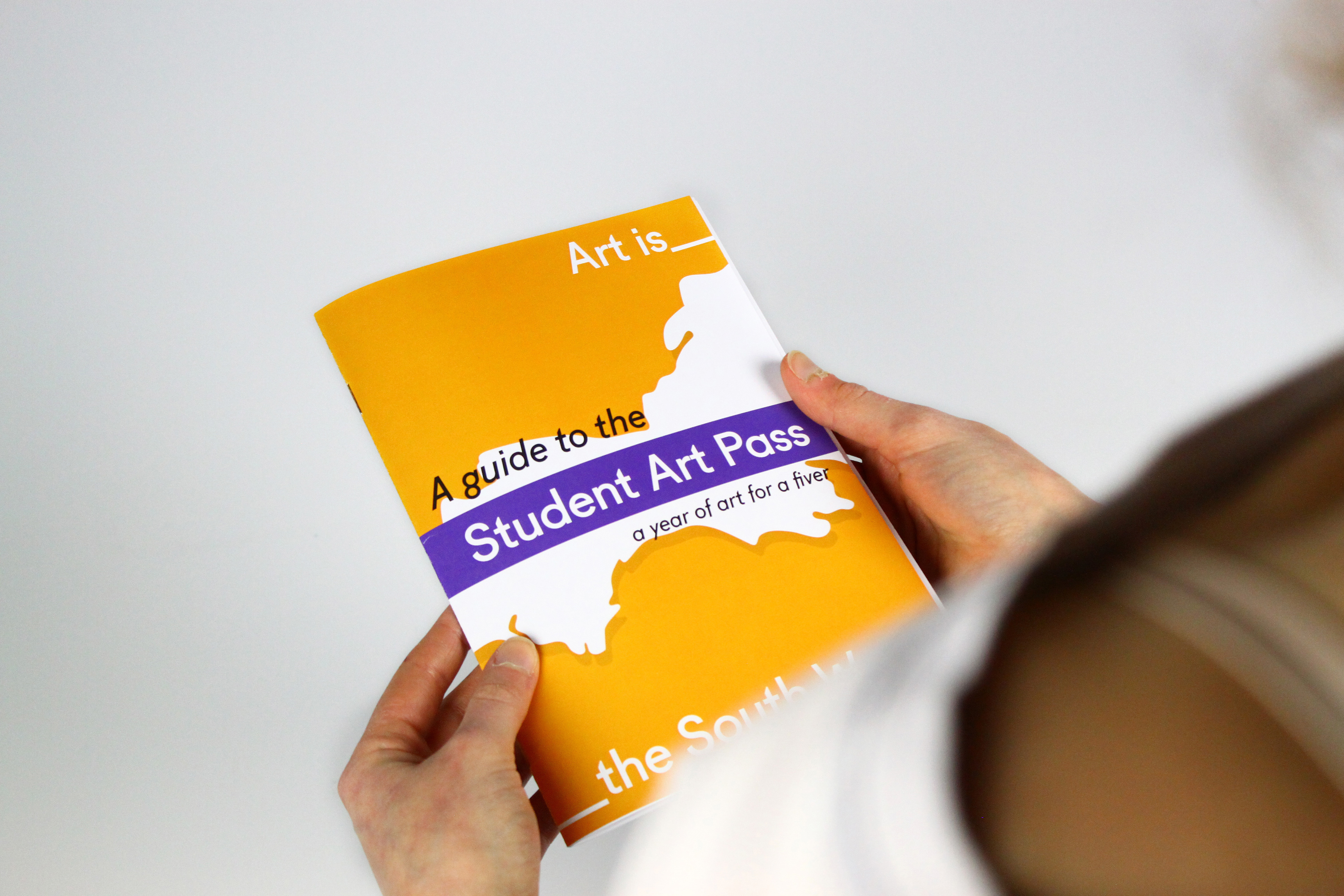
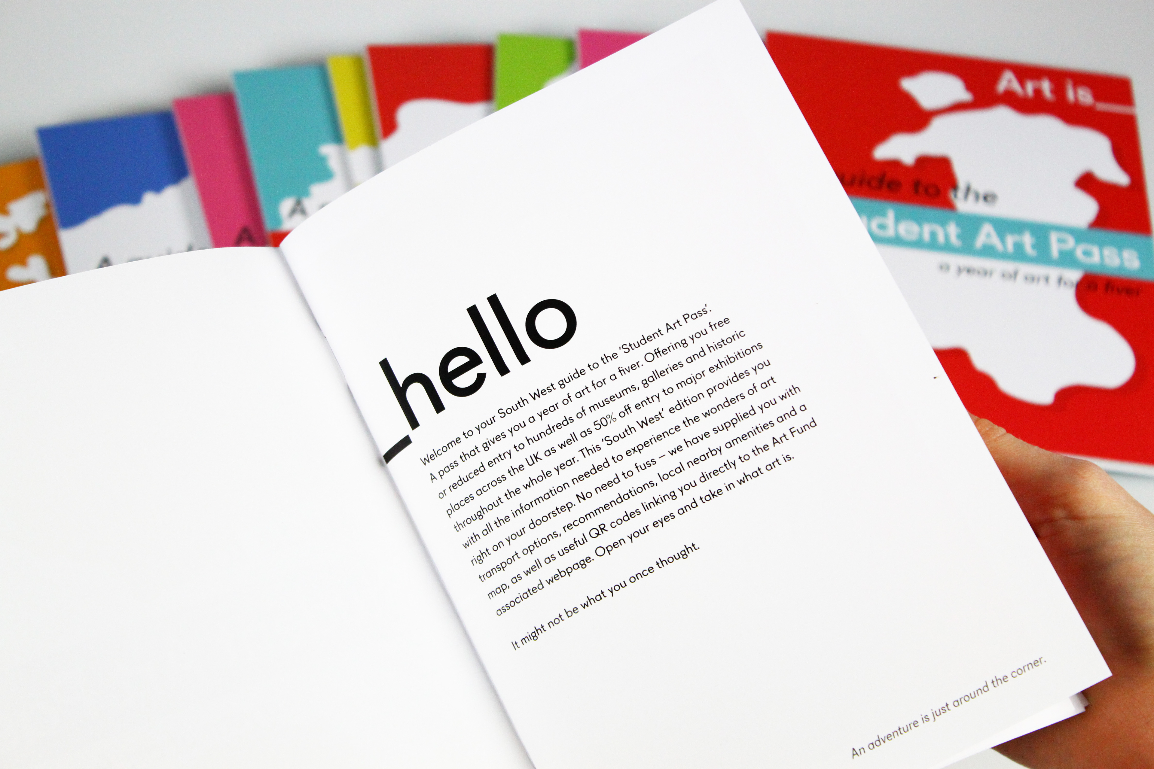
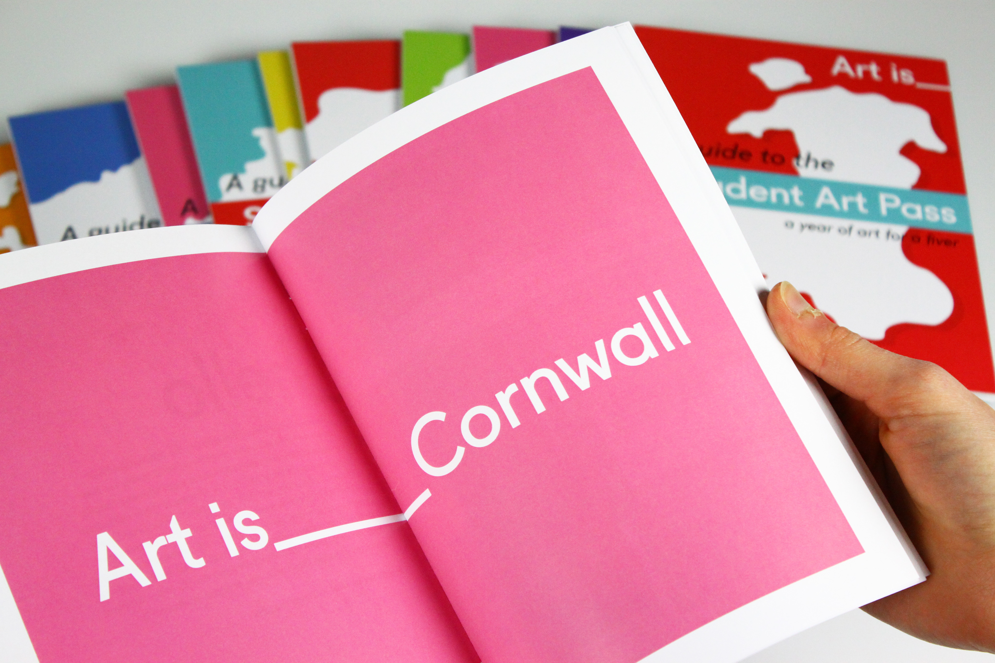
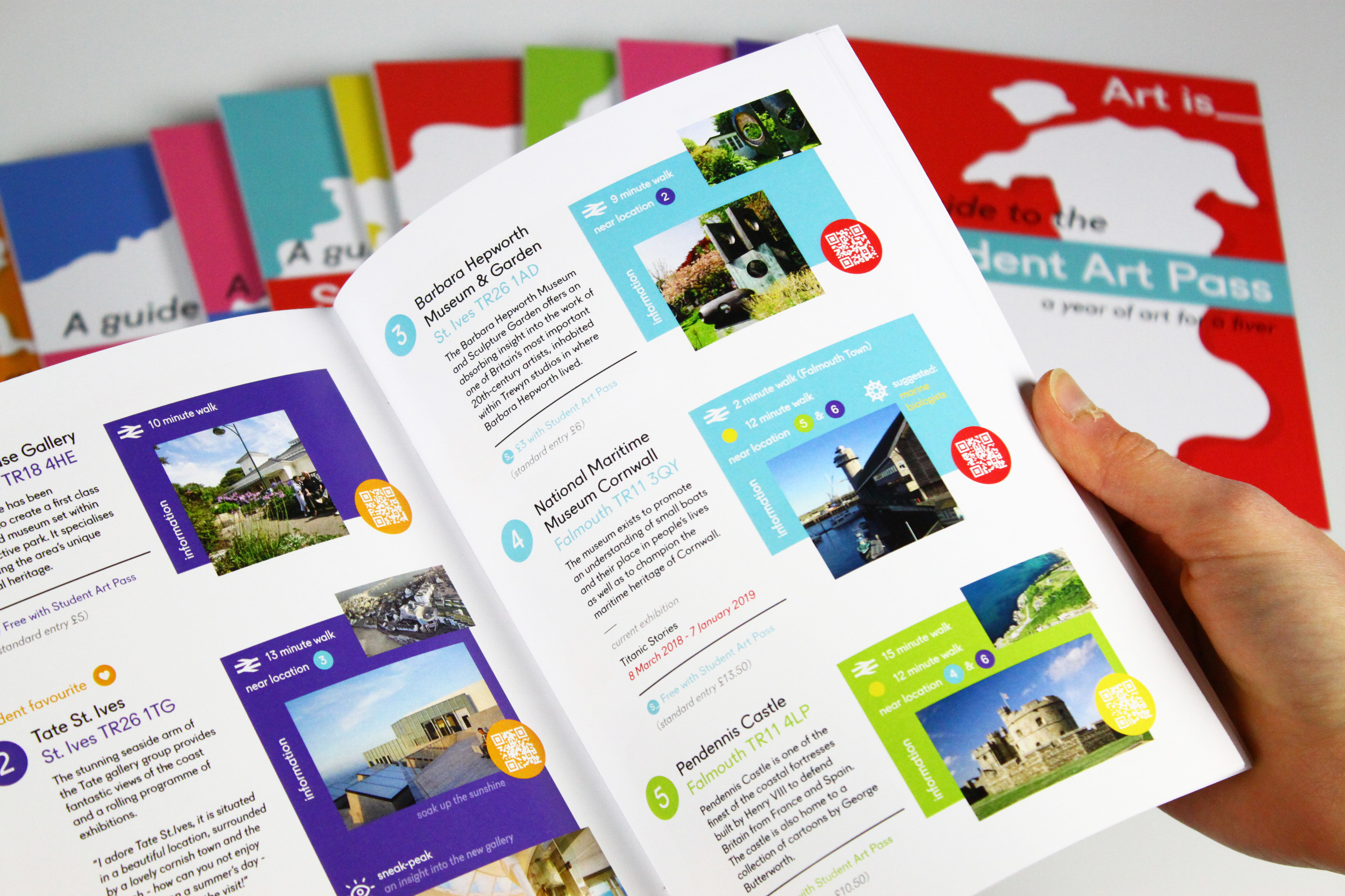
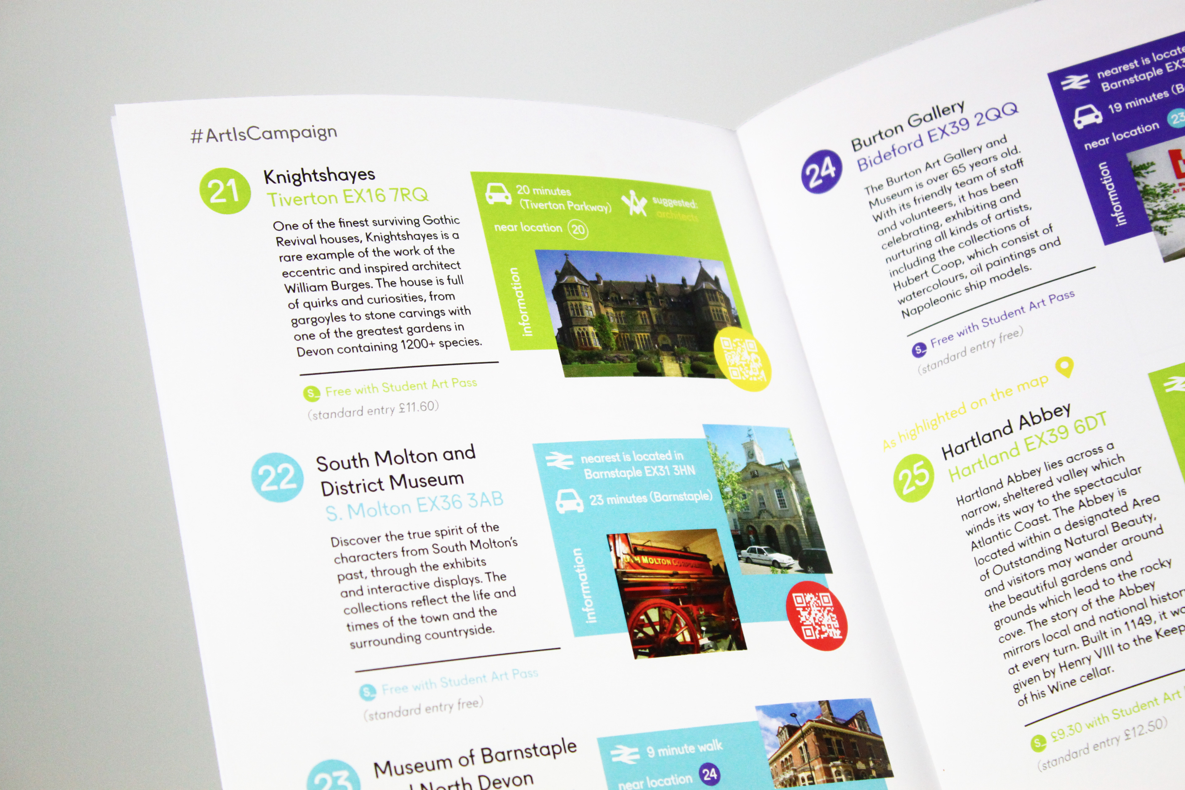
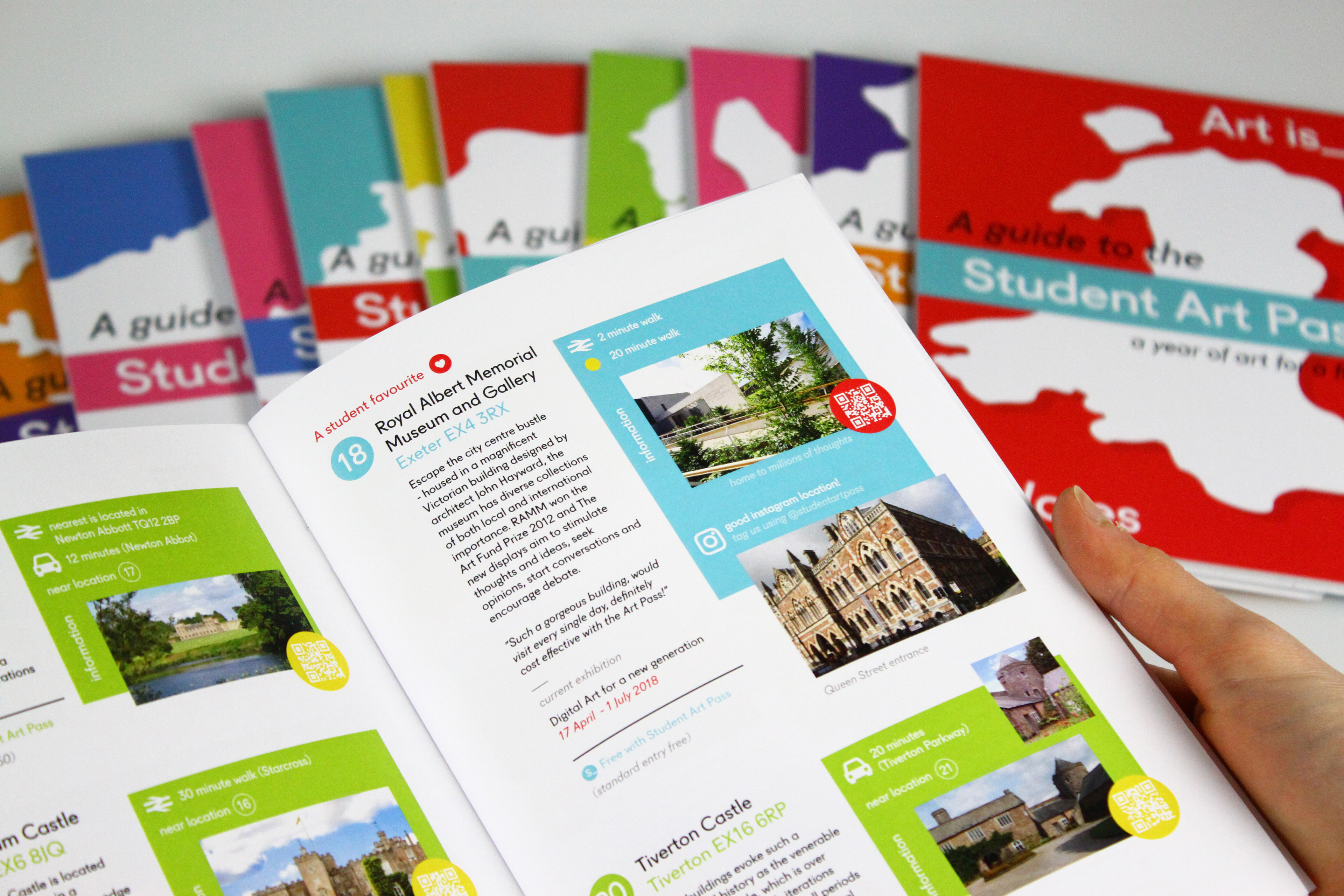
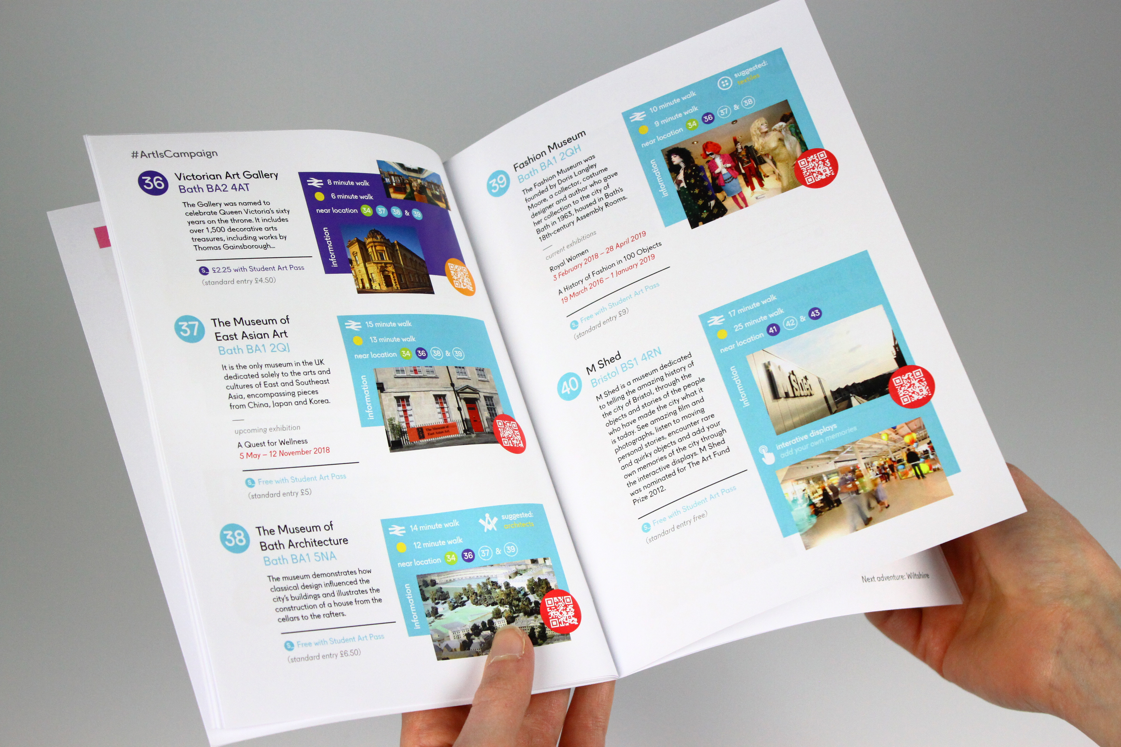
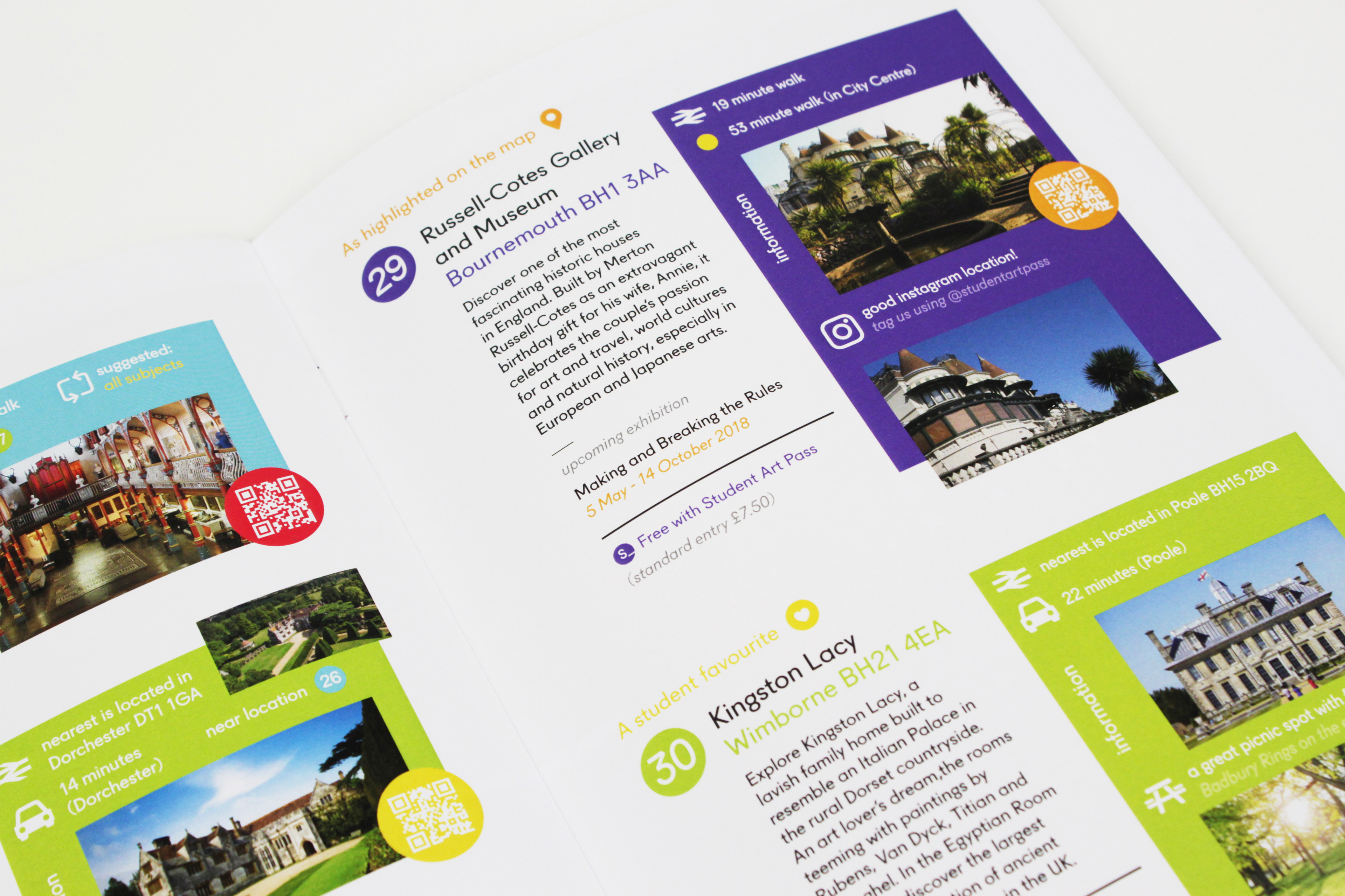
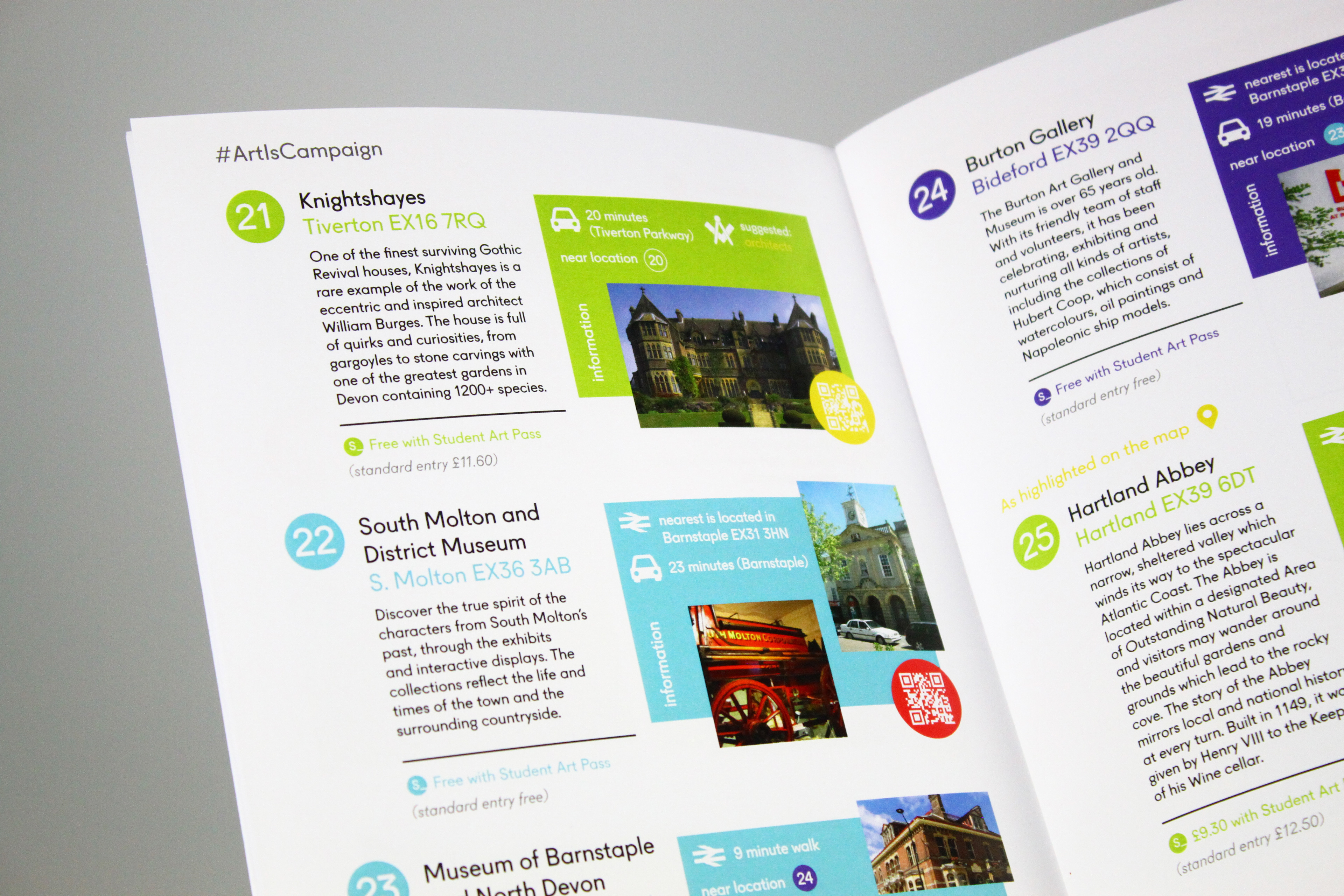
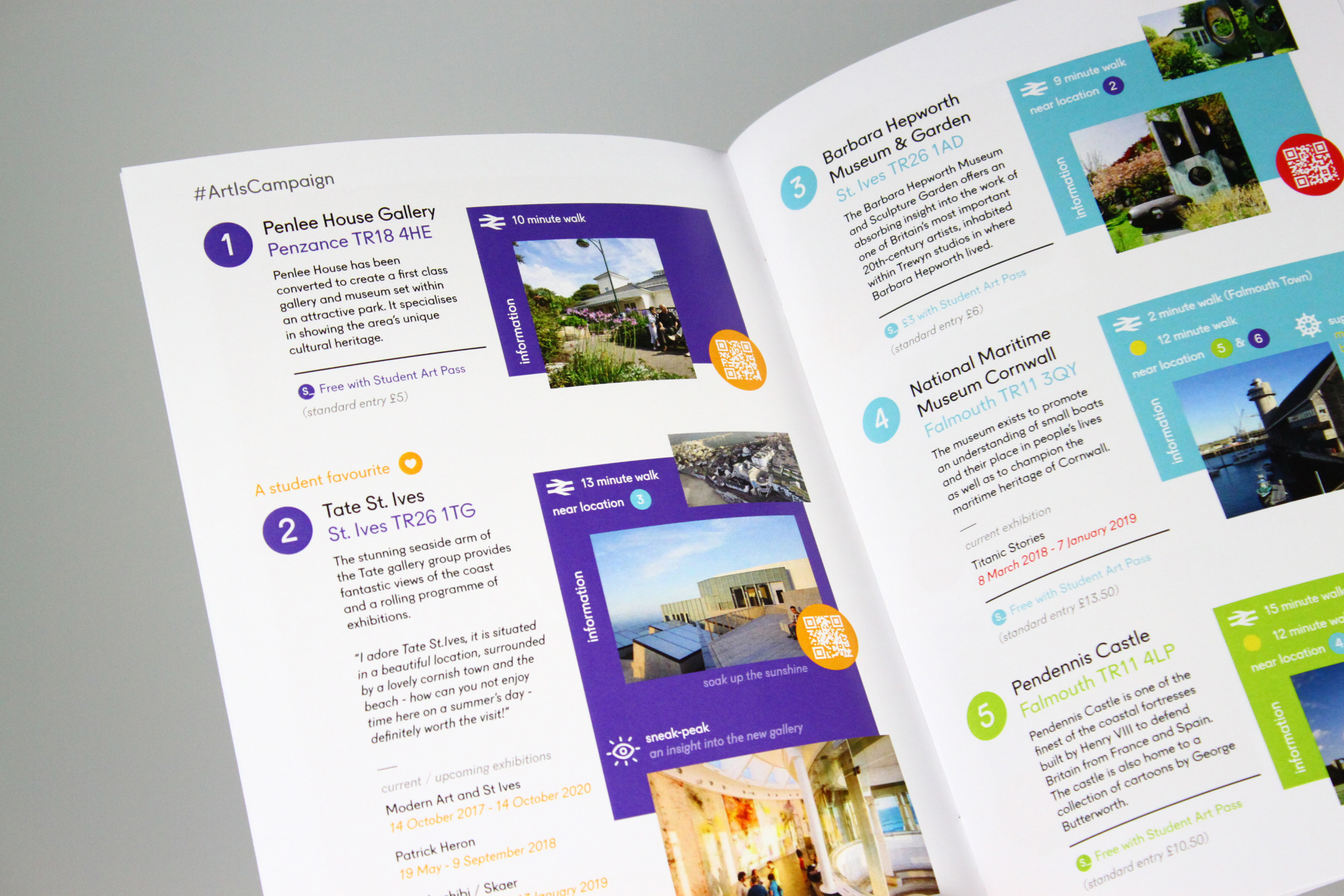
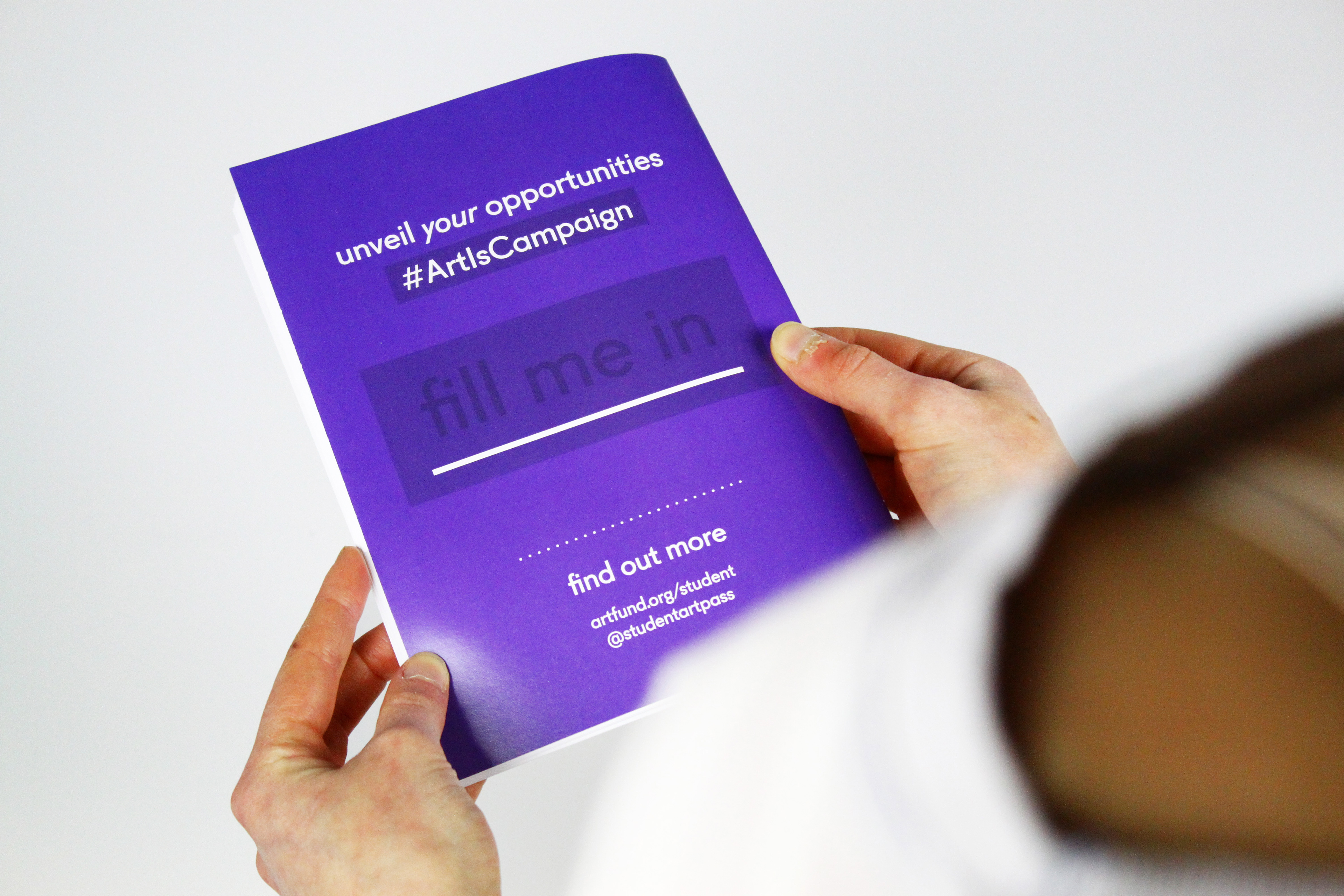
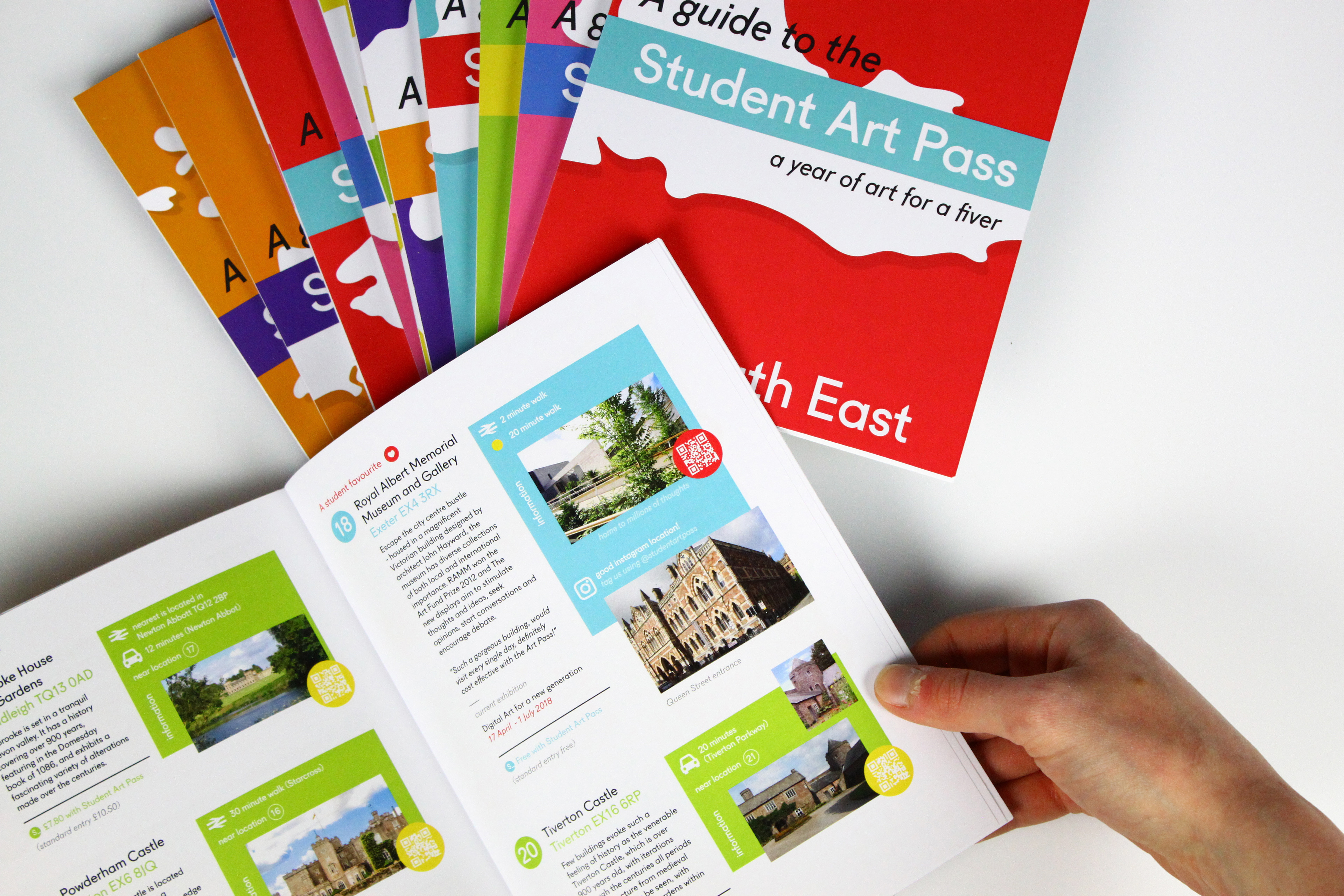
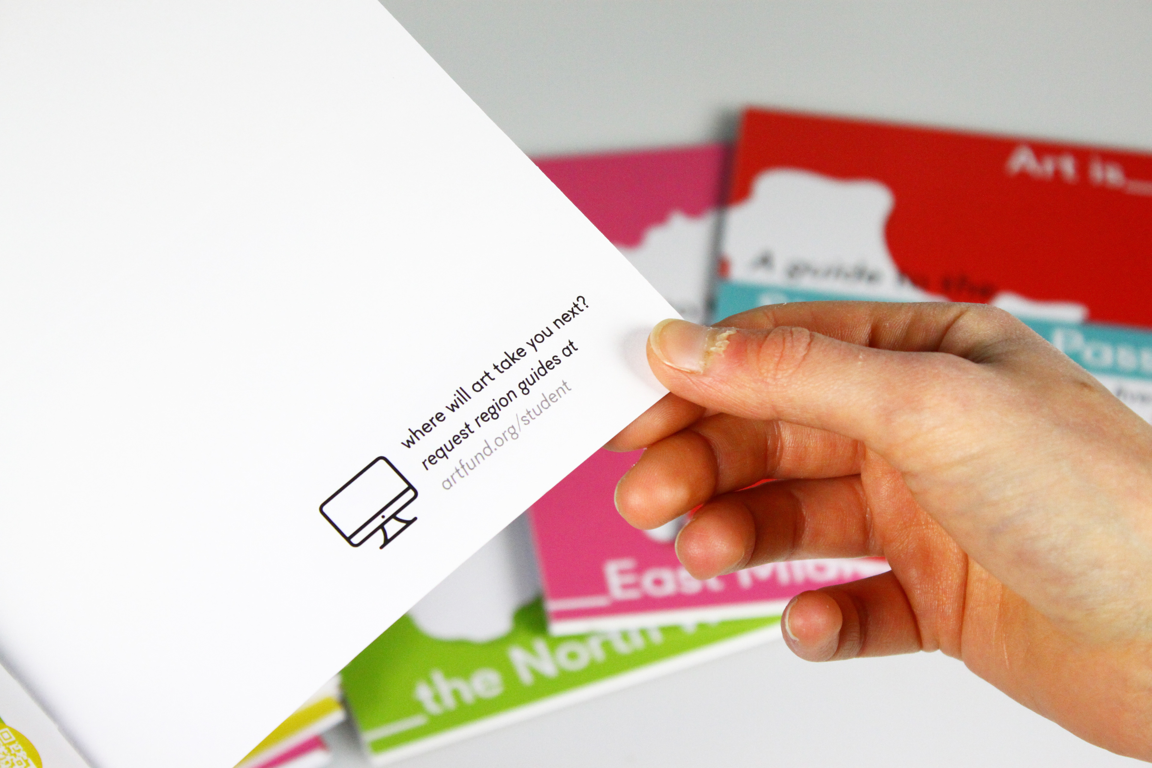
A selection of booklets are provided which reference the readers location and highlights all pinpointed destinations of their specific locations’ map, making it a device they can refer back to. Each region holds its own design and colour palette, combined with a geographical silhouette, providing instant recognition. The ability to ‘request alternative guides’ allows for further afield exploration.
The focus was to target students and their usual reading habits and maintain the life and vibrancy of the campaign. Symbols were therefore used as a stylistic choice to appeal to a younger audience, illustrating instant information without the need for large inputs of text. Extra content such as money saved per visit, accessibility via train stations, walking etc. and any additional nearby locations is provided, making it a hive of information without the hassle of additional researching.
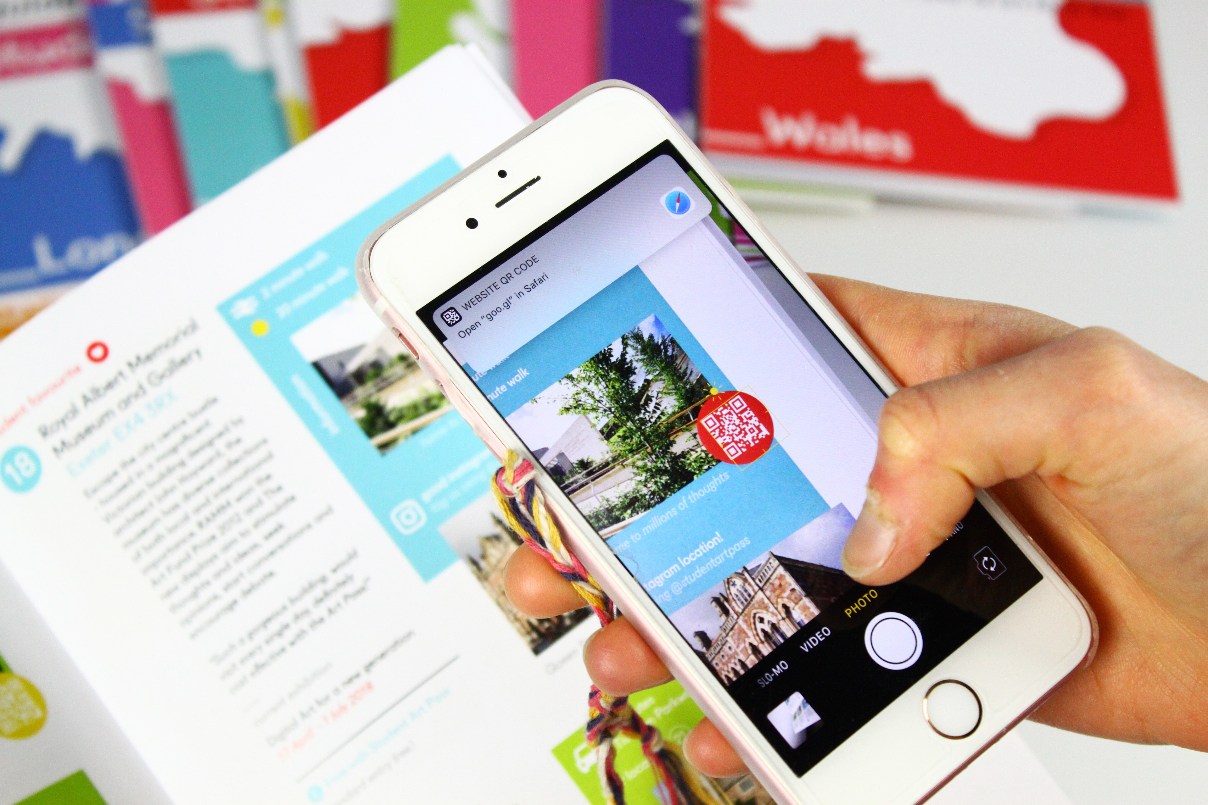
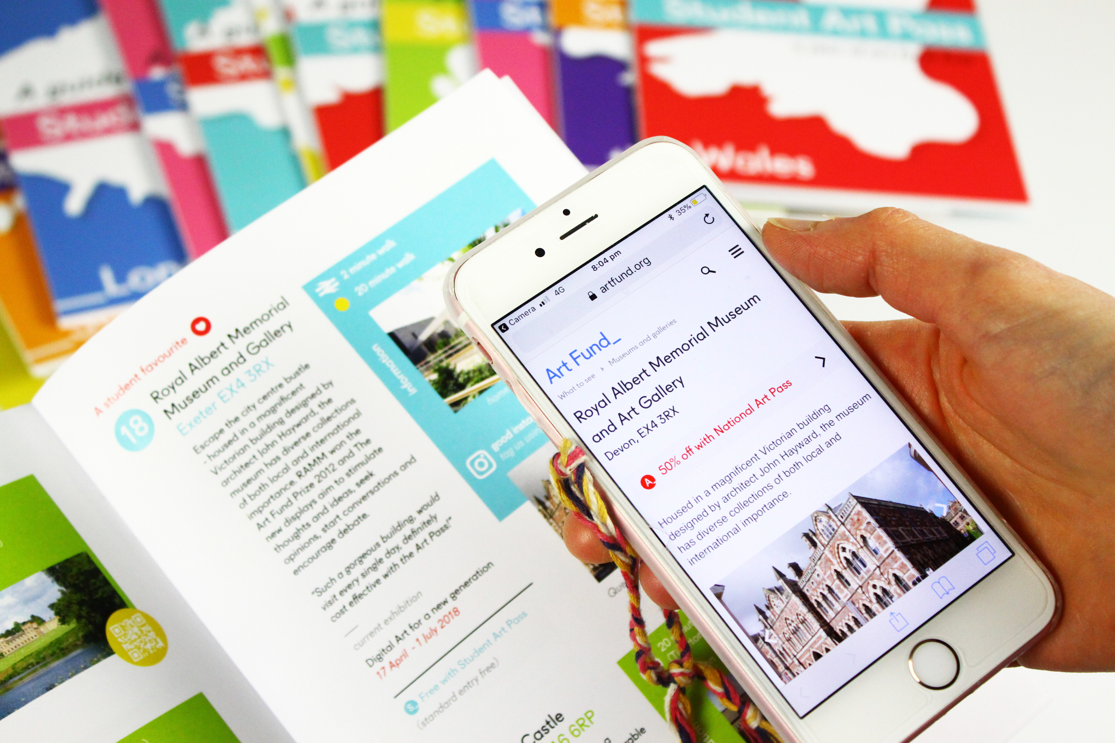
Active QR codes are peppered throughout the booklet, giving the individual direct connectivity to each location’s corresponding webpage on the Art Fund website.
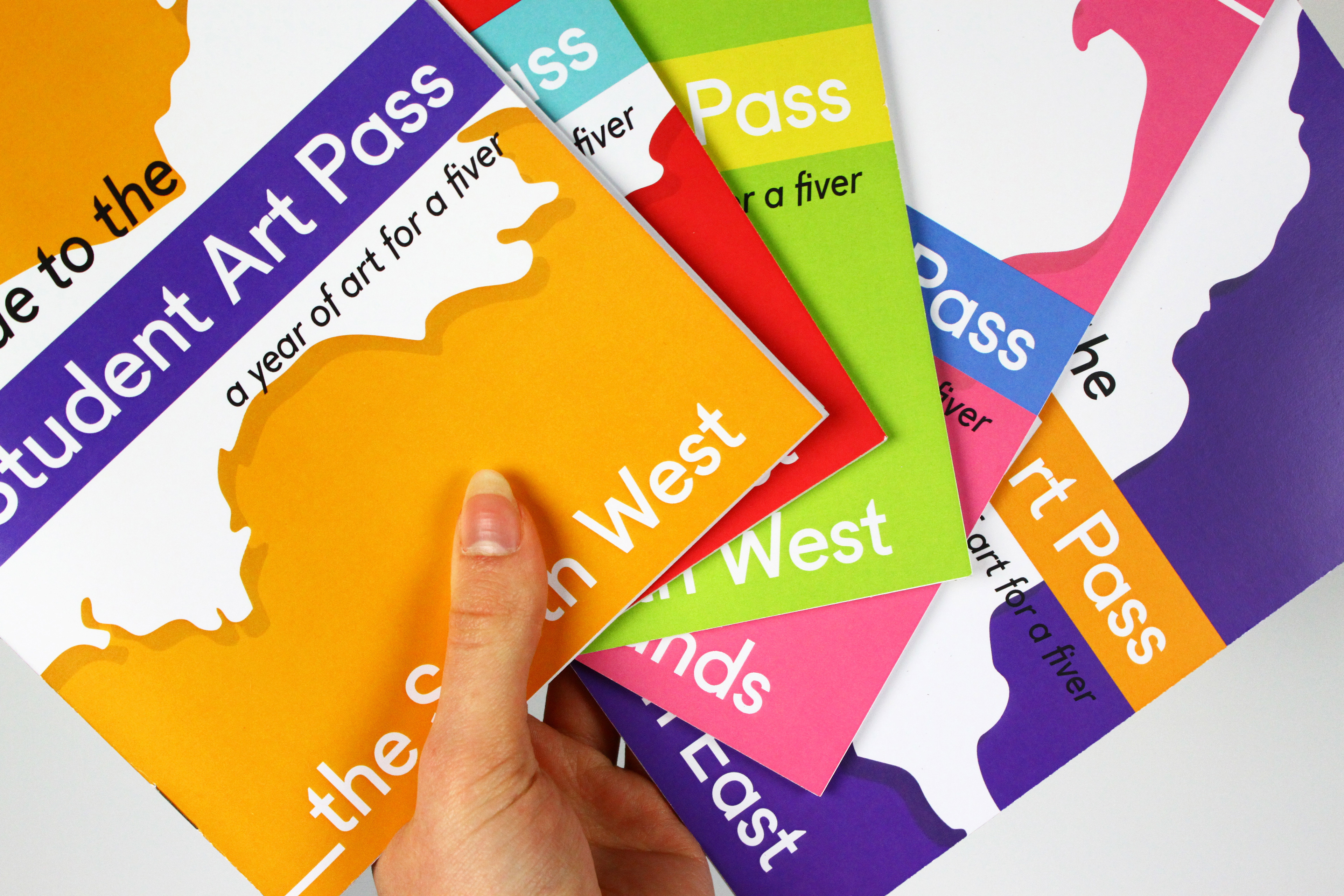
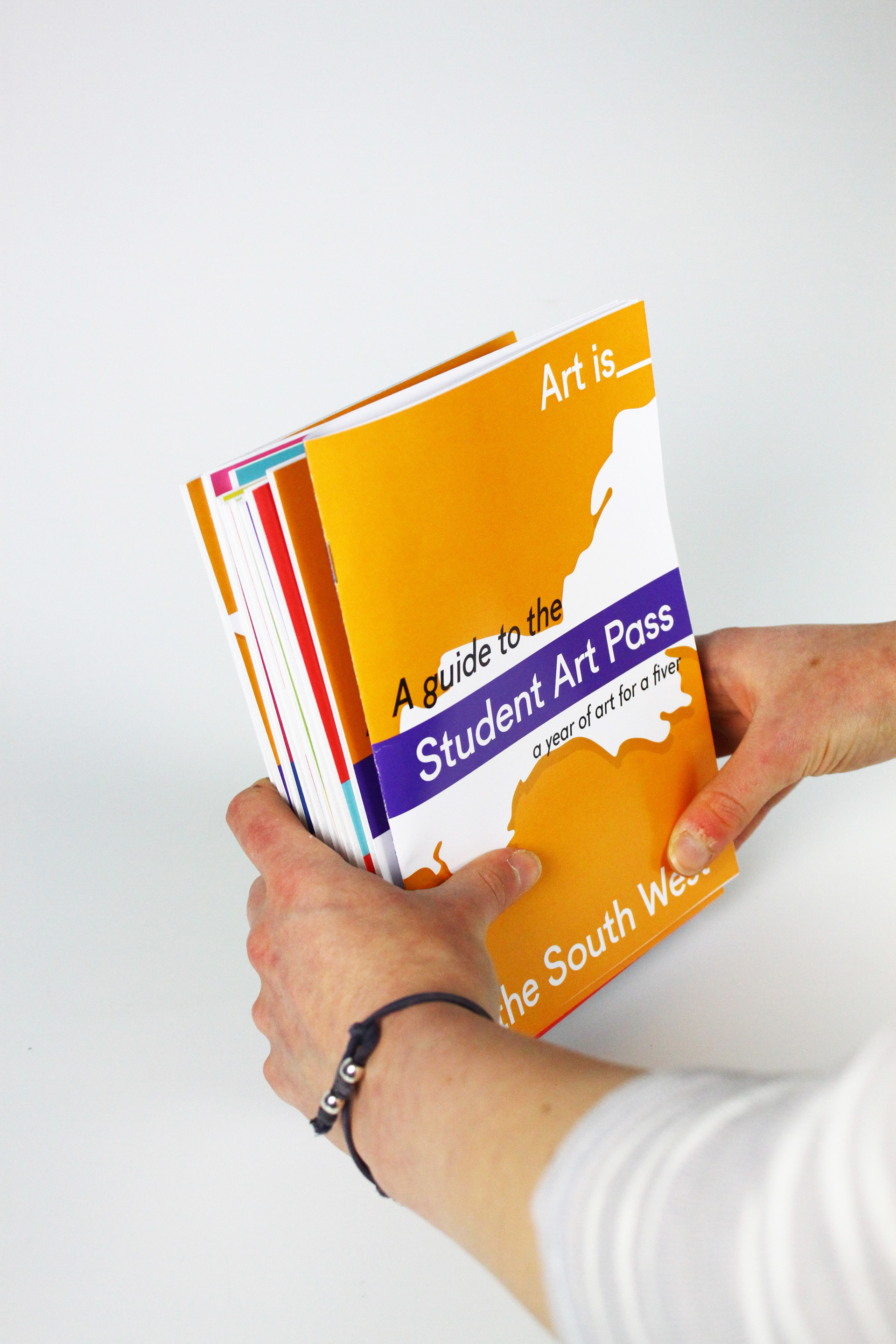
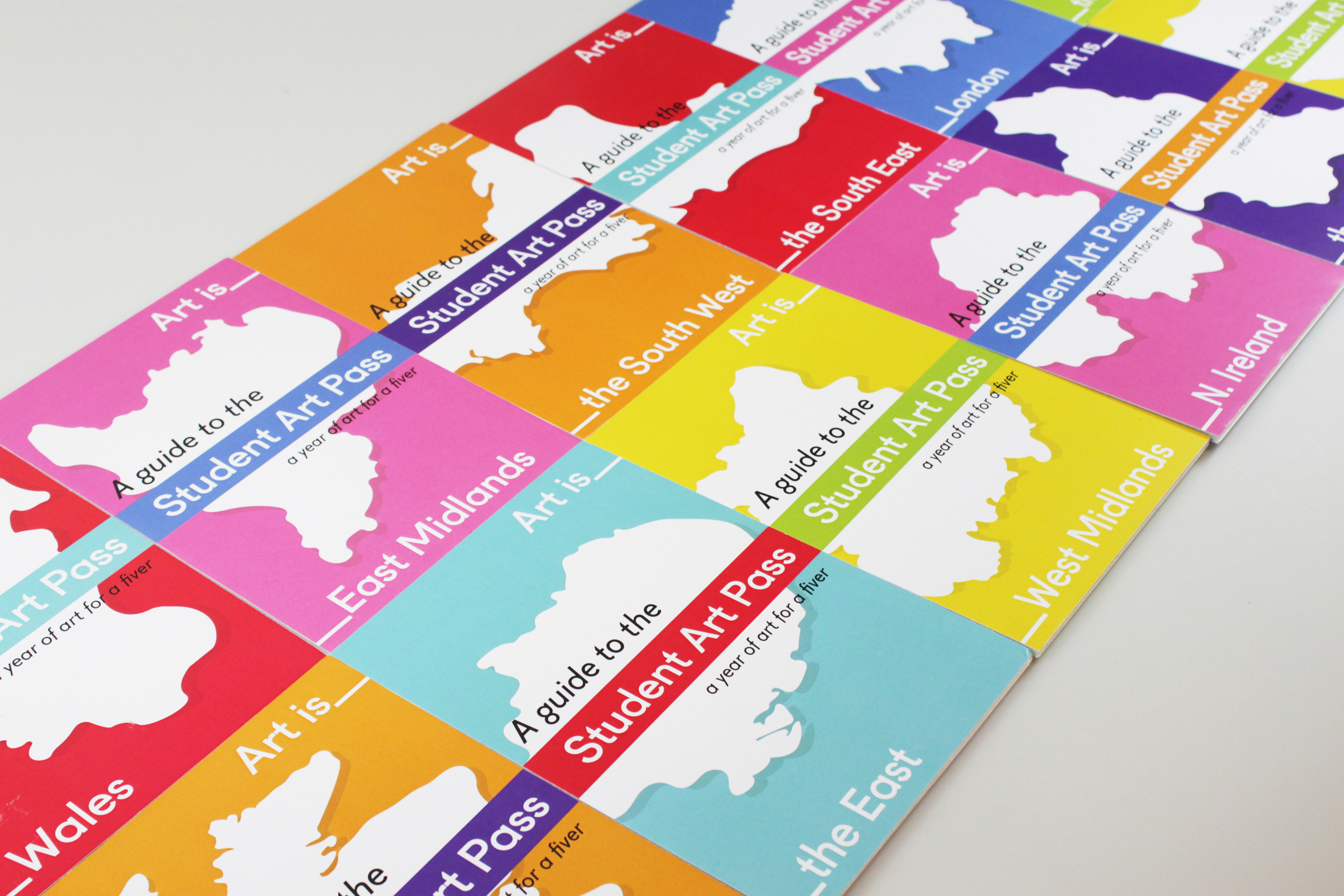
When all guides are collated and placed consecutively, the banner forms a long underscore using their defiant brand identity, attaching all regions together, suggesting that Art is_____everywhere and consequently, everyone.
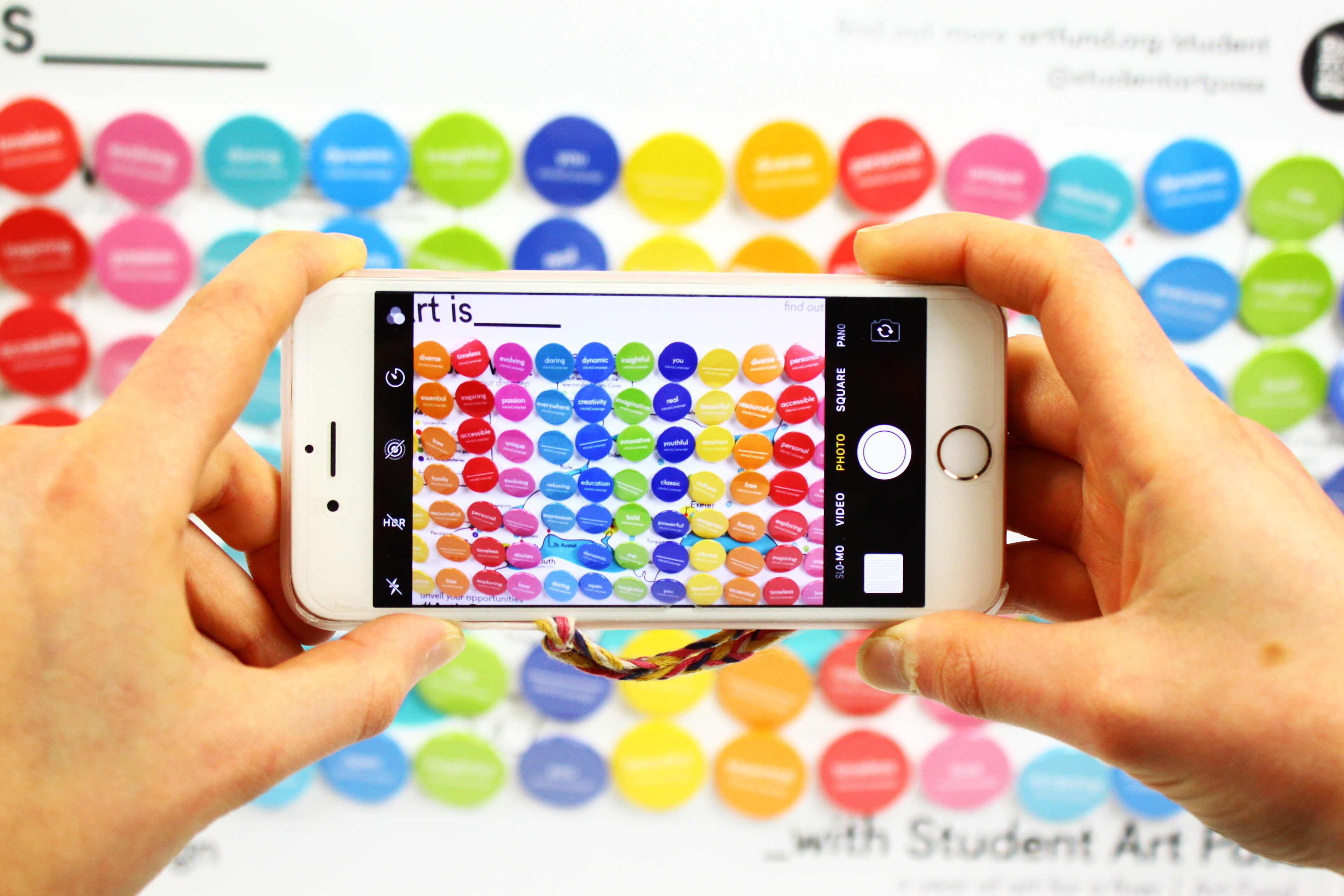
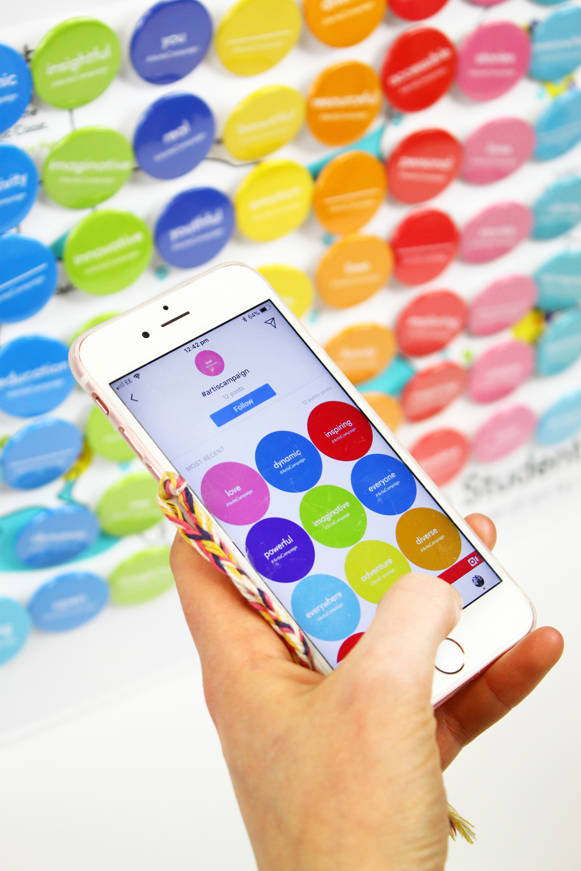
Students are encouraged to photograph and share their badges, and general campaign experiences, online with the hashtag #ArtIsCampaign, gaining additional publicity and generating further attention towards the pass.
Linked by the hashtag, the posts connect to create an online ‘digital badge wall’, representing that of physical form and creating a large online art community.
Social Media Campaign
Intended to stop students in their ‘scrolling’ tracks, I designed a fast-paced, kinetic typographic advertisement which sums up the campaign within a short 15 seconds. Its repetitive, quick nature grabs attention and combined with the audio, celebrates art, suggesting it is alive and breaks the usual stereotype.
These advertisements would be used as sponsored posts on social media. There would be a varied selection, each providing different responses and capturing multiple essences of art, widening the viewers horizons.

