Museum of Witchcraft & Magic - A glimpse of a world beyond
Falmouth University, 2018
Brief
In a crowded and competitive landscape, smaller museums are being overlooked, and their unique collections are slowly disappearing from view. Create a new brand world for a chosen museum or gallery, better defining their brand position, voice and transforming their ability to connect with an audience.
Background
Witchcraft is a subject matter that is unknown to most, an area which few people truly understand. It is intriguing, mystical and mysterious. However, it became apparent that there is a clear misrepresentation and misconception surrounding the practise of witchcraft as it is portrayed stereotypically as only revolving around black magic, curses and having negative impacts on humanity. A change of opinions and a reversal of views is required to reach a wider audience and show this misunderstood practise in a more positive and honest light, defeating the stereotypes.
Outcome
The concept for the branding is situated around promoting the Museum as an entrance into another realm, where individuals can experience a 'glimpse of a world beyond', embarking on their own journey, with the focus predominantly on its location, holding great importance to the Museum's foundations. With the use of a narrative tone of voice, mysterious visuals and an overall intriguing brand vision, the Museum will combat the perceived outlook of witchcraft, sparking interest and increasing its audience reach.
Upon visiting the Museum, I spoke to Hannah, a member of staff, who informed me that Cecil, the museum's founder, chose Boscastle in-particular, over 60 years ago, as he had a ‘feeling’ (something out of touch and spiritual) that here held “a magical porthole into another realm” where you are “transported to a world that seems more dream than reality”.
Branding and Identity, UX Design, Film, Animation, Print and Craft Skills

Mission Statement
Located deeply in the sheltered natural inlet of Boscastle, our museum is a mystical portal into another realm, home to a fascinating collection of items relating to witchcraft, the occult and the magic.
Free your imagination, immerse yourself in the wonders of this captivating world and embark on an enchanting experience. Explore the diversity of magical traditions and beliefs, from ancient times to the world we know today. The Museum of Witchcraft and Magic inspires you to connect with the wisdom of our ancestors, discovering the hidden dialect of the nation’s folklore and heritage. Uncover the intriguing truth and delve into the unrivalled, extraordinary insights of this misunderstood practise.
Follow the path and experience a glimpse of a world beyond…
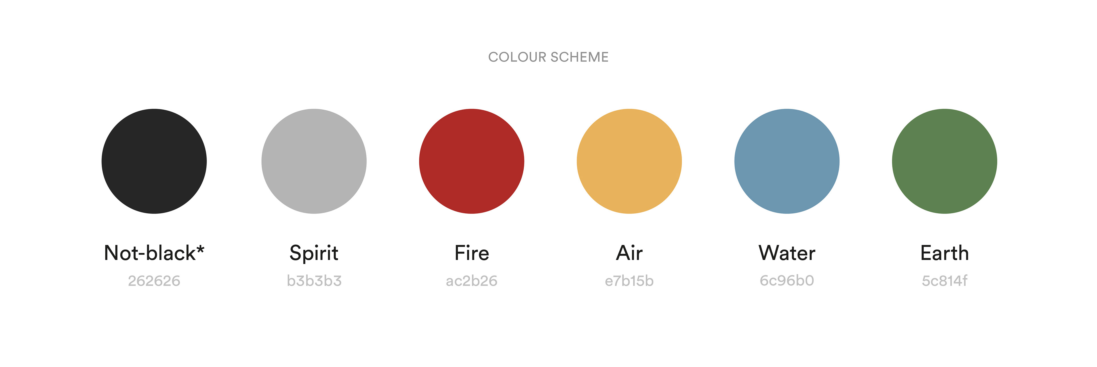
Colour Scheme
On the surface the practise of witchcraft is seen in terms of black & white magic, however it is not until individuals fully immerse themselves and gain deeper insights that they see its true colours. Consequently, the museum’s visual identity is centred around the concept of true colours being revealed when the individual discovers the museum’s ‘world’. The museum’s facade appears a slightly tinted black (#262626) colour. I did not want the involvement of true black within the branding as it has negative connotations and communicates powerfully, referring to witchcraft’s perceived sinister side. When true colours are shown they appear to reflect the five elements: Earth, Air, Water, Fire and Spirit.
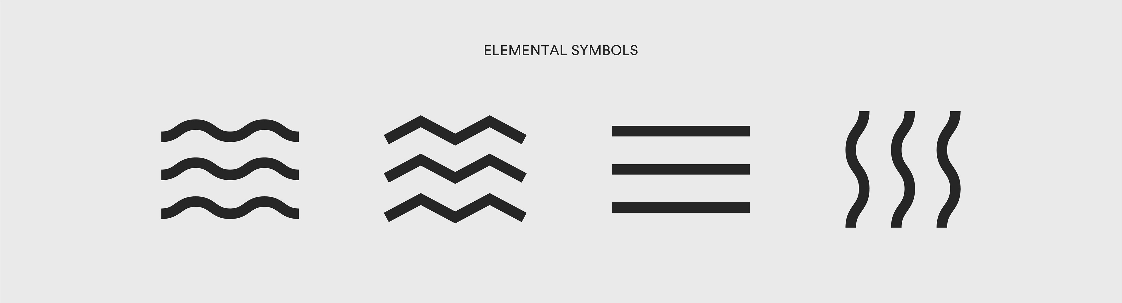
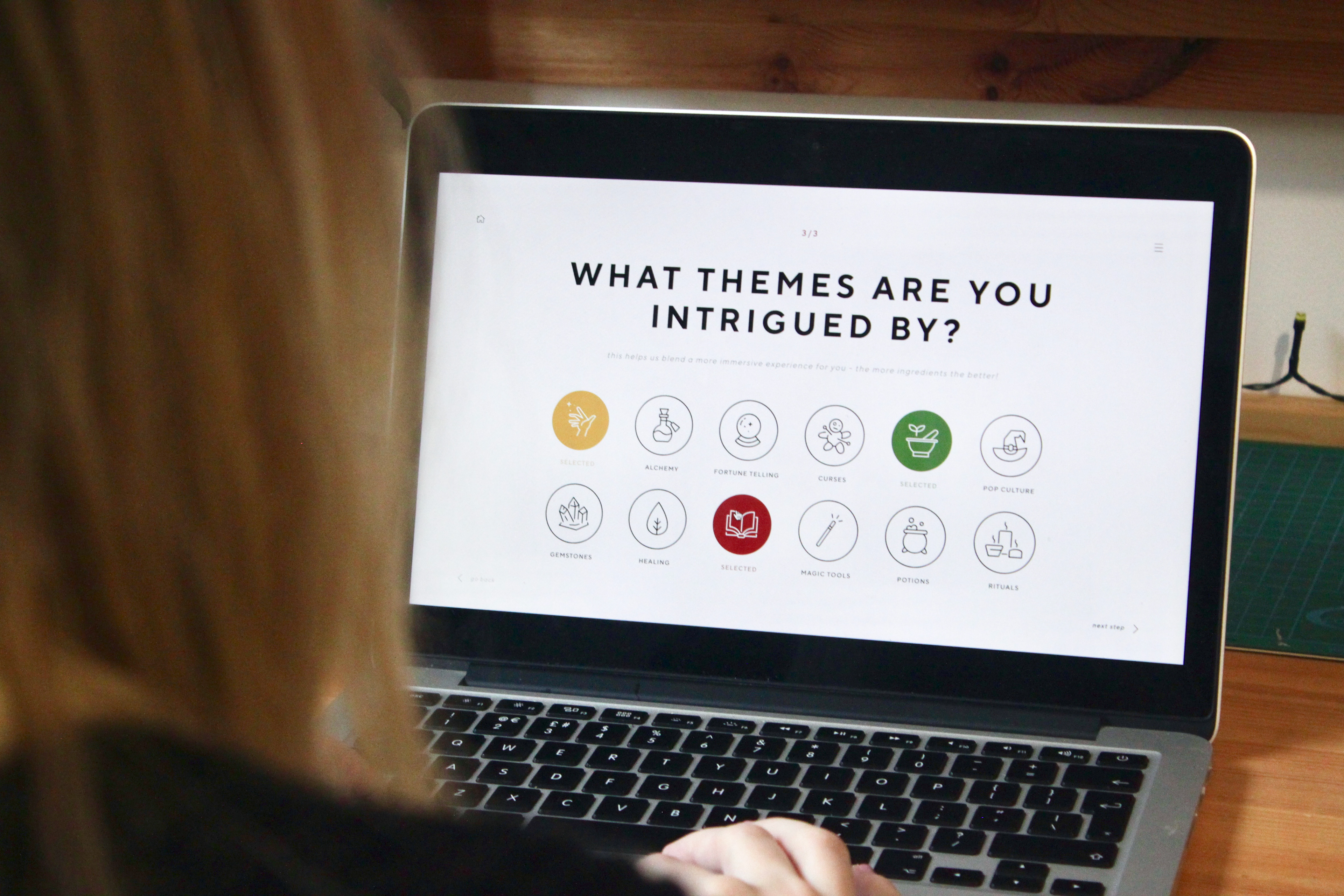
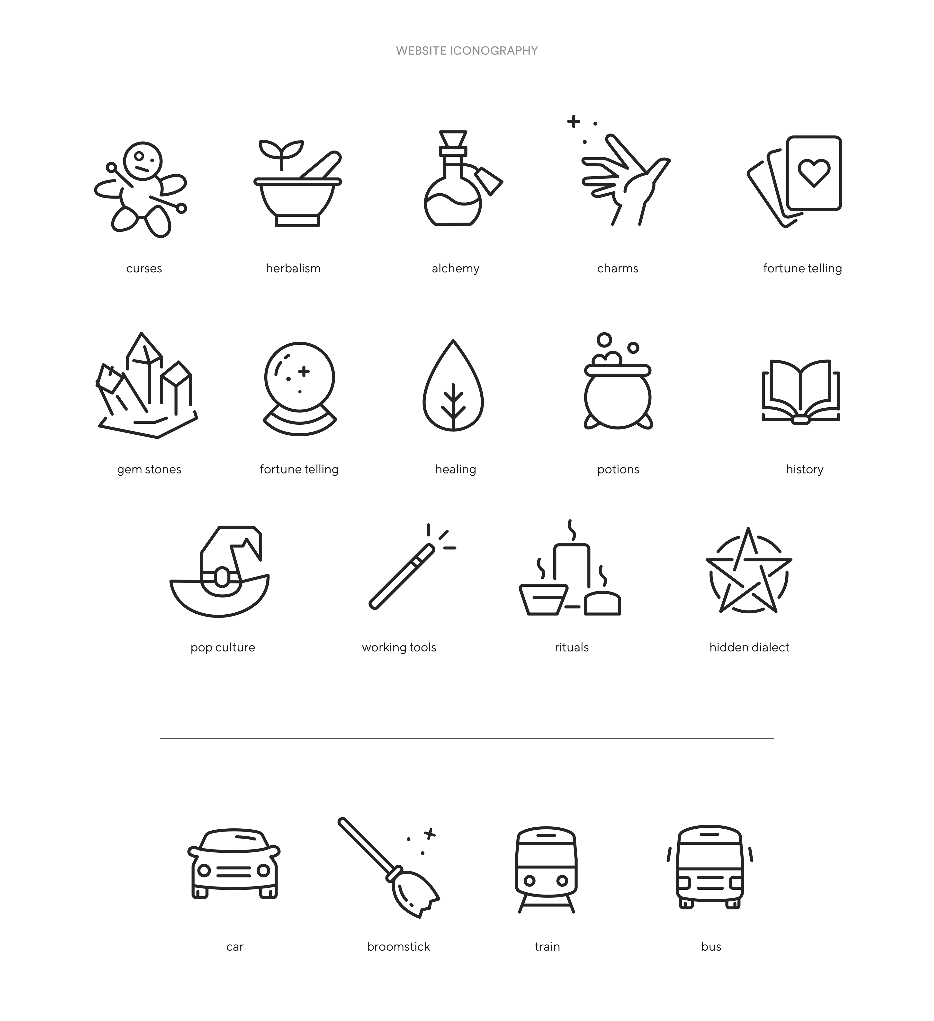
Elemental Symbols
The elemental symbols are threaded throughout the museum’s entire experience, emphasising the hidden dialect of folklore, the strong connectivity to nature and fulfilling a level of mystery. These icons are used alongside the logo and reflect Earth, Air, Water and Fire - the components of the world. The addition of the fifth element, Spirit, is emphasised by entering the museum, distinguishing our world from theirs.
Glimpse
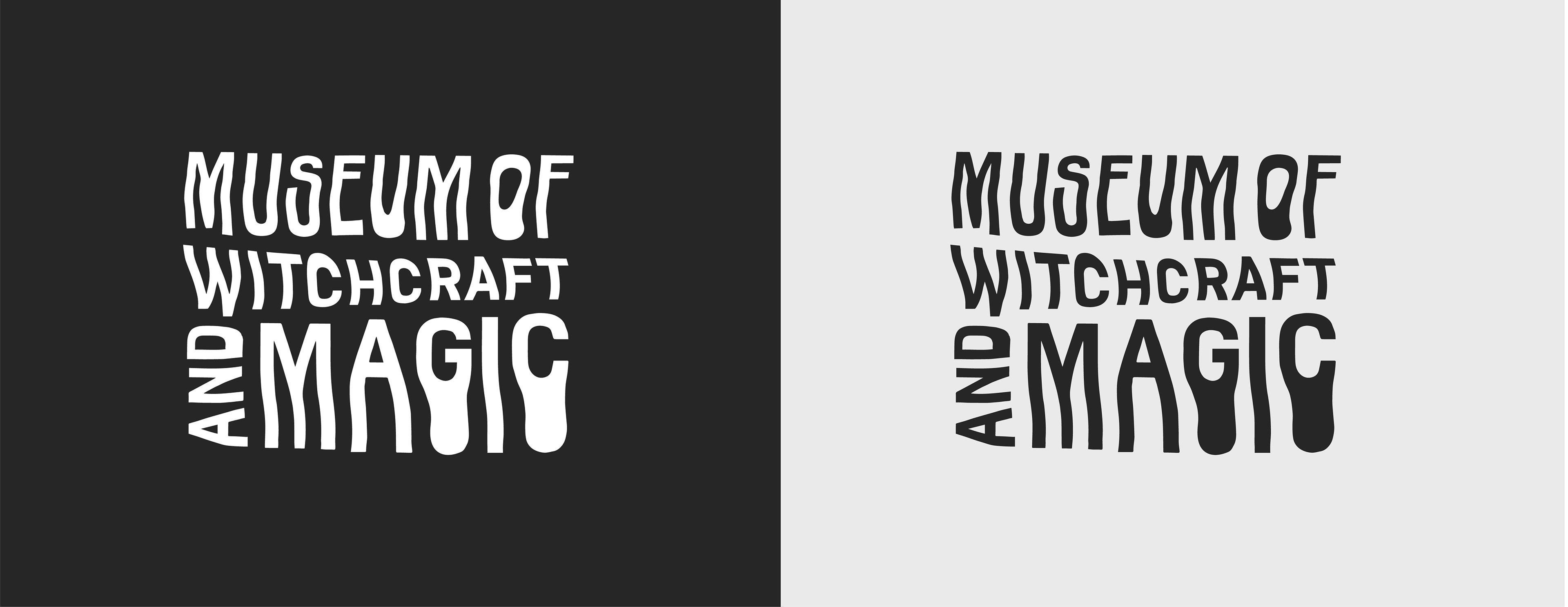
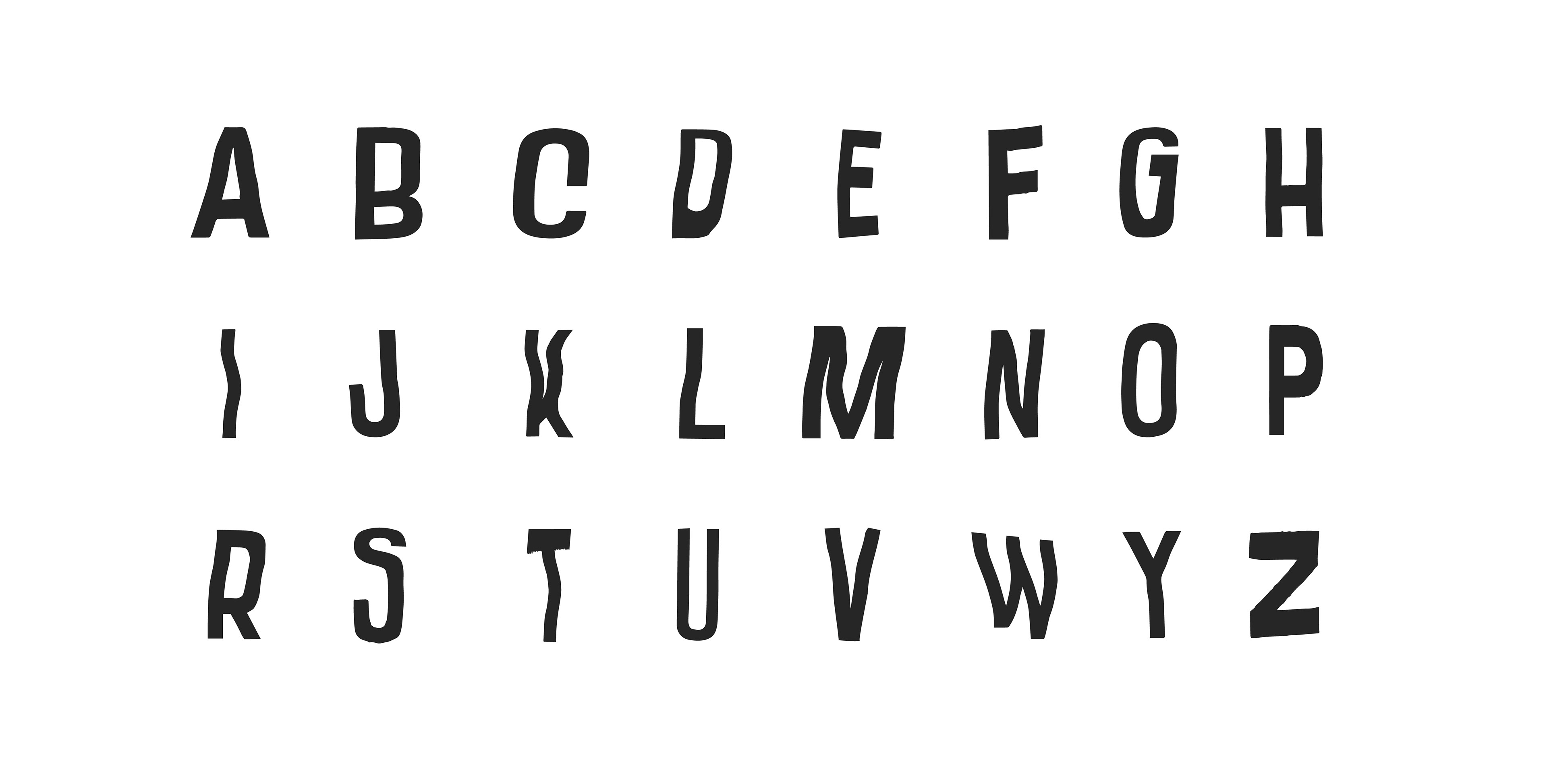
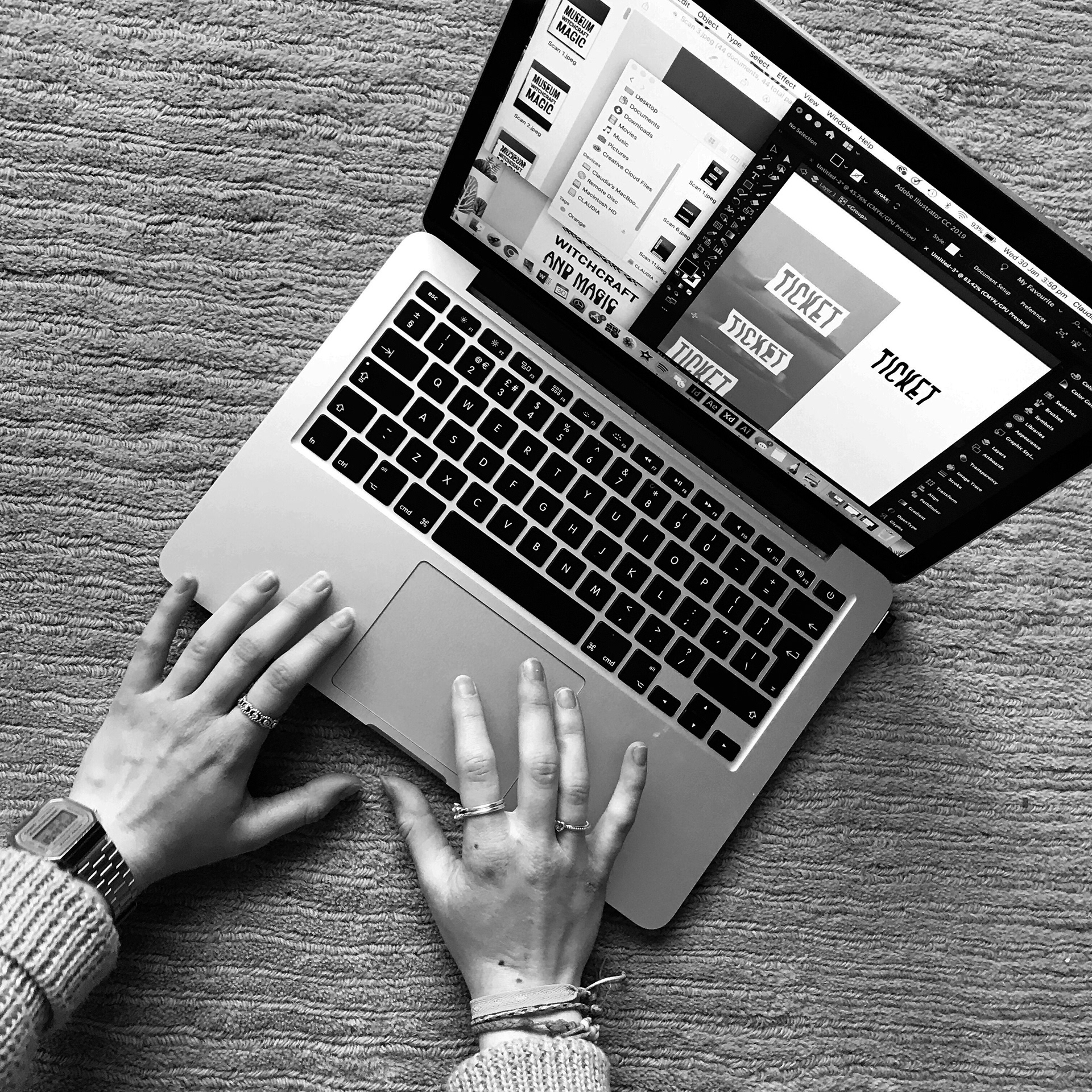
A new typeface
A specially designed typeface peppered throughout the museum’s identity. The typeface holds a strong sense of character. This character is channelled through the use of experimental scan distortions producing its letterforms. Each scan is unique and holds its own personality. A fluid, liquefied appearance heightens the notion of movement and supports the value of intrigue, due to its unusual formations and sudden character extensions/exaggerated transformations. The visuals mirror the museum’s distinctive experience.
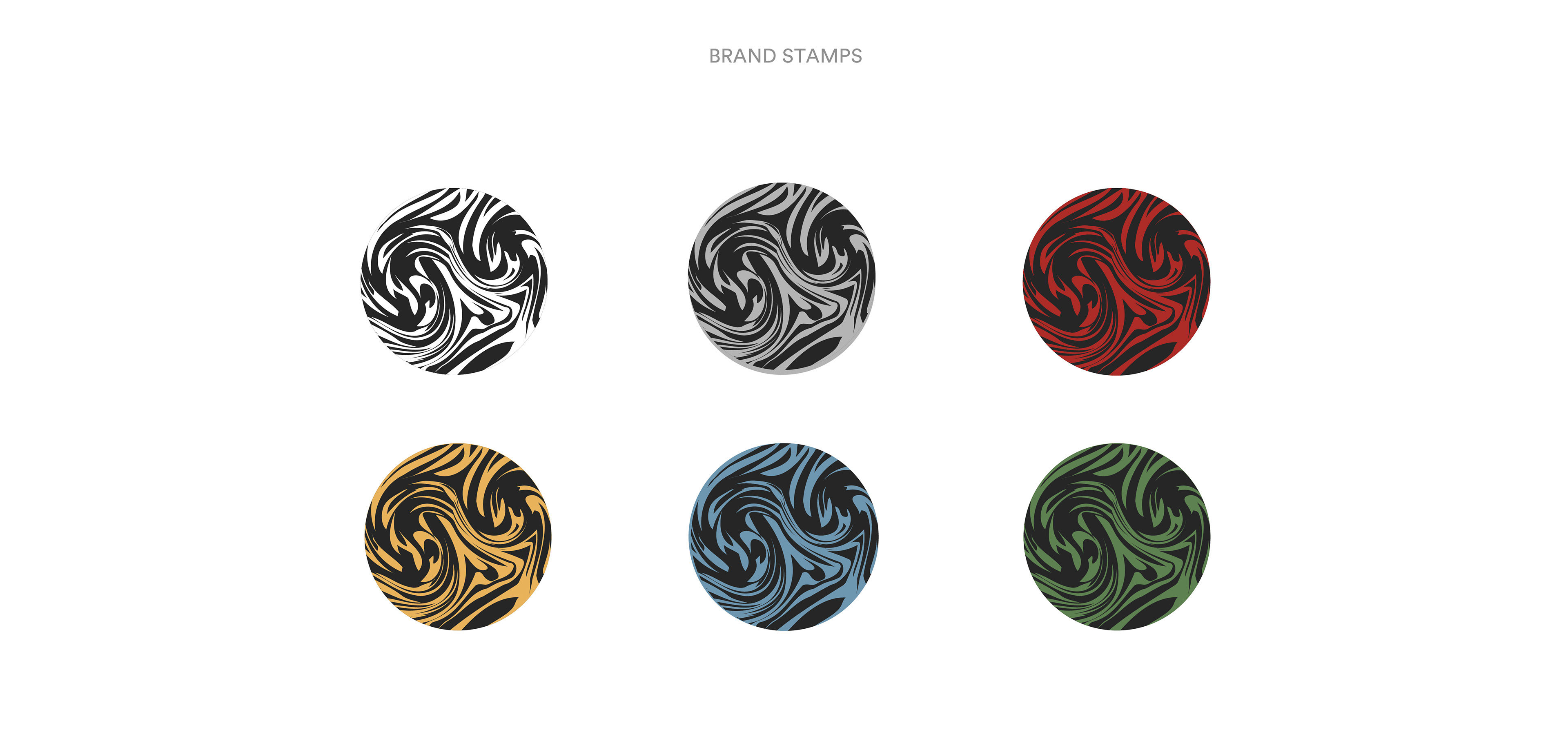
Brand Stamps
The selection of brand stamps are used in context of social media icons and in situations where a full-sized logo is not suitable. They allow for clear recognition and correspond to the museum’s values and concept. Each stamp resembles an element in its own right, enhanced by its assigned colour. Further scan distortions and warping effects produced the attractive spiral composition.
Film
To capture the spirit of witchcraft, the immersive film is vague and shows no true narrative, inviting the audience to construct their own storyline, having a unique impression. I wanted to capture a sense of each worldly element in its true context, remaining raw and natural with the lack of visual effects. This allowed the focus to be on nature and the location of Boscastle.
Interspersed throughout the film are short clips of a dark figure, which could be missed at a blink of an eye, adding fascination. The glitch effect resembles an incomplete transmission and movement between the two worlds. The style of imagery enhances the ideal of being a ‘glimpse of a world beyond’. Influenced by the definition of glimpse; “a momentary or partial view”, the ambiguous use of imagery and lack of narrative intrigues the audience and leaves them with many questions unanswered – an incentive to discover more.
The music adds a certain atmosphere and aura, making the viewing experience more exploratory and mesmerising – absorbing the individual into this world.
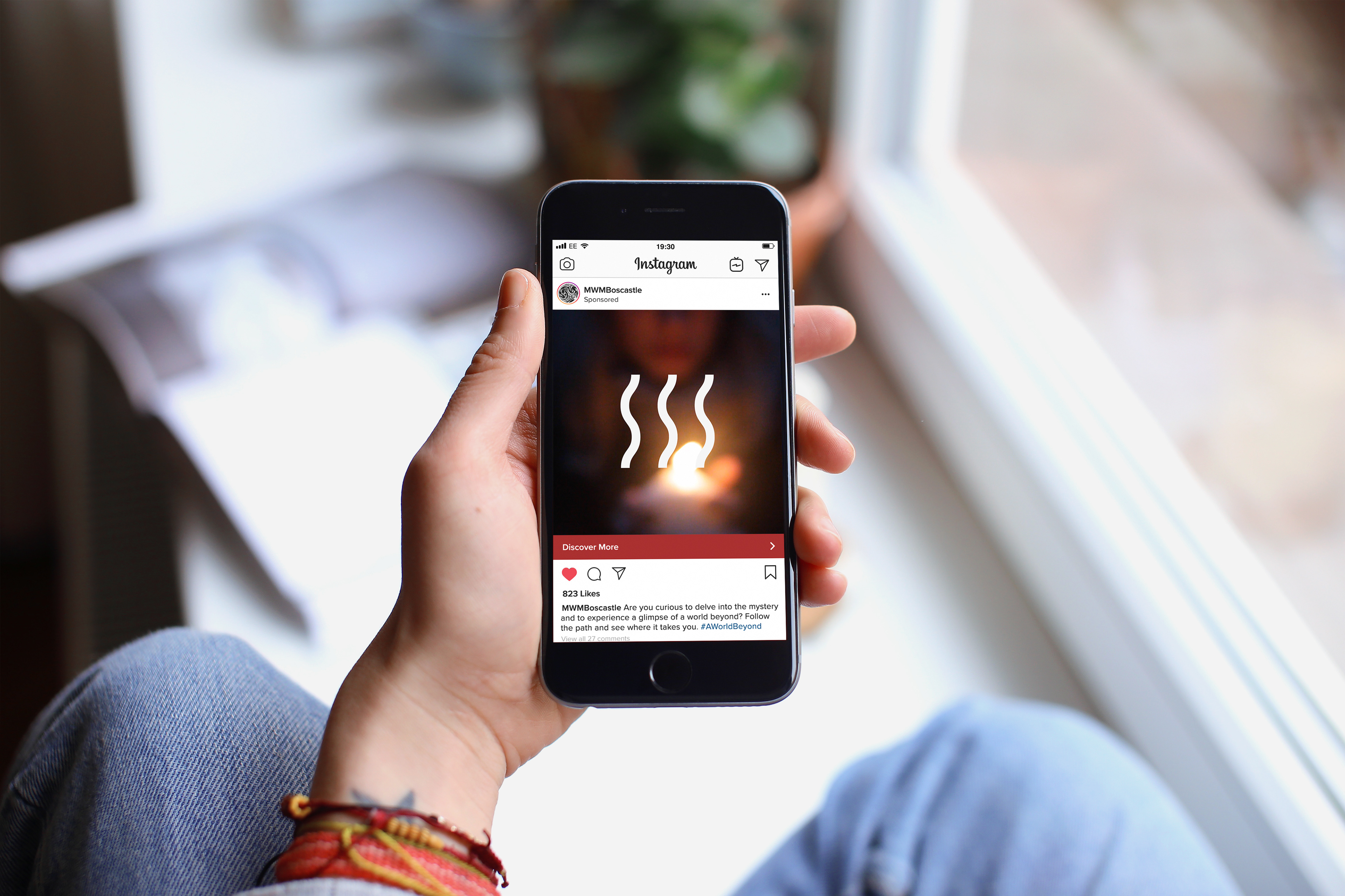
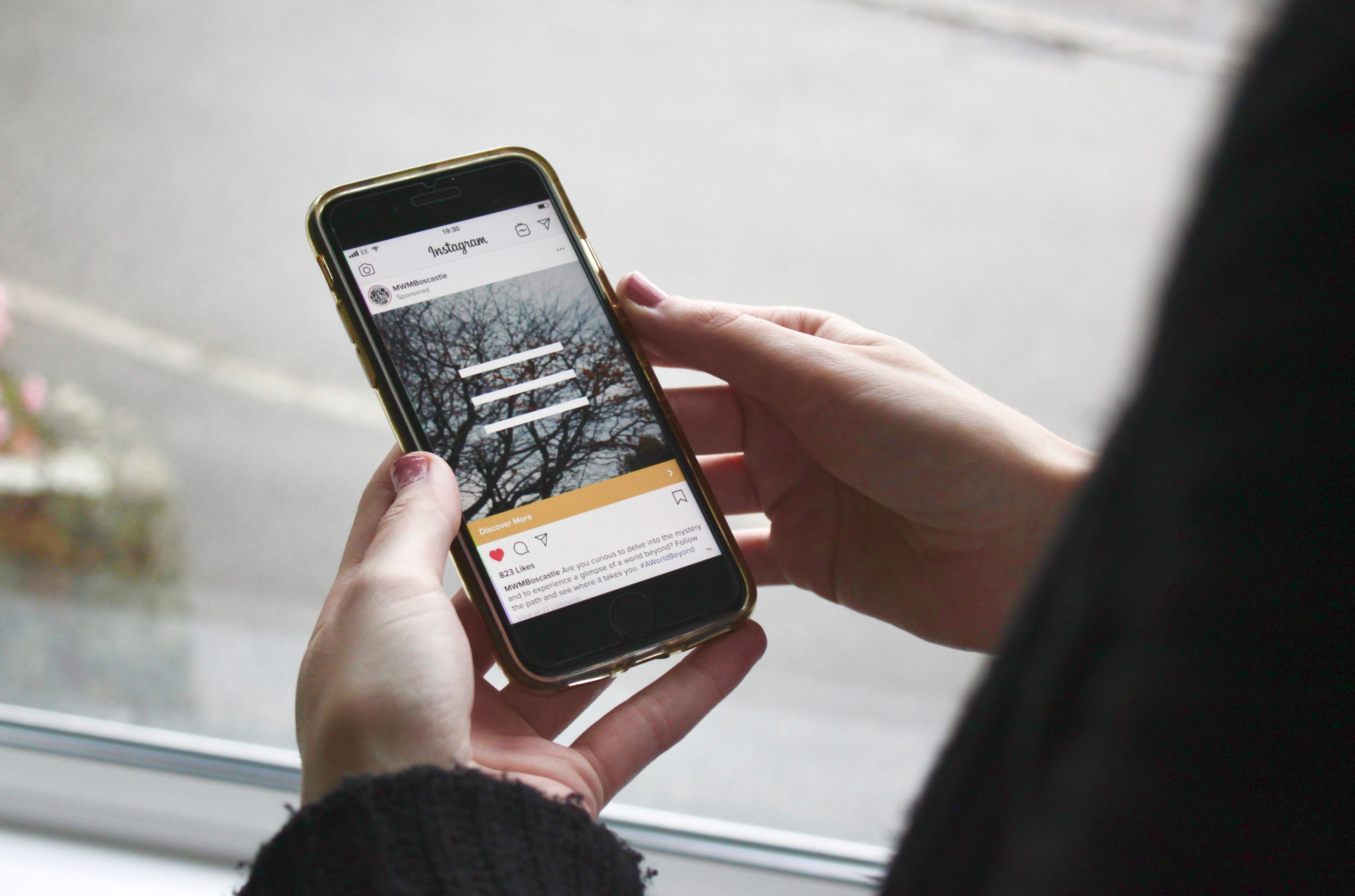
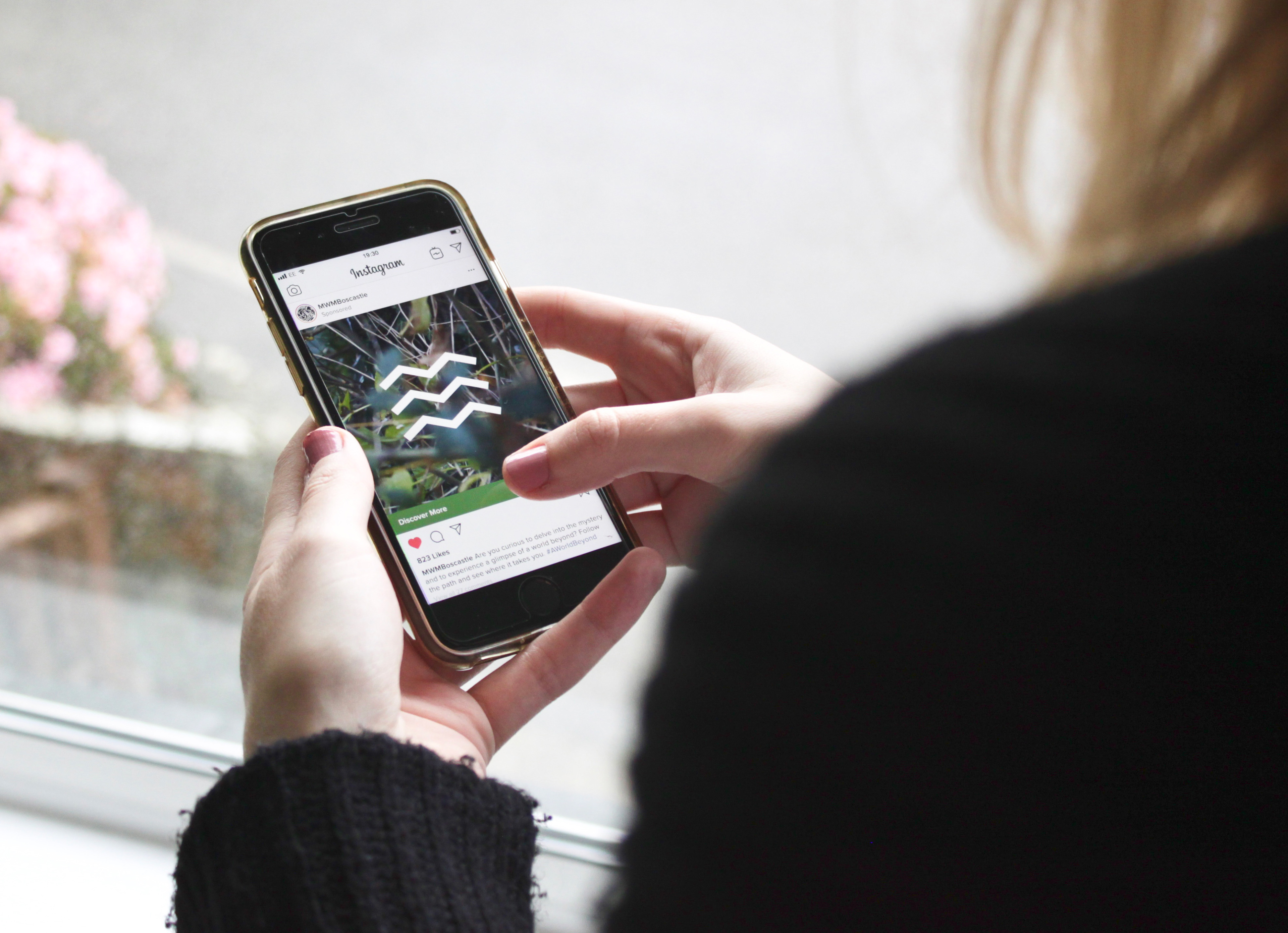
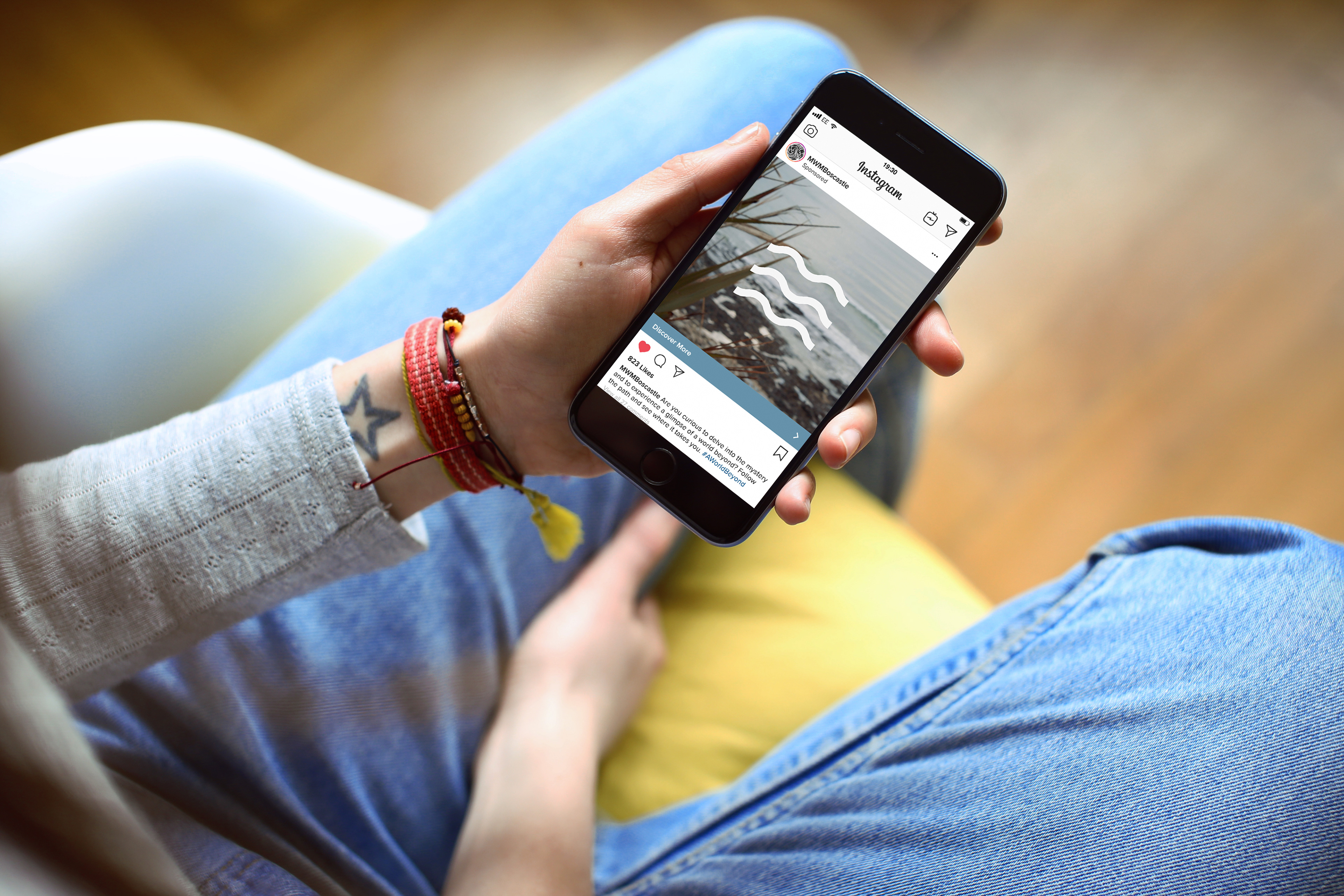
Social Media Campaign
The user experience begins with four social media advertisements, each mirroring an element and their associated symbol. The goal of the advertisements are to initially capture the attention of the user, gaining intrigue and consequently further involvement within the museum. The advertisements required short, but impactful ‘teaser’ clips, showing a ‘slice’ of what could be discovered.
The glitch effect reduces in intensity throughout the promotional campaign, mimicking the individual passing through a hypothetical portal into this ‘other world’. The bold copy enhances the experience and amplifies the user’s curiosity.
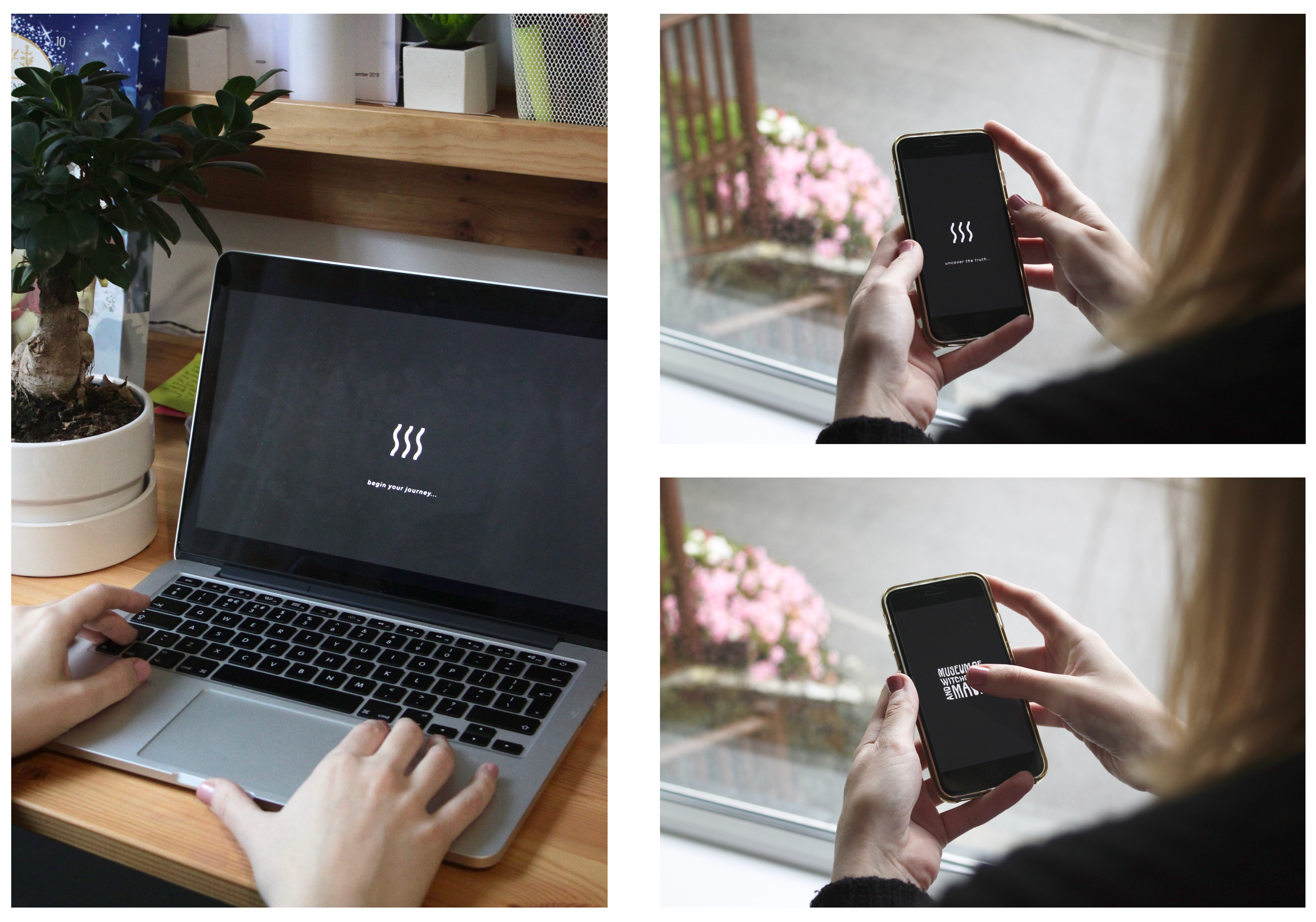
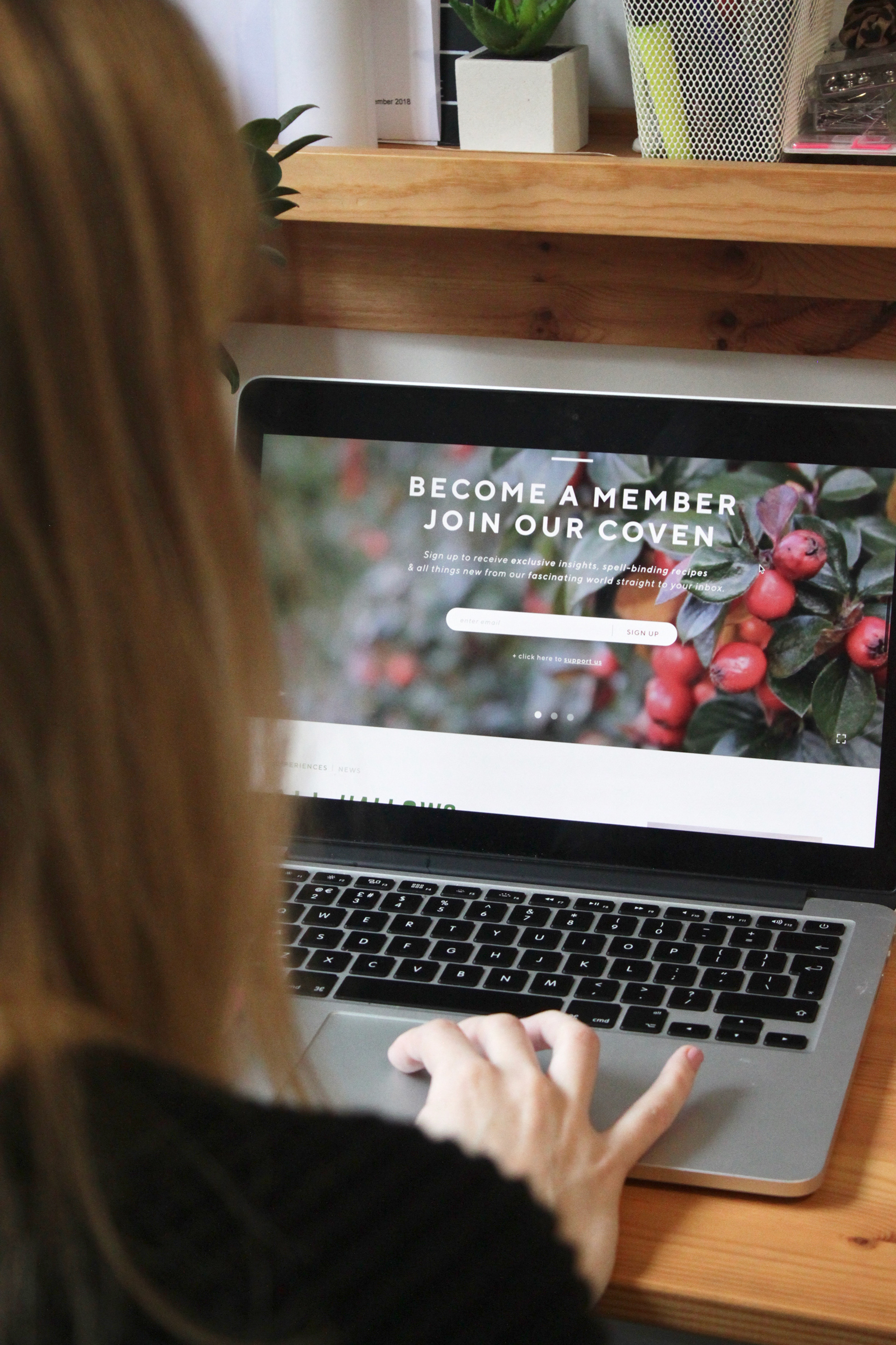
Website Landing Page
This loading page is the passage between the two worlds. Before entering the website there is an area of ‘liminal space’ where the individuals are held, reflecting the transmission through a portal. This holding page acts as a loading screen, with fluid animated elemental symbols, moving along the stroke line.
Once loaded, the museum’s logo appears and upon the users click, the logo expands and fills the screen, reflecting the individual’s submersion into this world. With the exaggerated animated ‘zooming’ visuals, the user is put at the driving seat, recreating the imagined experience of transmission.
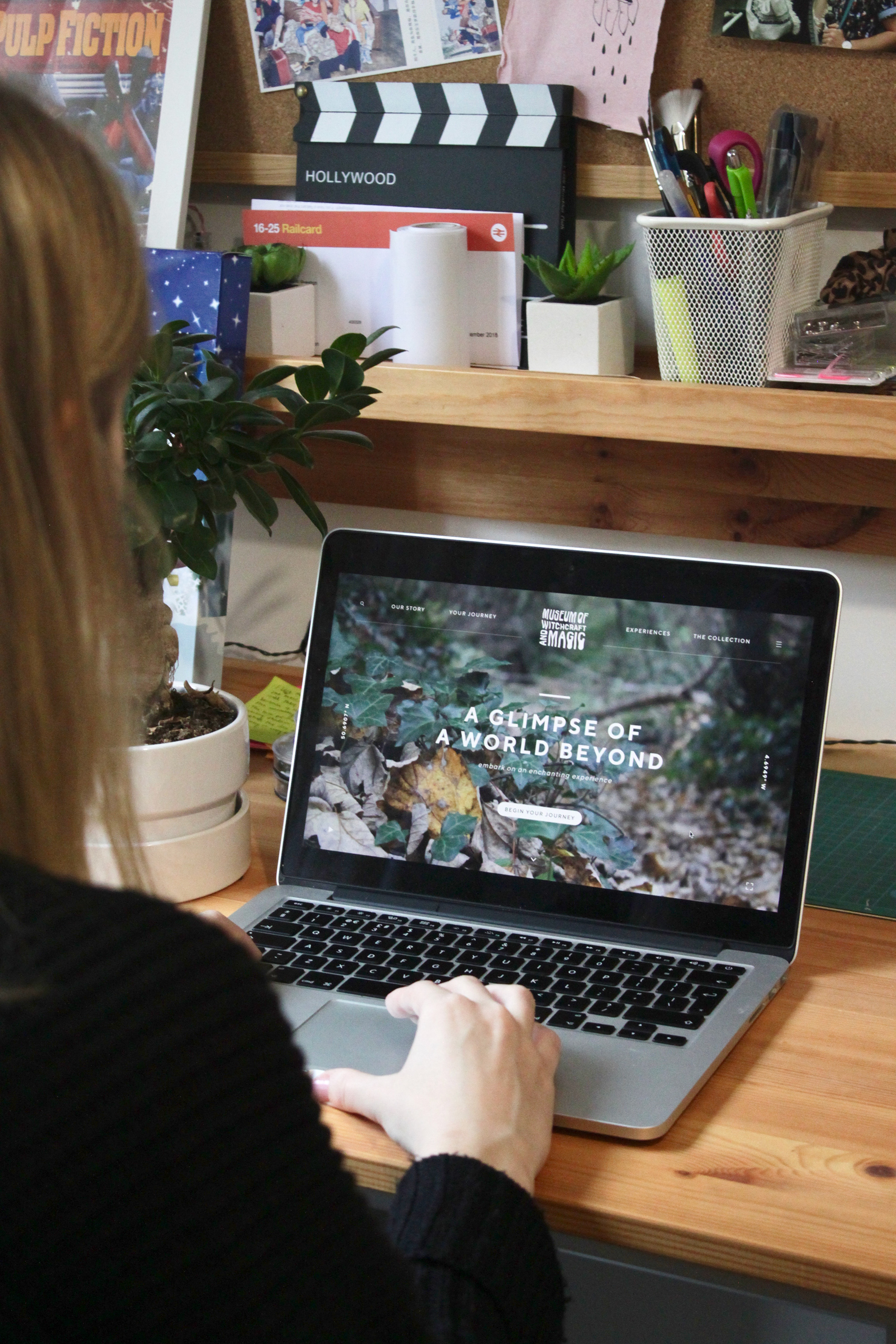
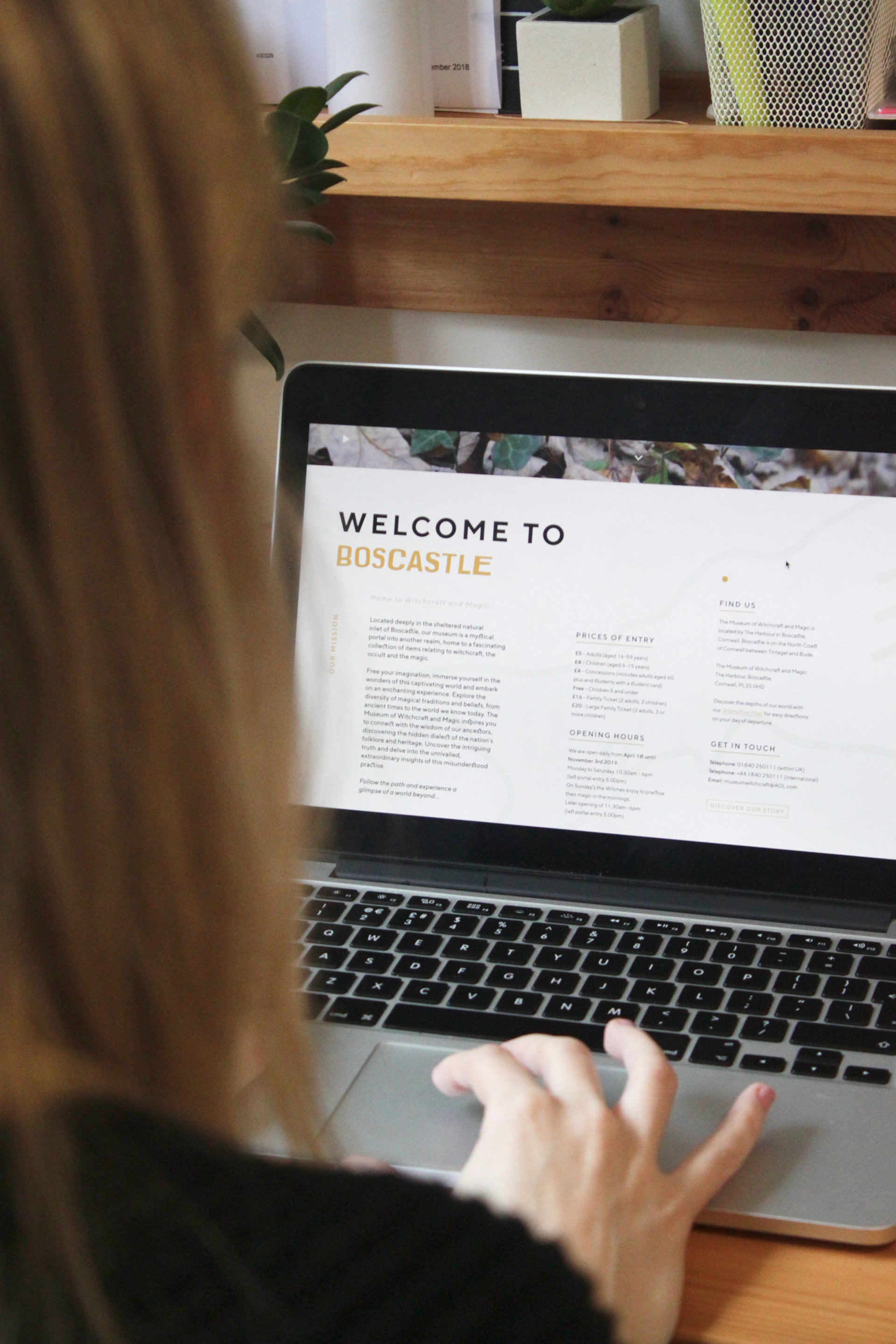
Website
With the film acting as a background, the website allows users to feel immersed and experience the depths of this magical practice by viewing its connectivity to nature in an instant. The website allows for full discovery of all areas of the museum; including news, events, social media activity etc. The copy is both mysterious and light-hearted, incorporating wit and informality, creating a more personable experience.
As the museum did not house a booking system, it resulted in the turning away of visitors due to an over-capacity. Therefore, the new designed system allows for the interactivity between the museum and the visiting individual, prior to their arrival, making it a bespoke experience, unique to each user, amplifying their journey.
(explore the website at https://xd.adobe.com/view/0fa2f42e-8d01-4a78-66d7-656fbbdc41d5-7993/?fullscreen)
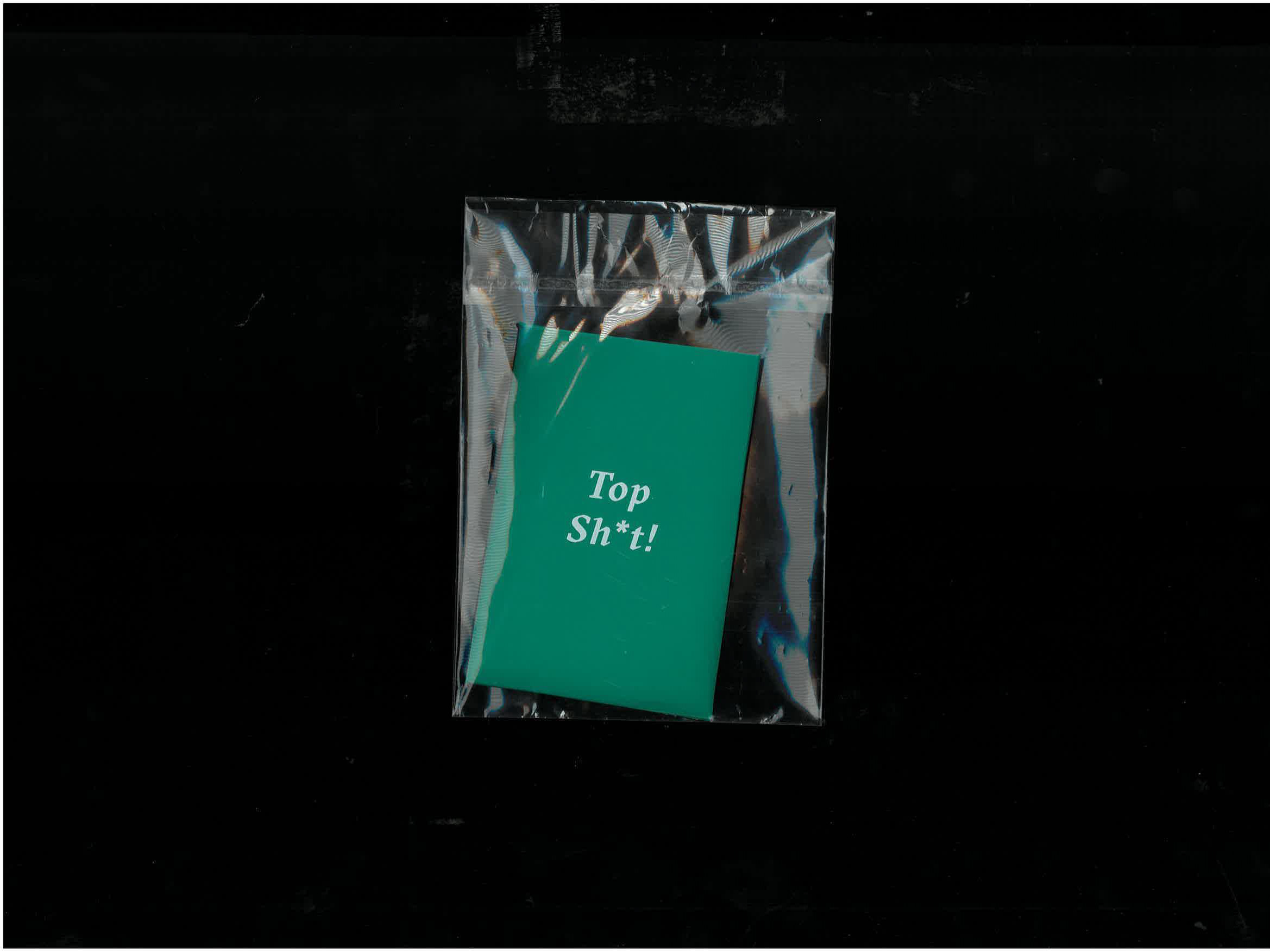
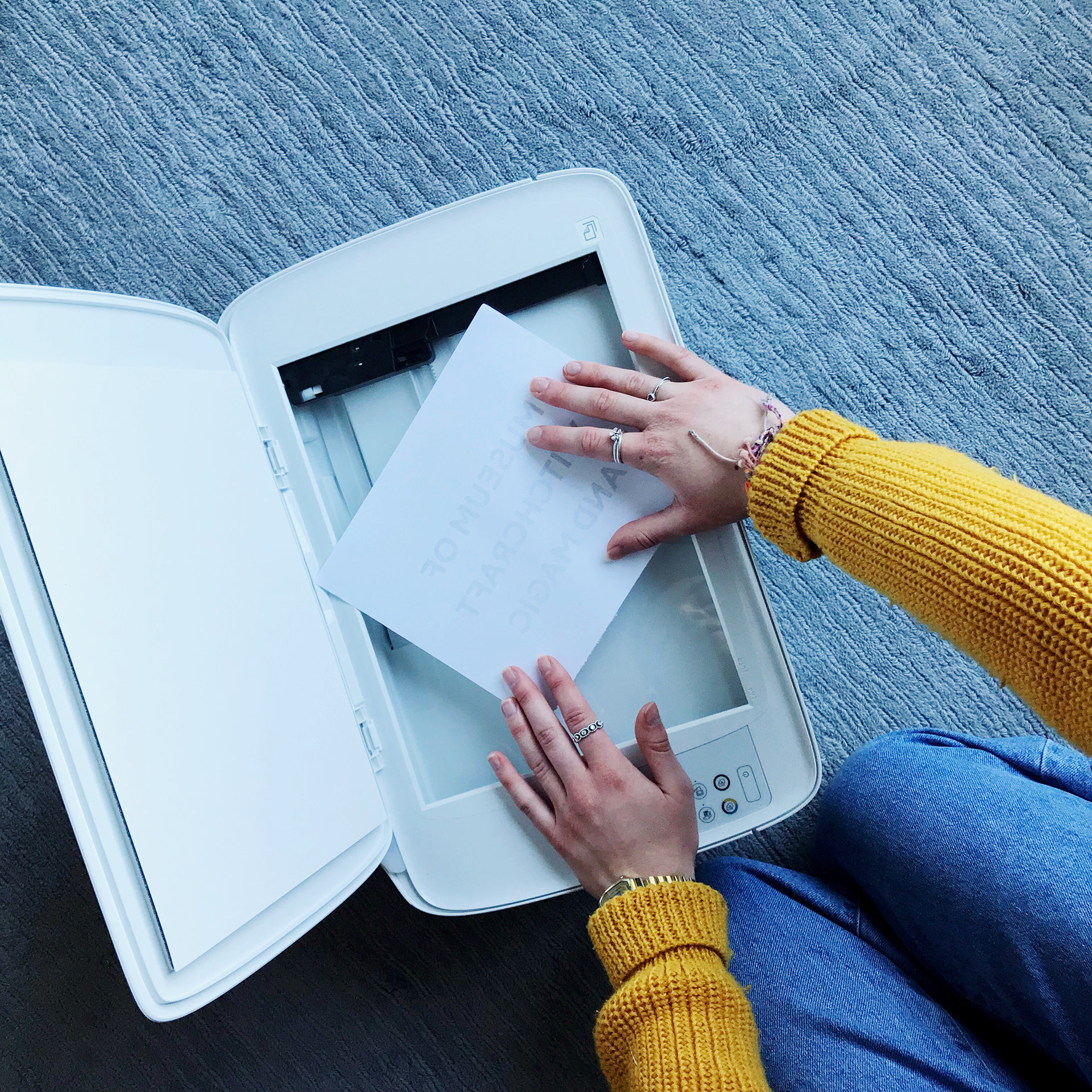
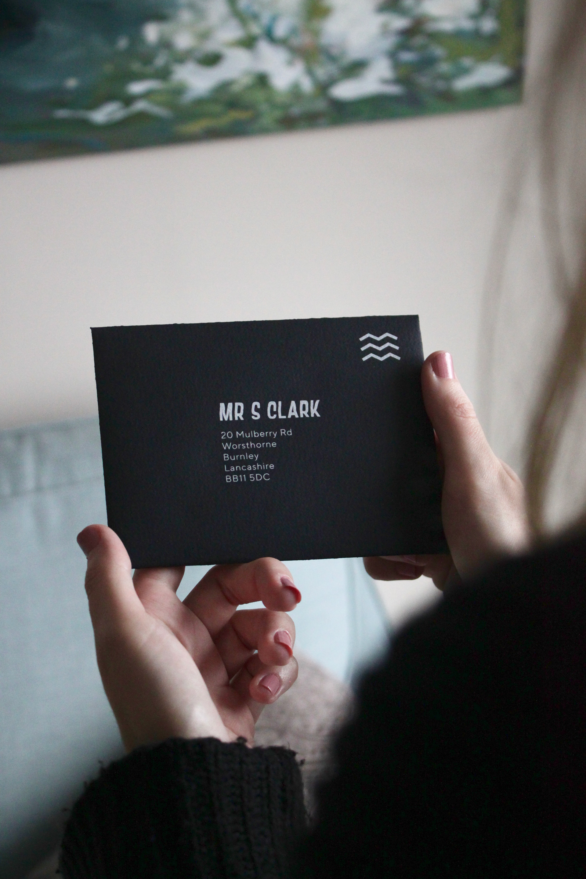
In post material
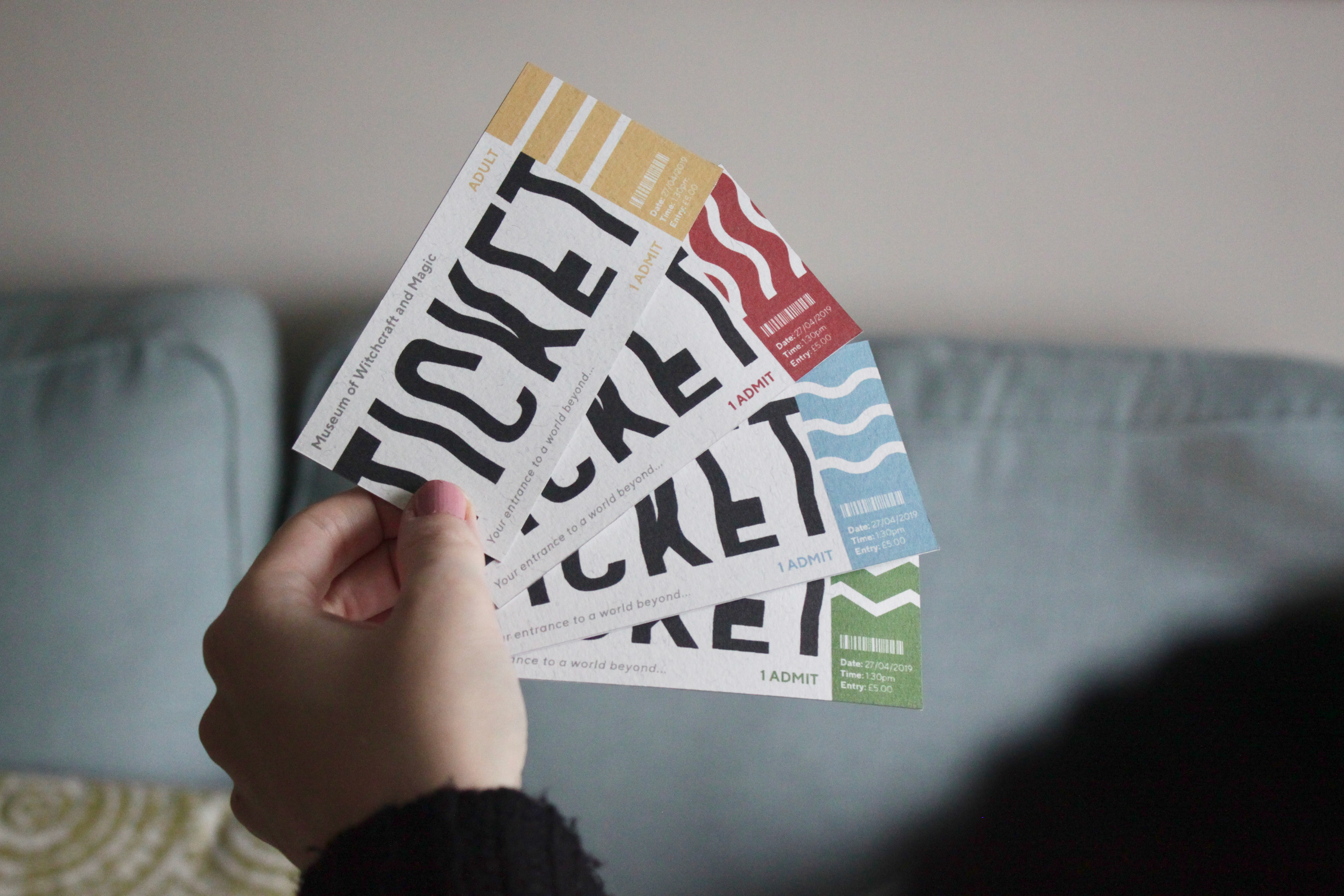
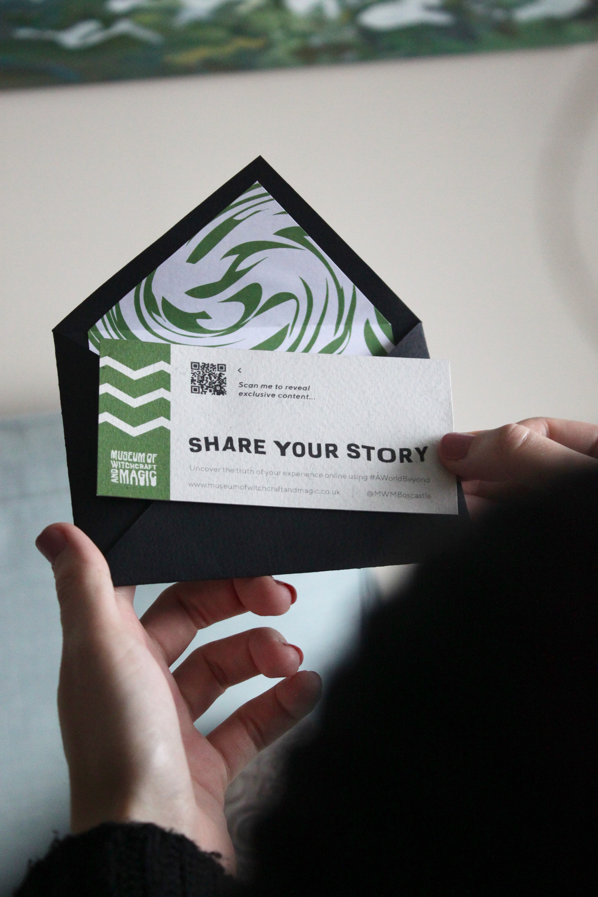
Once booked, the individual receives a simplistic black envelope in the post. This embraces the idea of perception vs. true colours and maintains the element of mystery, due to its vague design. Each pack corresponds to an element by the use of symbols on the exterior, mimicking the appearance of official postage stamps and by the use of colour and brand stamp patterns on the interior.
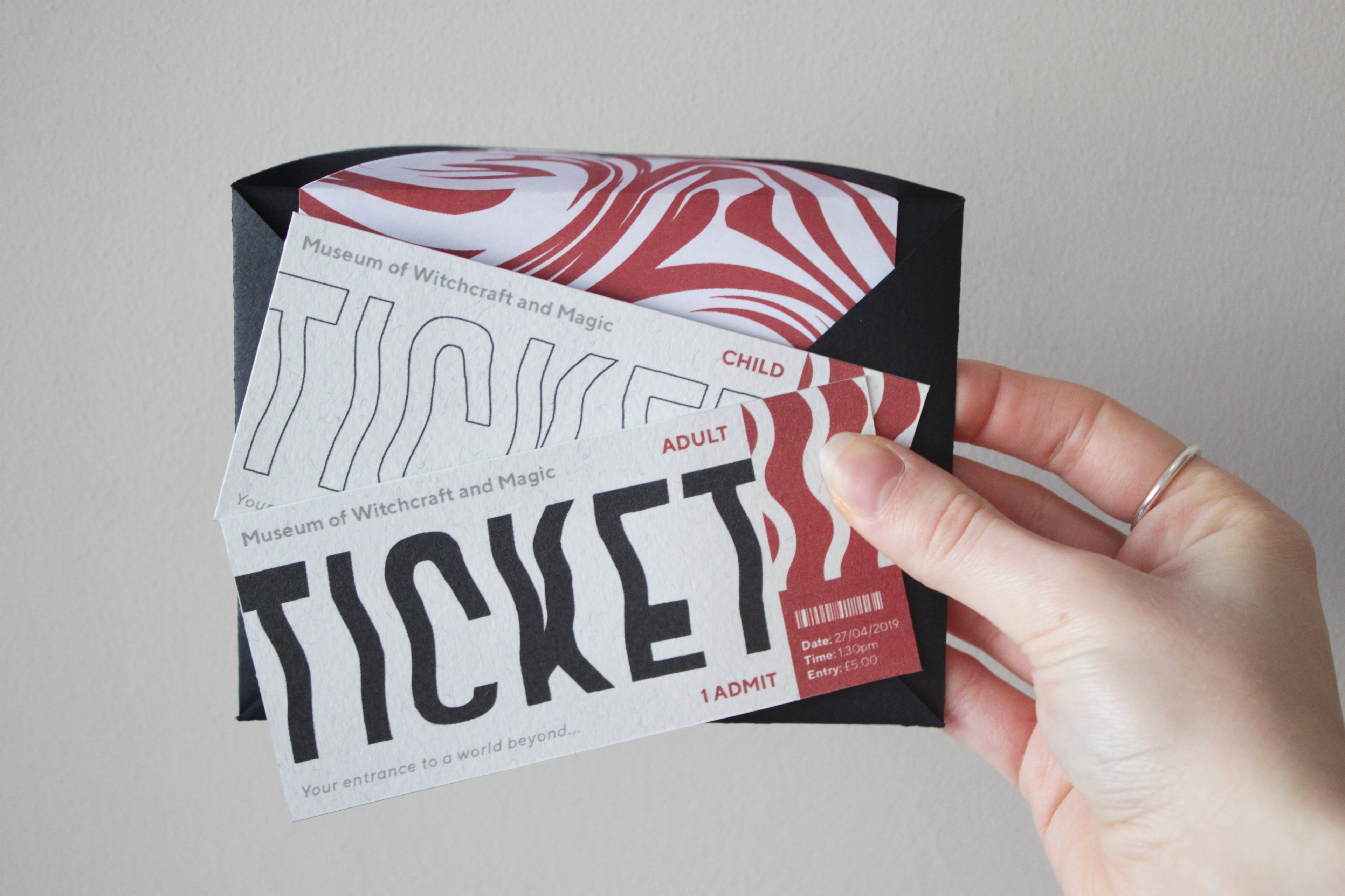
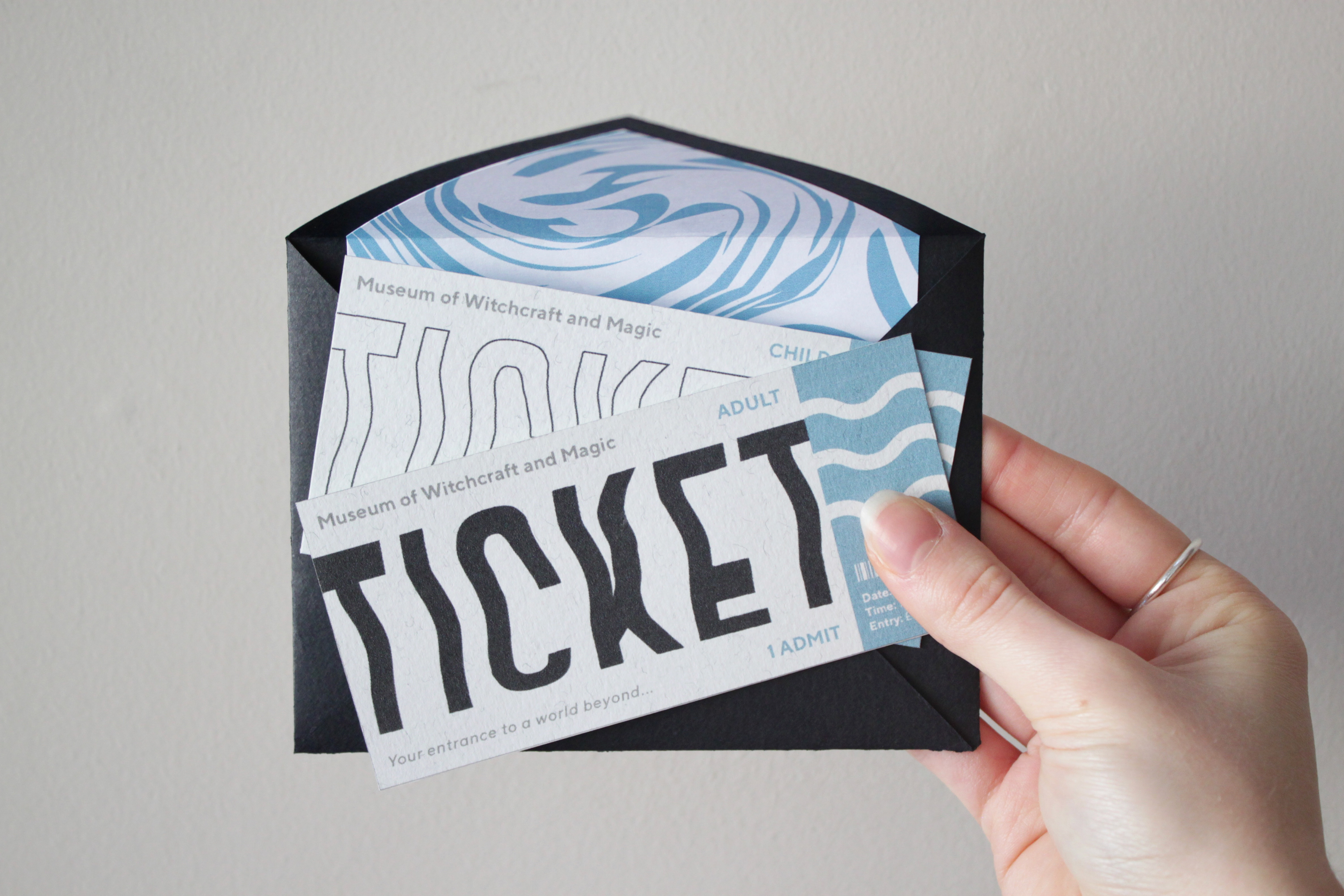
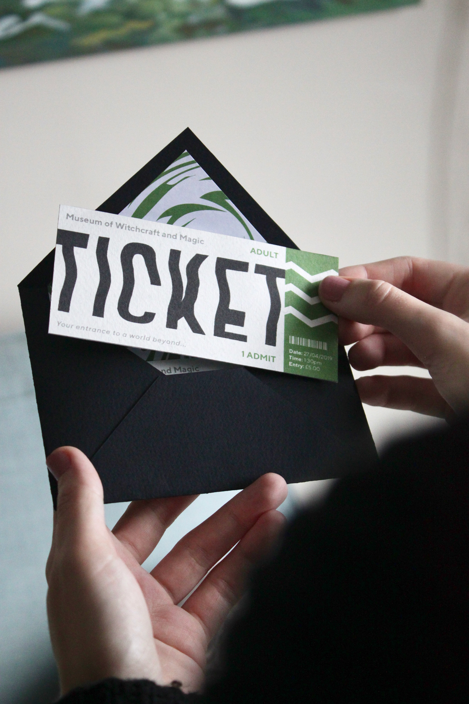
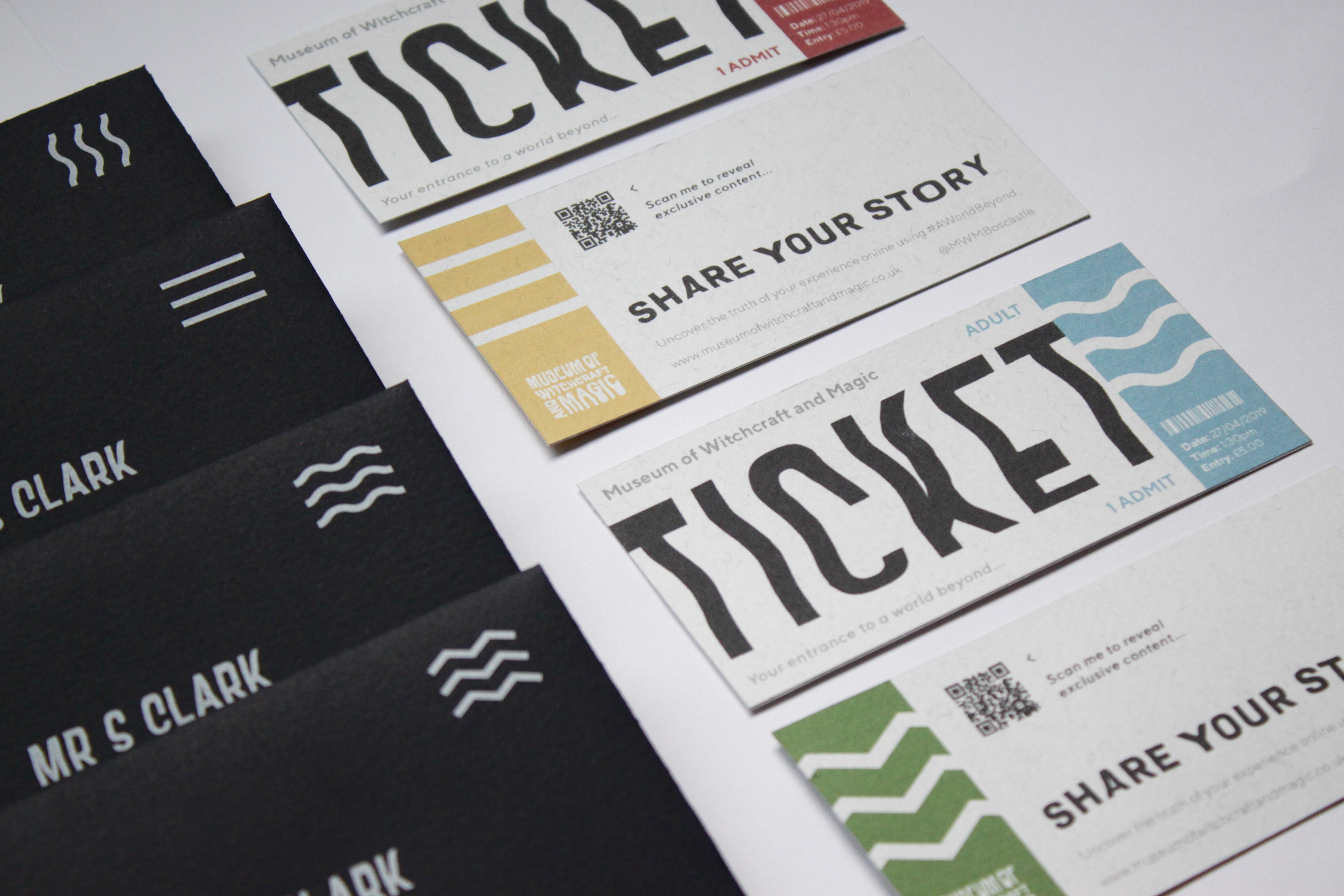
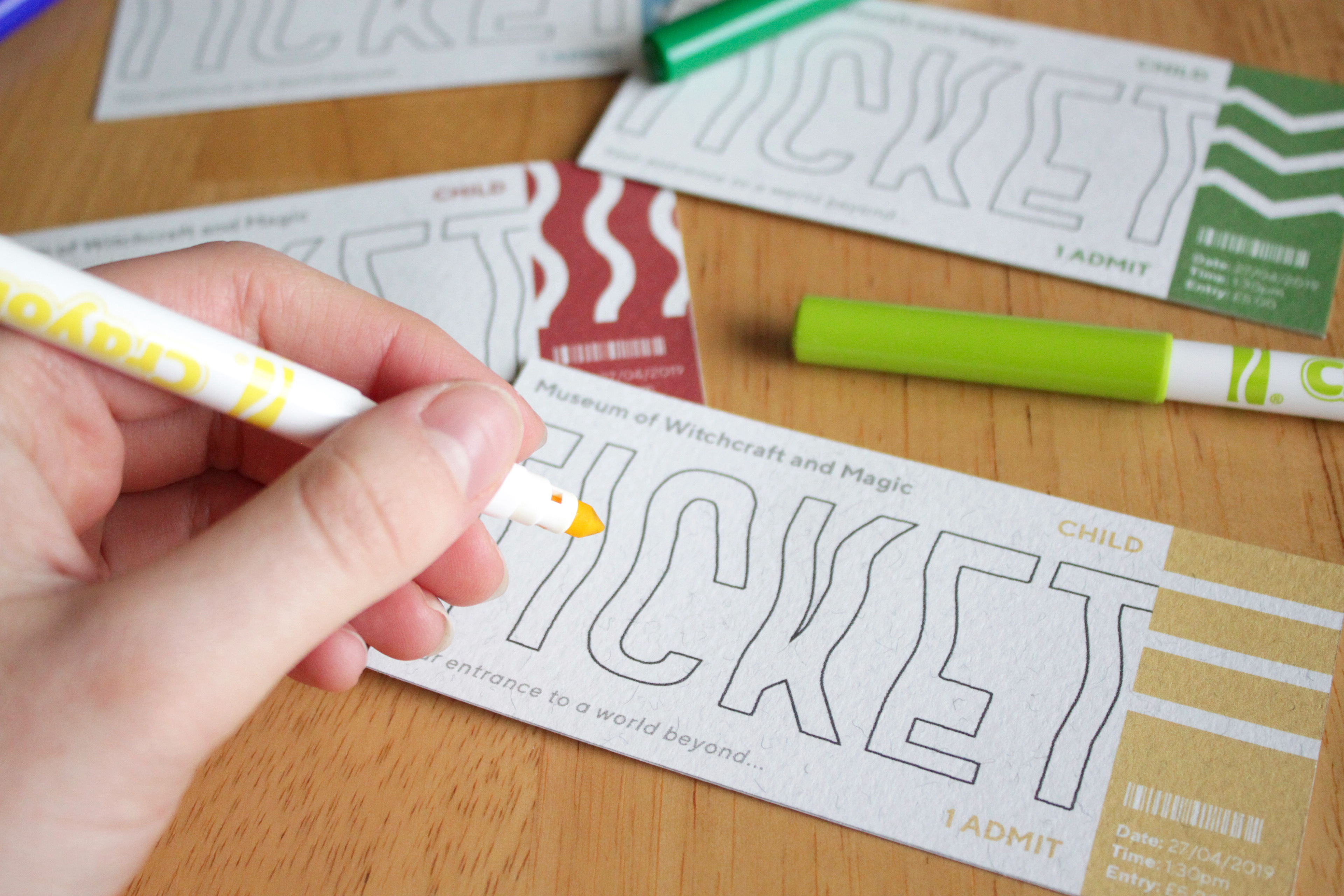
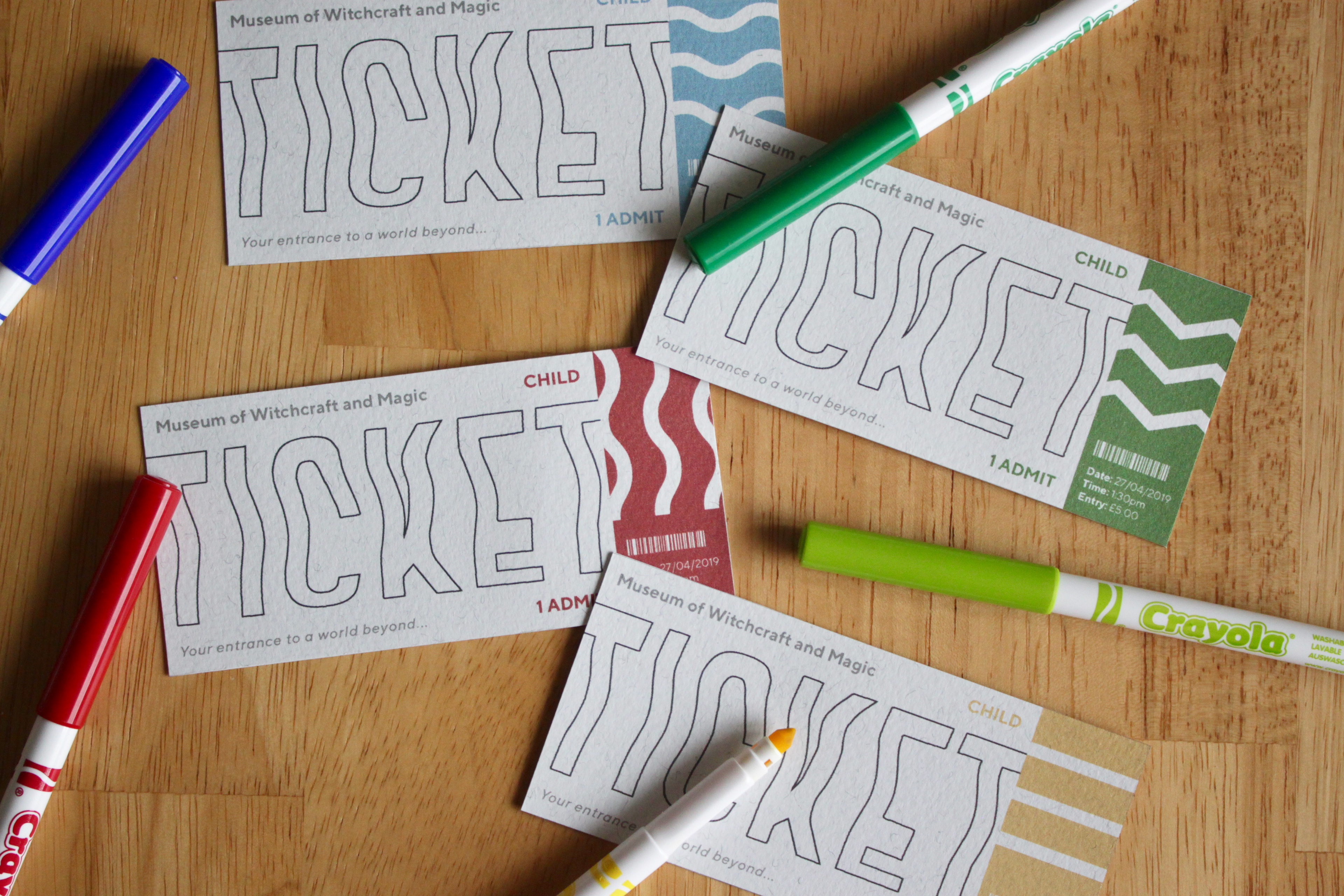
Children's Ticket
To increase the involvement of adolescents, the children’s tickets have been designed with interactivity in mind. A ‘colour-in’ activity allows for engagement and adds lightheartedness to a potentially ‘heavy’ subject.
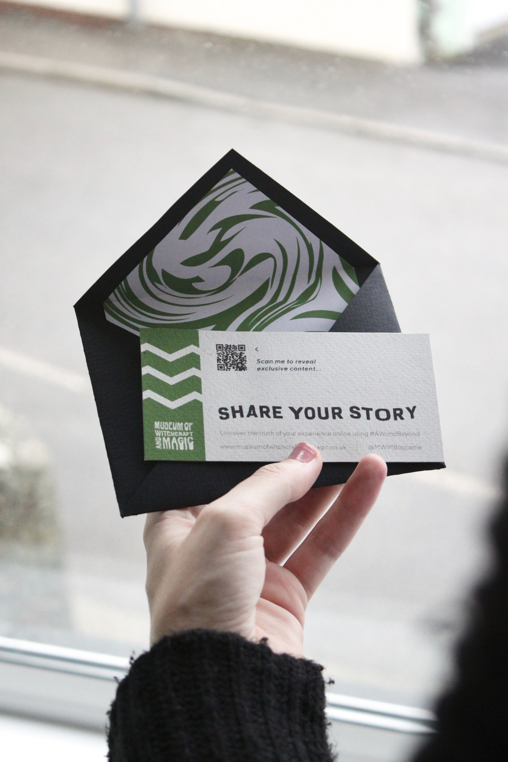
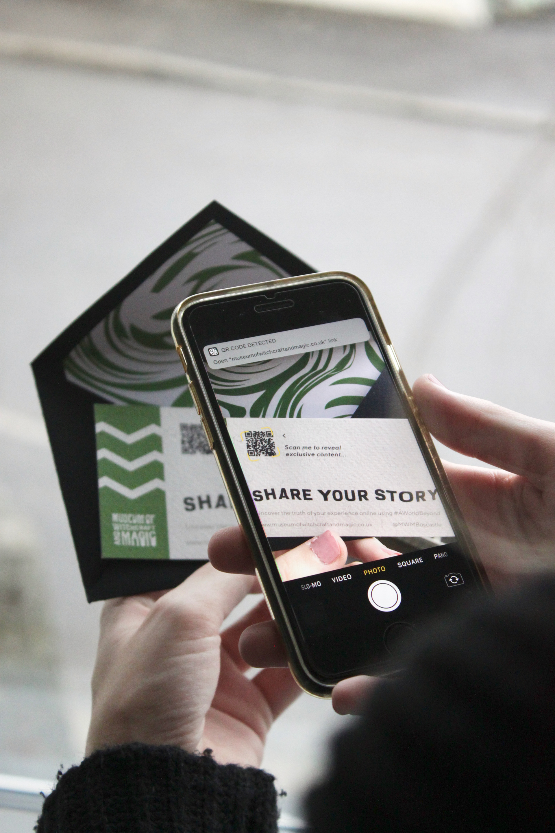
QR Code
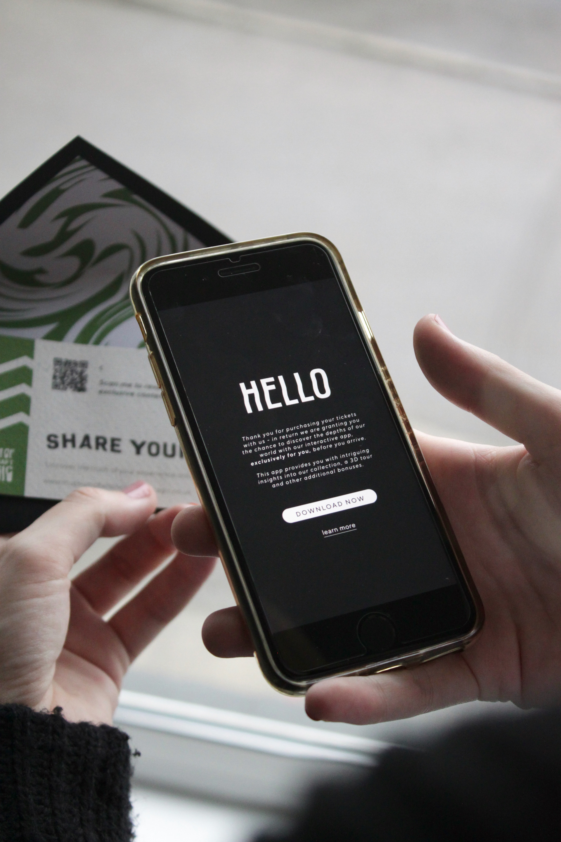
The visitor is invited to “share [their] story” and to scan the suspicious QR code positioned on the back of their ticket. The QR code directs the individual to a secret message, revealing an exclusive application for them to download. This app works as a thank you for booking tickets to the museum. The app would allow the individual to discover further insight prior to arriving.
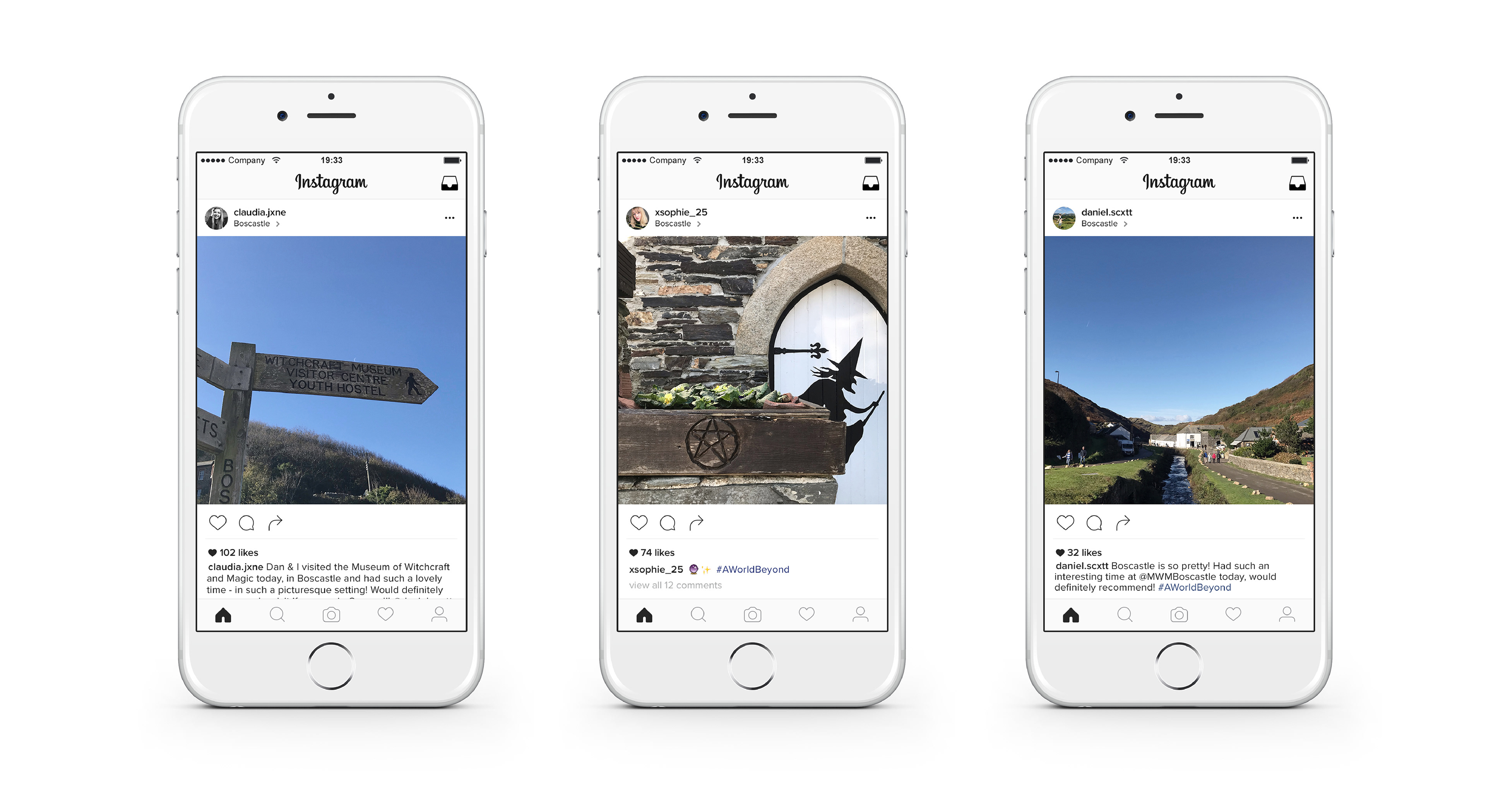
Social Media
Once the individual has experienced a ‘glimpse of a world beyond’ they are invited to ‘share [their] story’ online using the hashtag #AWorldBeyond, creating further publicity for the museum. The published photographs using the hashtag will feature on the website for future visitors to see.
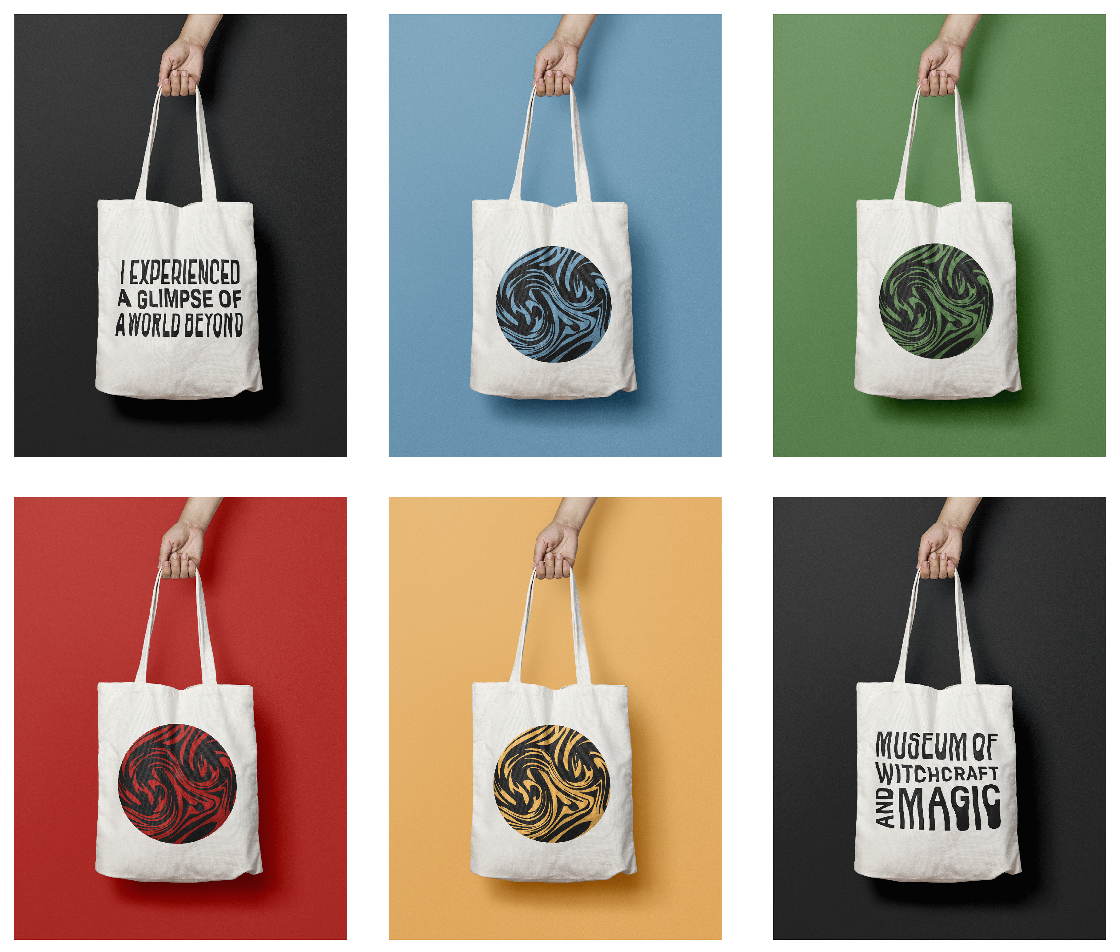
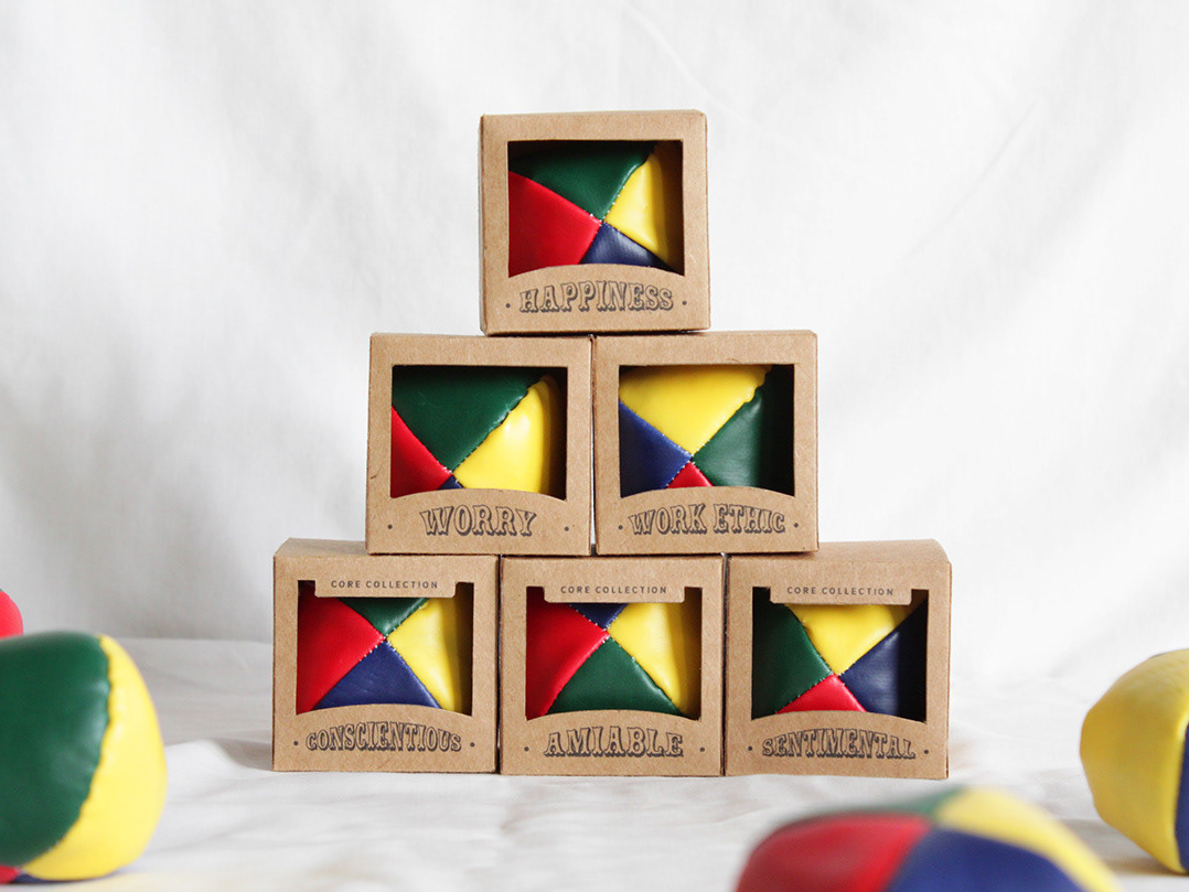
Merchandise
This can purchased from the museum shop. These tote bags clarify the completion of the individuals experience with the ‘I experienced a glimpse of a world beyond’ quote, incorporate the brand stamp and involve their associated elemental colour combinations.
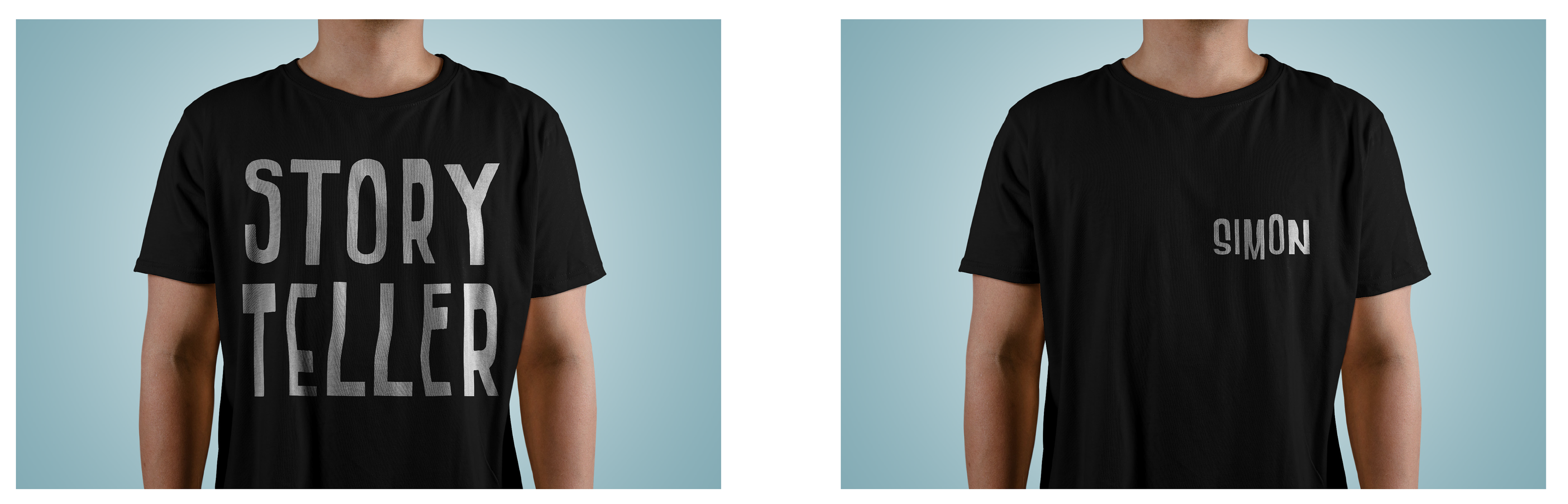
Uniform
The word ‘staff’ did not suit the language the museum embodies, therefore I altered their title to ‘story tellers’, as they provide visitors with deep insights of the world of witchcraft, tell stories but also add depth to visitors overall experiences.